Friday, December 30, 2011

....don't EVER smoke!!!!!!!....but check out this great lettering


In the remote town of Renovo, Pa., this wall still greets the locals and all that pass through. The railroad has left this town to somehow find its way with little around to help. This terrific piece of advertising history makes one feel as though the glory days are still at hand. Simple white and yellow sans serifs with a hefty black drop shadow. Thoroughly weathered and still beautiful. I have always loved the look of Mail Pouch barns and walls. Would make a great interior wall of my next home!


Why my father-in-law had this old snuff tin from back in '86 to give me is a bit odd, but I sure was pleased to see that great font that Copenhagen Snuff used along the sides. Thin white on solid black. A great "C" overtaking the "o" and that awkward "g" which is brilliant! The "SNUFF" font is modern and a good fit to the lower case above it.


Not sure how we acquired this ruler but it is evidence that tobacco companies had kids in mind. They attempted to look as though children were not the target but it would be perfectly wonderful if the people they admire most indulge! I'm sure these companies had no idea that kids copy their older siblings and parents. Love the two different fonts used on the front and back. Simple and classy. (Altoona was my old home town.)

Thursday, December 29, 2011

fellow art teacher gets recognized


Andrew Wales is a very talented local art teacher from the Athens area. He seems to live comics and his love of them shows in his quality products. It is always nice to see a local receive some proper praise. Nice work Mr. Wales! Read the full article here.

Sunday, December 25, 2011

matt's first graphic design project...a gift for cousin sophie


We should start with the fact that the project was Ashley's idea. She suggested Matt do an alphabet for his cousin Sophie (my brother Gregg and his wife Amanda's beautiful, almost one year old, daughter). The whole living in Florida thing moved us in the direction of sand and shells. We began the process by removing some sand from the turtle sand box in the back yard. I sifted most of the debris out before bringing it indoors. I spread it out on a 24"x36" tote lid. I wrote out the alphabet on some scrap paper so Matt could cross off any letter he finished. Matt randomly chose a letter and drew it large with his pointer finger in the sand.


With a plate full of shells that had previously been sent up by my mother (also living in Florida), Matt would chose which shells would go where. I would give advice now and then as to which parts of the letter might need another small shell or maybe we need to make the letter a bit bigger or smaller.


I would then take out the lid, carefully, onto the porch and take several photos. I tried to keep the shadows running in similar angles. Each day we made the letters, we were given different atmosphere for the photos. I'd bring it in, remove the shells and smooth it out for Matt to begin again.


18" x 24" final poster
matt will be 5 at the end of january

matt's 4th christmas


Dear Santa,
I know I'm going to
Like the presents.
Thank You very
much Enjoy the
cookies Love Matthew

Matt told me what he wanted to tell Santa, I wrote it down and then he showed off his lettering skills. The "Li" in Like were a bit tight and formed a four and he also attempted a bubble letter E. He colored in the "OO's" in cookies to make them into chocolate chip ones (he went heavy on the chocolate for Santa!).

I love how his lines roll out in smooth waves....already a font lover like his dad.
Merry Christmas ALL!!!!!!!!!!!!!!!!!!

Saturday, December 24, 2011

an angry "thank you"

We knew no one when we moved into this house. It was a new town to both Ash and I. The houses next to us "looked nice" but that is what you hear when reporters are on the scene of some mass murder case....that whole "they seemed normal" or "they kept the yard so nice" stuff. Anyway, we lucked-out with our neighbors. They actually are "nice". Good folks. Earl and Jessica are their names and thought it fitting to give them a dose of "Angry" for the Holidays.

If and when we move from this home, it will be them that we miss. Earl has become a regular golf partner. He offered up a chance for me to join him at a member-guest at the local course a while back. I must not have been to big of a jerk that first outing because multiple offers to play have followed. (thus the "golf channel" reference)


Thanks Earl!...Thanks Jessica!

the SUV wave


Friday, December 23, 2011

Plough's vintage tin....great graphic design

A friend of the family, Bob Martin, gave Ashley and I a box filled with old tins and perfume containers about two weekends ago. Bob has become a third grandfather to our children and is a kind, gentle and generous man. Our children climb all over him...especially our daughter Clare. He, like many others around these parts, has a basement loaded with piles of items. Overhearing my endless conversations concerning how excited I get when seeing old advertising and classic lettering, he trekked down his basement stairs and rummaged around for me. I attempted to thank him enough but you never really feel as though it is sufficient. This post is both an enormous "thank you" to Bob Martin and also a way to let the rest of you see some beautiful packaging. Old things just look better to me.

With a quick google search I was able to see similar enamel tins (did not find an exact duplicate) and date this particular tin to the early 20's - early 30's. I was unable to find info about Plough's and whether this was some kind of snake oil scam or the stuff really did what it claimed.


I love the sides of this tin. There are very subtle changes to the font used with the second line being a taller, more condensed version. They also utilized some wider kerning along the bottom two lines to help fill some space. They achieved a great look while isolating the two product titles.

The best compliment I can give an item is to have it displayed in my home. If I want to look at something often, it finds a shelf or wall space.

Thanks Mr. Martin!

Wednesday, December 14, 2011

local font find #3

If your heading south out of Elkland toward Wellsboro, Pa, you'll have to notice this awesome set of signs letting you know that "FLOWERS" might be for sale. Though I've never needed flowers, the location doesn't seem to be open for business.

These signs are recycled portable business signs and are on their last legs. My guess is that the internal wiring that once allowed them to light up is no longer in working order. The letters appear to be fashioned out of corrugated sheet metal, most likely aluminum.

Now for the font.....the lettering is so disjointed that they have become unified. This sign has that "it's so bad, it's good" quality. I LOVE these signs. Slab and thin, the letters make no sense if we just look at one or two. The sign below is small enough that the sign maker had to stagger the letters. I love that solid "O". I guess that cutting out the center of letters wasn't an option (thus the "R" made in a way to avoid the hole).


Further down the road, you'll pass the southern-most sign of the pair. The letters are duplicates of the northern version but the frame allows for that single baseline. The "S" and the "E" are flipped from their northern partners and I guess it wasn't done on purpose or given any real concern.


These signs always make me smile. To be honest, this pair inspired the whole "local font find" entry.

Friday, December 9, 2011

pug christmas cards done!


I finally got the pug cards back from the print shop. They look great (this photograph stinks, but trust me, the cards look great). I will deliver them to my co-worker on Monday morning and hope she is pleased with the final product.

We attempted to keep them both of quality and inexpensive. We had 50 cards printed at Mansfield University's print shop for $12.50. That's a whopping 25 cents per card. That price included folding (no extra fee due to the thickness of the paper did not require scoring). Charlie Earle runs the shop and is great to work with. They handle all kinds of print work....large format printing (I utilize this for posters all the time), lamination, cut vinyl lettering, etc.... Check them out if you are a local and need some printing done.


I was given the okay to self promote on the backs of the cards. This blog is the only place on the planet that I can promote...so there it is. Set this up for 8.5 x 11 paper with the final crop marks getting us to a 5 x 7 vertical card.

latest bulletin board at R.B. Walter


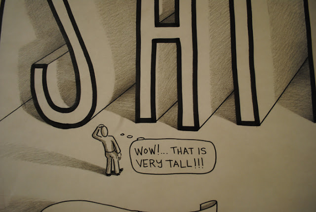
The latest upgrade to the 4'x8' bulletin board was an attempt to show the students a few ways to depict perspective.


I try to keep the images whimsical in order to get the youngsters to keep checking out the progress of the drawings. If they keep looking, the chances of learning go way up.


The shadows eat up 90% of the time invested into a bulletin board like this. My plan is to avoid shading until absolute necessity sets in. The little people were used to aid in the students understanding the images. They immediately add a sense of scale to the drawings as well as their long shadows helping to create a greater sense of dimension to the flat surface. I wanted the shading to be a major part of the theme and for the kids to notice how some strong contrast in the shadows really makes the whites jump forward. The only negative to this process is drawing on rolled paper....horrible!

Thursday, December 1, 2011

local font find #2


This little structure is big on font. The fonts are so awesome that the buildings next to it crumbled with envy and no one, as of yet, has had the nerve to rebuild. I love how the large lettering on the top of this facade seems to awkwardly fit into such a large space. I'm only guessing, but I think the lettering would have fit on one line using the existing letter spacing (kerning). The "sign man/lady" probably felt the font size wasn't worthy of that much vertical space. The result is this friendly, weird and attention grabbing sign. Lawrenceville, Pennsylvania should be proud.


These dimensional letters are just plain cool. A great sans-serif on sticks.  They cast a terrific shadow. On top of it all, these white letters are set off of this light blue background of painted vertical boards.


This business owner took the next step. The hand painted door! I always enjoy viewing the brush strokes of those talented men and women who take lettering so seriously.

I didn't notice until I stopped by to take these photos, but the owner saved some money when the hours of operation changed. It seems that you can get a cut Mon-Sat 8:00-12:00. Why the multiple lines???  Fri. got jammed in on the first row and then things are puzzling as to what is original and what was added. Has to be the result of pinching a few pennies...or the sign painter and the barber are the same man and this was a time saving device.

The individual letters are quite nice. The H in HOURS is a bit small.  The layout.......? My thumbs are both upward on this place. Very classy.

Sunday, November 27, 2011

local font find #1

This "local font find" will be a regular installment, maybe twice a month. As I come across awesome lettering or strange attempts at stylish signs, I'll post them along with a rant or two and a general location.


This high-contrast gem has me asking "why?" way too often. The sign maker was terrific at measuring but lacked any real knowledge of how letters are built.... especially if it has curves. The S's resemble wrenches. They are so bizarre that I don't know where to begin. If the sign maker would have just looked at a Steelers jersey and checked out how the numbers are built, they would have had little problem straight-edging out some quality S's. The rest of the problems arise when the painter had to fit all the letters into the same size spaces. The A's should not have been angled inward....they look sad and pitiful. The I and E look enormous surrounding the V. And the M.....that M!!!! The M is why I stopped the car at the Westfield Big M to take the picture (nothing to do with the Big M!). I guess the painter didn't want this letter to feel bad next to two O's that have angled corners. Those O's are designed perfectly. Also, maybe he/she couldn't go back and angle the bottom of the U once those O's looked so good. The M just looks like it had to be made with a few of the leftover pieces. Certain letters require more space. W's quite often are wider than M's.....WM....see! The painter counted out the letters, decided on a border width, and did the math. He measured himself into the proverbial corner!!!! Maybe instead of making the I's wide at the top and bottom, how about just a vertical rectangle?...Yikes!

The viewer is left remembering this sign but not for the intended reasons. It has this comic feel and I find myself wincing quite a bit. I can image the owner saying, "we fix cars, PAL!"  "Get the heck outta my garage before..." You get the idea.

All in all, I give this sign maker a big thumbs up. I probably wouldn't hang it in my house (it's way too big), but I always give it a glance when heading through Westfield, Pa.

Wednesday, November 16, 2011

dialogue


WARNING!...graphic design

For as long as I can remember, I've enjoyed these little black stick persons getting squashed, slammed, pinched, electrocuted, explosives to the face, sliced, poisoned, torqued around a drive shaft, etc. Who was the designer that finally got us to these simplified and awesome designs? I'd like to see what else they designed as well. All the fat is stripped from the best Warning stickers. They have to immediately convey what NOT to do and explain this danger in simple and serious terms. I went through a phase, back in the early nineties, when I was photographing them whenever possible. I'm sure that some nut somewhere is cataloguing all the Warning stickers but I haven't done the simple google search as of yet. If I wasn't married and raising two kids, that "nut" might be me. 


The orange and black (above) work so much better in my opinion. The red just isn't as cool. The red isn't horrible, just not as good. The black background and the white lettering also ad some visual balance and unifies the layout. In many of the older stickers, WARNING! was forced into a rectangular black box (like the !DANGER below). Visually, i don't like this newer, larger WARNING!, but I can understand the reason for changing it.

The sticker below fails to hold my attention to a point where I finally read all the text. The strength of the crane warning sticker is the all-caps subtitle below the cool image that reads THIS CRANE IS NOT INSULATED. 

Tuesday, November 15, 2011

designing for a pug-lover down the hall

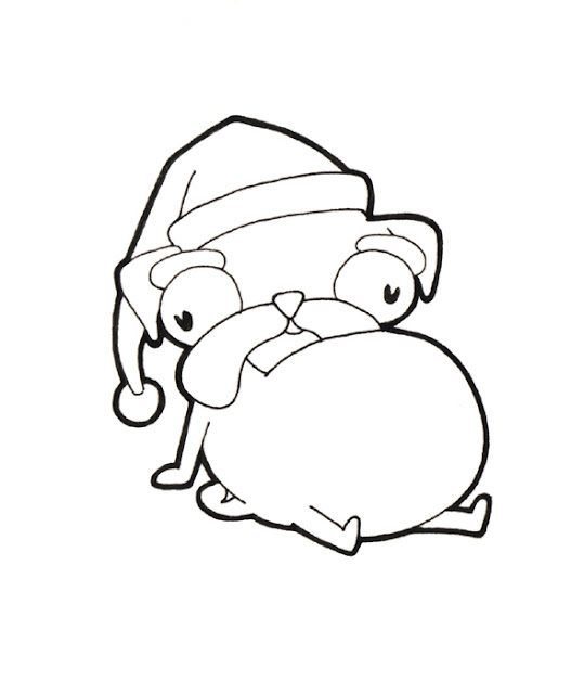
I have the good fortune of having a generous and intelligent neighbor teaching with me at R.B. Walter (I have to be kind because she brews the coffee for all us folks at the far end of the building). Mrs. Heatley has one fault, a genuine major flaw, and that is this love of pugs. I have made an ongoing joke of their lack of beauty for a few years now. Most of the jokes show up in the form of small ink and watercolor drawings that depict the odd appearance as well as strange quirks that pugs possess.

This year I am attempting to have the pugs adorn a Christmas card for her to send out. Here is a bit of the post-brainstorm clean-up process.


She settled on this design and this language. (the purple crayon is a hand tracing of my daughter Clare)


Here are some alternate phrases that I brainstormed to accompany this image:


I don't possess a shut-off mechanism.

Hey, Santa does it!

...a little help here!!!

I'm a sucker for stuffing.

I'm already a pug, what's the difference?!?

Just turn on the Lions' game already!

No, I didn't eat an ornament.

I'm even cuter now, don't ya think?

Haven't ya ever seen a bad hair day before?

There's no denying the importance of genetics.

Full?... I think not.

To a pug, "help yourself" is a dangerous statement.

I feel as though the term "disorder" is a bit extreme.