Thursday, December 26, 2013

designing characters for Terrayn

The process is well underway of designing a set of four characters for this online computer game...Terrayn. Terrayn is being developed and that process is still tough to describe in a blog format. Simply said: Amazing. The guys need me to come up with four kings/rulers, all of which are siblings. Two males and two females that will represent four different kingdoms. Without describing them in detail at this point, I thought I would just show some initial sketches. I figure if I start putting them out there for others to see, I automatically place pressure on my performance. This always seems to help. Good Stress!

This first character is the youngest and baddest. Likes to fight. I wanted him to look like he is ready to fight even though he is a ruler. Obviously likes to show off his powerful form as I kept his wears minimalist.


This next character is the one I completed this evening. The hardest part is familiarizing myself with possible clothing ideas. I am new to this kind of art. I am struggling to keep it unique and still adhere to my own preference and keep the design/materials simple. All of the google searching has me not wanting to google search. Most of the characters being developed are way out there. I am attempting to reel it all in and make these rulers seem possible. Without getting into the idea of the game (you can link to the facebook page and "like" it and learn more about it there), my thinking has these kings wearing very reserved attire. Maybe it is just my style coming through....we'll see what the powers that be think. The game is to have a family appeal....the ladies will be handled as classy as possible. Wow, some games sure sell the scantily clad stuff. I will be no part of that... never have, never will. My son reads this blog! Anywho:


If you like what you see, then head on over and Like us at 
https://www.facebook.com/TerraynOnline .

Tuesday, December 24, 2013

2013 Christmas cards for each other

Every year Ash and I exchange Christmas cards that summarize the past year or some recent past event(s) that have impacted us greatly. It is a creative way to express how we love each other and respect the others survival/coping skills. 

2013 was full of stress. Our jobs are changing drastically without changing at all (other teachers will get that). One thousand other things as well have come and gone, some choosing to stay.

Ash has been talking quite regularly about the fact that our son Matt is definitely "my boy". We have scattered brains and difficulty staying focused. My card let her know that I agree and feel for her and her situation. Her AWESOME card speaks for itself. She's a real talent. I love her.

...showing outside then inside (hope that it is obvious but just in case...)

mine:


ash:


Merry Christmas everyone. Happy New Year. Drive safely.

Thursday, December 5, 2013

local font find # 15


Saw this in Corning, NY the first time I traveled along Market Street (about 8 or 9 years ago). I remember stopping and knowing that this was an amazing sign. Simple. Stately. Strong. Straight to the point. No fluff. Fancy, yes, but NO FLUFF! It has natural weathering but you feel as though it always looked this way. We can see each brush stroke of the sign painter. I check it out every time I'm in town. To the man or woman that made this.....Thanks!

Monday, December 2, 2013

a hunting logo for co-worker

I don't hunt. The reasons are the same as most people. Plus several others. I like to walk along and maybe push some deer toward the armed folks, but generally speaking, just too much cold to tolerate for meat I don't enjoy....though deer jerky is mighty fine! I come from a family of hunters. I like to shoot weapons. My brother had a wide range of powerful hand guns as well as assualt rifles before all the laws changed. I was into sports that required me to move. Sitting around was out. I struggled with fishing when I was very young as well. As I am typing this, I feel that this logo should be displayed with ZERO color around it. I love black and white for it is a proving ground of design. If your design holds up to being viewed without color, you've got solid work. Color, to me, is just fluff (not really cause I use a pile of it but that statement sounds good and tough for this post).  I am changing the look of angrystrongo.com as of this post. Minimalistic. 

This logo was straight forward with a hint of Harley Davidson as inspiration. Just a hint! I weathered it a bit using some texture I created printing from a Styrofoam sheet. Not sure what "Hard Times" means but it didn't need to be understood to get this design. I tossed around a dozen or so lettering styles before settling on something solid looking. I kept it hand drawn because I knew it was to be weathered. I like bolts, screws and rivets (I think I mentioned this in a previous post). The flatheads give it some elements that eat up some design space above as well as allowing me to form the word "hunting" around something other than the outside edge.

Saturday, November 9, 2013

new project TERRAYN and Code Mushroom logo design

I received a call about two months ago...maybe an email...maybe a text to my wife (I don't text yet). Whatever, it was from some guy named Jason Gehman and he needed some artwork done for a game he was designing. The local grapevine told him to contact Ashley and I. I told him that I might not be the right character for this job and explained my skill set. He said that I was the right person and that we should get together and talk out his idea. Okay. I took him up on dinner at his house. Ashley and I joined his beautiful family for a wonderful meal and some great "gettin-ta-know-each-other" time. After dinner, we were met with the full force of Jason's excitement over this project. The project was this online game that he and several other computer geeks (i use this term with the utmost of respect for the level of knowledge this group possesses) were constructing. Jason told us that they could build the game but none of them could draw....thus....the dinner. Needless to say, Jason won us over. He wasn't asking for money, he was just asking for our time. The goal was to make this work without dishing out piles of everyone's cash. He explained that if we can't make this work on our wits, then it wasn't meant to be. It all sounded good and I wanted desperately to be a part of something. There were no big projects in my life and this had some quality potential. Ashley was swamped, and still is, with graduate work and other professional obligations and has only had time to critique my attempts to please the group. 
The evening of the dinner, Jason told us that the group of geeks was calling themselves Code Mushroom. Okay. My mind instantly started rolling on possibilities for a logo. I drew a pile of the standard mushroom ideas and all felt very blahhhh like the ones below....


I spent a few days on some dimensional ideas because the game was to be both above and below ground level.


I then began to think of more mathematical ideas. I took a square and began slicing it in half (upper left, below). It wasn't long before the chopping was getting me somewhere and I began to feel a connection with it. Soon, two triangles seemed to capture the feel of the mushroom. I knew that this was it. I kept sketching out lettering as well. I decided to work all the letters into the same size rectangle and to build them in photoshop to see if it would all work


Once in Photoshop, I manipulated the triangles in many ways. I knew I was close but it wasn't until I chopped the ends of the triangles that it really looked good (below). I chopped off the stem of the mushroom, the bottom triangle and it solidified the whole design with a cool shadow of negative space.
Then the lettering....it just kind of happened. Not much changing from my sketch and mental image. I did some redesign due to capitals and lowercase not looking quite right...but...this is what I presented to the squad. Jason showed it around and I was asked aboard. I am now a proud member of Code Mushroom.


Once I was brought on board, I set out to conquer the design of Terrayn. Terrayn is to be a Massive Multi player online game. It is set on this never ending, constantly evolving and growing landscape. The whole idea boggled my mind but I didn't have to build the game, just get some cool looking lettering. My initial idea, pictured below, had similar origins to the code mushroom lettering. Simple, box-shaped, modern looking letters. A mix of caps and lowers and minimalism. I wanted it to be wide and not reveal much of the game (that was easy since I knew very little of the game at that time). 


I also went with an above/below ground idea with the Terrayn logo. It wasn't long before I knew it just couldn't work for this project.


As I learned more about Terrayn, I knew that my design(s) were not going to fit. The game had taken on a feel of medieval times. Tools, weapons and structures would be from long ago. My lettering was wrong! So I scrapped it all and moved onto calligraphy and black letters. I drew countless versions of Terrayn. It was proving to be thousands of times more difficult than the code mushroom logo. Once I was getting close (the top version pictured below), it was just tweaking and tweaking and more tweaking. I drove Ashley nuts with calling her in for an opinion.


After solving the capital T in a way that proved to be interesting (not normal, but interesting), I had visions of it becoming riveted metal. I scanned in some well aged and distressed paper that I found at my job. Manipulated the look by adjusting the curves...and they liked it as well...


Below is how it looks on some fine 3-D rendering of another Code Mushroom teammate, Joel Tremblay. He was called in to help create many of the things I can't do, namely all things 3-dimensional on the computer. At this point, about three weeks ago,we all felt like we were on a roll.


The game is growing fast. Construction is only slowed by the day jobs we all work. As things come together and our web presence is ready, I'll be posting links up for all to see. The next two months are looking great for Code Mushroom. This geek has to get back to work.....later all.

Check us out on facebook.... https://www.facebook.com/TerraynOnline


Saturday, October 26, 2013

bottlerockets! what a day for matt! (and me)

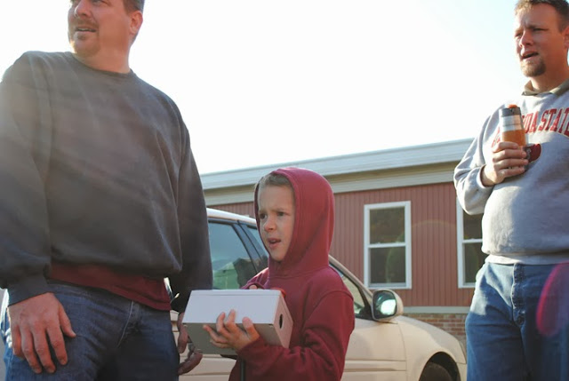
About two weeks ago, my son and I had a lock-in at the Knoxville Community Center (the old Gertrude Case Elementary School). Matt, my son, is in scouts now and they held their annual bottlerocket event. A great night of movies and games was followed up by a large breakfast and the launching of homemade bottlerockets. Being new to the whole bottlerocket thing, I slopped a few together not really sure if what I was doing was the slightest bit correct. I had briefly seen the contraption pictured below and still wasn't sure about proper design. I did my best for Matt and even spray painted them. 


Jason Gehman, the man pictured below on the far right, put about a week's worth of hours into this amazing machine. Mechanical arms clamp above the ring just under the screw-cap. Water is then pumped into the bottle. Air from a compressor is then pushed above the water creating some mighty forces that want to get out. 


After the kids count down from five, WHOOOOSHHHHH! The clamps are released and the air wants out. The best part is that the young scouts get to control the whole thing.


My first rocket failed!. Once the air pressure was applied, water shot out from the many holes created by the hot glue. A novice move indeed! Matt was a bit confused as it wouldn't take off and even more sad that his dad was inept. I was very concerned that I was about to let the boy down. The kind of let-down that he'd remember on his high school graduation day. Luckily, I had a second rocket that I only used duct tape on.


It launched about 40 to 50 ft into the air. Poor design had it curving about 30 ft off the ground (as seen above). It wasn't the best rocket there, but it worked. Some of the rockets just about left our sight. They were designed beautifully and went hundreds of feet in the air. Impressive to say the least.


After the first round of launching, Mr. Gehman turned up the air pressure substaintially. Some didn't survive. This lucky shot caught the explosion of one that wasn't so lucky. You can see the plastic shrapnel heading toward the innocent bystanders. Yikes!

It was an awesome day! AWESOME!!!!!!

Saturday, October 19, 2013

local font find #14....WOW!

My son joined Cub Scouts this year. I was able to begin attending on their second meeting. The usual meeting spot for Pack 22 is the gymnasium part of the Knoxville Community Center (formerly Gertrude Case Elementary School in Knoxville, Pa). I used the front entrance on the east side near the gym. Walked in, turned left and was in a modest basketball court with antiquated equipment all about. Upon turning to my right to find my son who had bolted ahead, I was floored by the wall! Yes, I said it, FLOORED BY THE WALL! A monstrous canvas adorned the space protected by a sturdy fence-like cage. It was awesome. Truly awesome. 


This beast spans about 30 feet wide and about 15 feet high (a rough guess).


It is a wealth of local history as well as a visual gem for those of us that love lettering as well as painters in general. The landscape below, though I believe is not a local dwelling, is a beautiful painting by itself.


I was told that this canvas might have been used as a curtain/billboard at the Knoxville grange many moons ago (that structure no longer with us). I was unable to find out info regarding the Keystone Scenic Co. and this sign. If anything is known, shoot me a message and I'll post if for all to see. I am very interested and will be on the hunt. If you're ever in Knoxville and the building is open, take a peek! WOW!

Friday, October 4, 2013

always liked this one

This photo was taken about seven years ago. A run down shop of route 6 in Mainesburg, Pa. That's about all I have to say about it.


Thursday, September 12, 2013

angry makes it onto Dynomighty's blog

Well, I sent it and they loved it. I'm not normally in the business of self-promotion (this blog excluded) but I sent a link to angrystrongo to the folks over at Dynomighty (the folks with the Tyvek wallets!). I thought my comic was an honest assessment of what I felt concerning their product.

Jamie, in customer service was way nice! Not one of those stuffy goons with no personality (even though were typing to each other) like you might get dealing with...lets say....GE or Maytag..... I believed every word. It was refreshing to say the least.

This was their initial reply to me:

Mighty Customer Service replied:
Randy... YOU'RE AWESOME!!!!!!!
Thanks so much for your support and awesome cartoon.
We'll be sharing that with our fans next week, if you don't mind.
Please let us know if that's not cool.
Thanks again and have an awesome weekend,
Be Mighty.

Jamie Paladino


they kept their word.......I love these folks!!!!!!! I am gonna be a mighty wallet person for some time! Give em a looksie!

Monday, September 2, 2013

a great find that i didn't find #2

Dan Cook, our good friend and great teacher over at Williamson High School, did it again. He can't just show up for a meal and some conversation. Nope! He brought over some more tins. Really cool ones! Here are a few...


Not sure where they will come to rest in our home....but for now they will be stacked around my computer so I have something to look at while I wait for those big files to save.


 Love the Pure Nutmeg...


COFFEE!!!!! that sure is a strange "P"


my favorite of the bunch....the whole thing is beautiful....traditional, classy
& chock-full of lettering goodness!

Thanks! Dan


Sunday, August 25, 2013

angry strongo #39 the new wallet


I normally don't write about my Angry Strongo comics but this one is rare for two reasons. First, Angry really isn't hassled throughout the entire comic. It ends well with him getting what he pays for, rare indeed!. Second, I really do love my new paper wallet! This thing is awesome. My d.i.y. blank mighty wallet by DYNOMIGHTY DESIGN was well worth the $15 (free shipping!!!). I was skeptical at first because I did think I could build one like it. After getting it, I was instantly sure I couldn't pull it off nearly as well. There's nothing worse than paying for something you could do on your own with a little bit of effort. This wasn't one of those times.

The worst thing about ordering the blank version was what to draw on it (also, DON'T MESS IT UP!!!!!). The Tyvek material doesn't bleed much when the Sharpie hits it which allowed for some stress relief. I decided that Angry should be on the wallet with him presenting his proudly. I do have to find some Sharpies with those odd colors so I can finish the coloring. 


Inside, I let my kids sign it with a small date in the corner. Clare (4 yrs old) hasn't had many reasons to write her name this summer. She'll have her lower case "a" back on track in no time!


Also, a big "thanks" to Sarah (my sister-in-law) and her boyfriend, Luke, for showing me these wallets online. BIG thanks!