Showing posts with label drawing. Show all posts

Monday, February 12, 2018

a love of all things type

Over the past few decades, my sketchbooks have slowly switched from general drawings of my surroundings and random doodles to lettering. Letter forms are inherently beautiful when done well and inherently difficult to do well. That search for making something your own and making it hold it's beauty is a challenge that drives an amazing amount of people all over the net. My nerdiness isolated me prior to the Internet. Once I made my way into the modern age, I realized that my disorder is plaguing people all over the world. 

As an elementary art teacher, I am always looking for a way to inspire my students to look closer at the world around them and creatively analyze it. The "problem solvers" are what schools should be turning out. The art room is a great place to kick start this process. 

When the first two paragraphs mesh, you get student names/initials as design. Some students were asked their interests and others I took as a straight typographic problem to solve. Some choices were based on student personality while others are reflective of my state of mind at the time. (Sophie, the first one shown, is my neice, not a student)....


Thursday, February 2, 2017

a major "thank you" to Ryan Belz...former R.B. Walter Elementary student

This past year, BMW drove an i8 supercar to R.B. Walter Elementary. One of our former students, Ryan Belz, now working for WENY as a Meteorologist and journalist, came to the school to do a story on that event. Somehow, I failed to post the video that Ryan produced that made its way onto our local nightly news.

A fine young man with loads of talent, Ryan has continued to bring his knowledge and skills back to R.B. by presenting super interesting demonstrations on science and weather in the classrooms. I know the demos are cool because my daughter has come home singing his praises. Kids will let you know how they really feel... Ryan is good!

Here is the video that he shot:


We are proud of you Ryan. Best of luck to you as your future is wide open and ready for big things. THANKS AGAIN!!!

Under Armour is Awesome! "Sneakers of the Future" project a homerun!

Two years ago, a major car company did nothing for my 4th graders as we sent in a Cars of the Future art project. I am not naming them because we can never be totally sure if it was the companies fault. Anyway, feeling a bit sorry for the lack of response that was given to my students from that company, I set out to find another way for the students to get some interaction with a major corporation. Sneakers of the Future was hopefully the answer.

I was a teen as Nike defined cool footwear and athletic marketing throughout the 80's. Their shoes were visually light years ahead of the others. Nike commercials, in my opinion, were often more exciting than the sporting events they advertised during. Under Armour has emerged as a possible new trendsetter in athletic marketing. Their logo is showing up EVERYWHERE. Students are wearing the gear, commercials all over and professional athletics have the logo showing up on jerseys across all sports.

So, last year, the 5th graders worked on a project that had them analyzing their own shoes and inventing concepts of how shoes could look and what innovations might show up on them in the future (I defined the future to be months from now up to 100 years from now). They worked mighty hard and they were sent down to Under Armour's corporate headquarters in Maryland. This shipment happened at the end the 2015-16 school year. 

Two examples:


About three months ago, I received call from Danielle Thompson, Assistant Production Line Manager - Youth Footwear, at Under Armour. A super nice young lady, Danielle said that Under Armour was very excited to see the student designs and that they wanted to do "something" to thank the students and their hard work. I, of course, was pumped. I told Danielle that my students would love "anything" that Under Armour would be willing to do. 

Most companies get some gifts in a box and send it off to us. Some get their design teams involved and we get a bit more thoughtful and interesting gifts. And only two, prior to Under Armour, have stepped outside the very cool and entered the awesome and those were BMW North America (check it out here) and Subaru (check it here).

(this next paragraph is slight speculation mixed in with many facts as I was not present with the folks at Under Armour as they went through this process) 

This year, the number of awesome responses from companies has jumped to three. Under Armour had their team of designers review the student artwork. They each picked their 5 favorite ideas presented by the students and then the top 5 of those were boiled down. The Under Armour team then decided that they would make a 3-D digital model of the finished shoe that combined those 5 elements. They then took that show and built a small commercial/thank you for the students. 

Put yourself in the shoes of my students and check out the video (really, no pun intended!!!! really!)... make it full screen....


The video brought the student work full circle. They could see their ideas in seeming real life. The students sketched, made a finished version of their ideas and Under Armour finished it off. The students were pumped.


The top five ideas were:

5. Color changing 


4. Self-fitting
3. Temperature Control


2. Storage Pouch
1. Fly/hover mode


Also, the designers at UA designed a 3D paper shoe (below) that the students could build. This probably took longer than the video to figure out! They sent some blank versions so the students could design variations of the Warrior 2055. So COOL!!!!


With some careful cutting and little bits of glue, you get a very cool paper Warrior.

I gauge awesome in this entire scenario by the response of the students. This was AWESOME! Under Armour should be proud of this team and their thoughtfulness. Creative people can change peoples lives with their time and their care.


Wednesday, December 28, 2016

a new version of tee shirt for WildFly Charters


I have been drawing nothing but lettering for the past few months. At some moments, I really feel like I am getting it. Wow, is it difficult to get it "just so". The slightest mistake is usually punching you in the face. There is no middle ground with type. It either works or fails. I am pushing myself with all kinds of tools and styles to get the right look of every project. My brother, Capt. Gregg McKee, of WildFly Charters, is tough to find gifts for. I just try to keep him in interesting variations of tee shirts for his business. 

I like the mix of type styles and the weights of it all. When I squint, which it almost constantly as I draw now, it felt right. The space is just as important as the letters. I think so much differently now about Art in general. My expectations are much higher but the focus of those expectations are in far different places and on elements like "space" and "movement" and "emphasis". When I was young, it was on realism and more realism. That is gone. That is good. Art is becoming much more fun because of it.


version #2 of hand drawn lettering always tastes better

Been super busy as of late but had time off over Christmas break. Merry Christmas to all (by the way) and hope all is going well. This idea, though silly, never seems to be far from my mind. I can't shake it. And when I can't shake it, I doodle it. The many doodles have lead to this.


I look everywhere for well-used vintage book covers. The color and level of abuse are usually the deciding factors when found. They work well for what I have visioned for the final products of certain ideas. All of the color was printed using Styrofoam sheets and then scanning in. I do not use Photoshop Actions or pre-packaged apps to get my weathering.

Happy New Year as well.

Monday, December 12, 2016

hand drawn type and web design - what a process

A few years ago, I met some fine gentlemen that were working on a game design. They needed someone to draw what was on their minds (and some stuff that wasn't). I knew, when I met them, that their talents were great and that I wanted them to appreciate my skills in their future. That intro brings me to the now. I was asked about a month ago to design a layout for a website. Calob Hess is a computer geek (geek is used here to mean super smart / ultra-talented person in his/her field) who needed some design help. I thankfully got the call. He has started a web design company but was in need of a landing page and internal experience.

Not knowing half of the terms listed in his "skills" column on his current website, I was at a loss for where to start my designing. Creating visual interest with a webdesign company usually results in photographs of the design team sitting around a fancy hipster table in a high end conference room (probably in Portland). Not that there is anything wrong with Portland, but this is north central Pennsylvania and we are not hipsters. I did not want to design something standard....predictable. 

My first thoughts were toward his logo. Good starting point since he had one already.

pics of logo and color bands

I liked the colors but it didn't strike me as something compelling or memorable enough to lead me in an artistic direction. I needed an image.

As I teach young students all day, I am constantly attempting to boil things down to the "element" level. I though about the purpose of his business. "Move other people's businesses forward." Pretty simple. Showing this is difficult but I knew I wanted a single image to get that across. I boiled the sentence down further to just "forward" and an arrow came to mind. I went outside to my garage and found some of my children's sidewalk chalk and began to draw an enormous arrow that I would photograph from a ladder leaning on my roof. As I was finishing it, I thought maybe my son would pose for a picture so it would look like he was finishing it. It was sunny....perfect weather for this shot.

orig pic of matt

The shadows were great and the sweater was interestingly simple. I made sure I was high enough on the ladder that the viewer would not see his face. 

I still wasn't sure if a kid drawing an arrow would work for a web design site so I set out to work on the word "forward" in the mean time. 

pics of forward tries

Finally, I stumbled upon a solution for the type. I overlaid it on the picture of my son and it just seemed right.

pic of matt and type

Now...how to make a whole website based on the look and feel of this image. I shot the image over to Caleb and he shot it around to some of his trusted friends. The feedback was immediate and positive. It was working for them so I ran with it.

I set out to simplify the other three pages he needed at that point and had to boil them down to a single image and single typography concept. Since the arrow was not perfect and made to look as though a young person drew it, I purposely used hand drawn type to impact the viewer first. "Seriously whimsical" were the two words I kept present in judging my designs. I wanted it to show that even when dealing with simple solutions, the business is serious about your business. I did lean toward hand drawn type because I love it, but, if it didn't fit, it was out!

Luckily, it seems to fit.

Often Design has limitations. This stinks. I like design to go as planned. Many of my wood projects have been less than my mental picture of the final project due to some of those limitations in the wood. Web design has some inherent limits that are not there in print. BOOO HISSS!

We will see how it all goes but the whole process sure is fun. Learnin' lots and lovin' the new venture.


Thursday, December 1, 2016

the Air Force 1 by Nike still rules as an impeccable design


I have always loved the look of this shoe. Nike came out with it in 1982. I was 12 (you do the math). I never owned a new original pair but bought a used pair of size 11 1/2 off of a friend (I wore a 10). They were a bit to expensive for a sixth grader. My love of their look has never faded. EVER! I have found that I am not alone with this belief/disorder. To show my love of the shoe and also my love of certain artists/illustrators, I set out to draw a serious doodled right shoe that drops in hints of illustrators that have influenced me.


Many of the marks are just whimsical ideas that happened as chance. As illustrators, cartoonists, or artists jumped into my head, I carved out a place to fit 'em in.


My owl from a graduate school poster project.


The whale squashed into the darkened sole was just a drawing of a whale. No influences. Just thought it would fit in the space.


Sorry about the image quality. Hope it doesn't detract from the time spent drawing this up. Sure was fun to stare at an Air Force 1 for hours at a time.

Sharpie on thick railroad board.

Sunday, July 24, 2016

one can loose one's self in lettering


It was designed for a personal tee shirt. It sure is a beautifully frustrating hobby....letters! It is like drawing a face, it either works or it stinks. You can tweak it and tweak it and tweak it. It never seems done. It never really feels perfect.

Sunday, February 14, 2016

my good friend jonathan miller attempts yet another feat of strength

My wife was asked to draw a cartoon of my friend Jonathan Miller to celebrate an upcoming milestone. In our research for the comic, we have had to watch this video many times. Jonathan's sense of humor as he endures the effects of his stroke is truly remarkable. Give this thing a view and see how you might be handling the tougher things in your life. I know I need to keep things in much better perspective....thanks Jonathan!


Tuesday, February 9, 2016

a new book cover project


A few months ago I was approached to do some artwork for a local woman, Cheryl Edgcomb. Mrs. Edgcomb has lead an amazing life around Tioga county and it seems that she was continuously surrounded by stamps and the people that used and loved them. Coming from a family that worked for the U.S. Postal Service, she has not fallen far from the tree. Her personality and kindness make her one of those people you struggle to say "no" to. After a short conversation, I found myself neck-deep in beautiful examples of historical documents from the area, vintage postal ephemera, and all sorts of interesting objects and envelopes that were hard to put down. 


Mrs. Edgcomb was in the process of writing a book about the people she has met and the amazing tales that her travels found her a part of. She needed a book cover. Though not sure of what we could do for a cover, I was honored to attempt to make something concise out of all the mayhem. She had her title and tagline and the rest was on me. I brainstormed quite a bit. Her story lacked an isolated image that could stand as a cover image. I thought about creating some unique text but that seemed a bit vain on my part for this kind of story. As she started getting her collection out of the many boxes around my dining room table, the pile of stuff looked cool. I said that these things say it all. Like the countless stories, each of the thousands of items are a part of her and her history. I assume that all that know her, and that seems like every resident within 150 miles, would agree that the cluster of objects fits with her spirit....a myriad of stories that all lead into each other. For the cover photo, she picked out the items that were tied to a story within the text and other items that were close to her heart. 

She has a passion for life. An obvious one. She liked the idea as well as the final image. I used Styrofoam to ink some letters for the "stamped" look. Scanned them in and did some manipulation and color overlay. I hand drew the tagline that was inspired by her own handwriting. That's that.

Anxious to see the final book! She has put a pile of work into the project.

Monday, February 8, 2016

large pencil rendering of wellsboro, pa - 3' x 9'


While attempting to locate a much smaller piece of artwork, I bumped into this rolled up drawing in the corner of the closet. It is a large pencil drawing of downtown Wellsboro. Wellsboro, Pa. has a beautiful downtown/business district. Traditional gas lights run the length of town in the median. If you are heading to the Pennsylvania Grand Canyon any time soon, stop in town and walk the 4 or 5 blocks. Anyway, I was teaching one point perspective to my 5th grade classes about 4 years ago. To get the point across, and also to show what some hard work can produce, I chose the scenic downtown as my subject due to the interesting depth created by the many buildings and the trees. 


I walked (jaywalked) across the street, stood in the middle, snapped three side-by-side shots and continued on to the other side. After combining the images in Photoshop and tacking up some rolled paper on a large bulletin board, I set into the drawing. After about 30 hours spent on the work, I had achieved my point which was to inspire the youngsters into pushing hard on their own work. 


I do have a few regrets though. Mostly, I regret not using a quality piece of drawing paper so that the drawing may have some value (not monetary) to maybe a business in Wellsboro. I guess it would not have been as sketchy if I used good paper and would have doubled my hours just to reach this unfinished stage. I would definitely finish it if it were on better paper, for sure. The tape on the back doesn't bother me due to the lousy rolled paper used. Oh....drawing trees without leaves takes many more hours than some made up leaf formations. More building visible though!


Vanishing point had a red sticker placed on it (light spot back there where the street disappears) to help the passersby while it was under construction.

Tuesday, January 26, 2016

new angry strongo fan art - from my wife

My wife is a very talented lady. I'm sure that she is not sure how talented she is. This version of Angry Strongo (below), as my birthday card, highlights her skills. It looks better than all my other cartoons. Her sketch hand-coloring is so rich and vibrant that I am considering changing the entire presentation of my comics. We are definitely looking into using this style soon in some other ventures.

thanks Ash....


Thursday, January 7, 2016

forkzilla - another exercise in brainstorming

While on "lunch duty" at my teaching job (we walk between tables and make sure the students are behaving and all), a young 6th grade girl called me over with a terrific smile on her face. She had a look as though there was something awesome to tell me. The awesome news was her fork. Yes!, her fork. It was gigantic and super heavy as well. She thought it was so extraordinary, she had to let someone know about it and felt that my being the bizarre Art Teacher, I was the perfect recipient of this great find. We all laughed as we looked at this abnormally large fork. It was almost a serving fork. I asked a student on the other side of the table if we could see her fork. I took this regular sized fork and placed it next to the enormous one and WOW!!! It really was big. Anywho, we all laughed (not sure why) and I left my "duty" to go back and teach for the afternoon. It was most strange that I couldn't shake the large spoon and the general sillyness of the whole event. How did that spoon get into the school? Why did this young lady feel the need to show an adult? Why was it funny? Why can't I stop thinking about this odd silverware anomoly?

So...I used the event to show her class how I brainstorm and idea to relative completion. The result was FORKZILLA and the R.B. Lunch Disaster! I will use this as an example for an upcoming Comic Book Cover lesson I teach at that grade level.


Monday, December 28, 2015

angry strongo and the new look-a-like!!!!


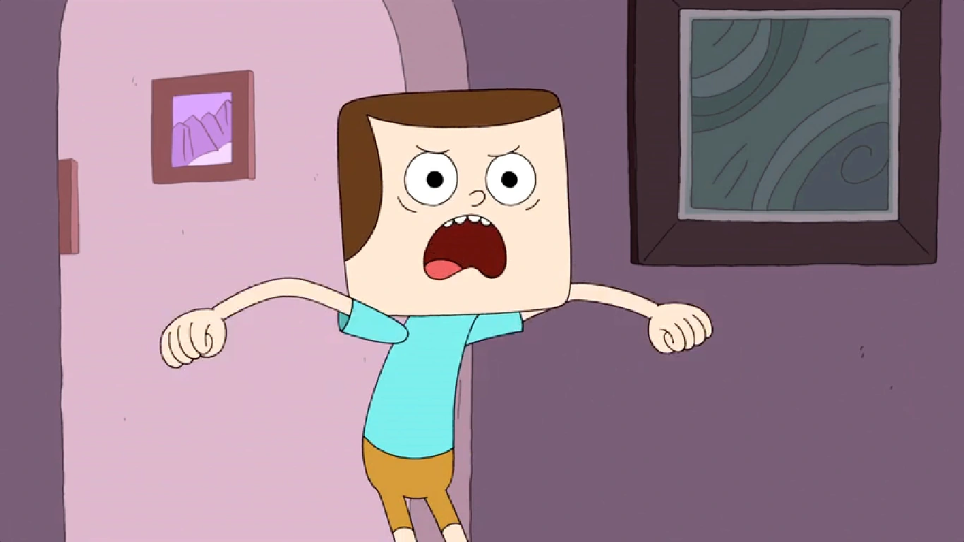
I have been enjoying this new Cartoon Network show called Clarence. A very strange cartoon about an even stranger young kid named Clarence. He has all kinds of odd habits and hangs with the other bizarre students in his class. You really have to watch a few episodes to get the full picture. 

The more I watch it, the more I am reminded of my Angry Strongo design and the similarity to Clarence's friend Jeff (Clarence and Jeff are pictured above). Jeff's design is an over-sized block head with a sweep of hair across the forehead and a large semicircle down the sides. Angry has a slightly different sweep that resembles a large wave that follows his always scowling uni-brow.


Not that anyone that reads this blog gives a hoot about whether I copied off this cartoon or not, but the reason for this post is the sense that any one reader might think that is the case. I am also not saying that I believe that the creators of Clarence copied my design but there sure are some weird similarities. What we have here, more than likely, is a very close case of independent invention...I hope.

April 14, 2014 was the premiere date for the show. This has Angry Strongo being designed some 2 and a half years prior. I first started showing designs for my new "Angry" character in 2011. With the first post showing the current look of Angry Strongo appearing in October 31, 2011 (shown above). I had a version of Angry even earlier than this but the one below shows the first time I clothed him in the striped shirt that was later colored red to pay my respects to "Calvin" from Calvin and Hobbes.


As I researched the similarities further, I was struck by the layout of the room pictured below. Now I know many homes have large framed images on the wall and rounded doorways that were all the rage back in the day, but when you look at it all together, it just seems strange. 


My Angry Strongo layout pictured above was from January of 2013 (again, Clarence didn't air until April of 2014).

Anywho, I am not attempting to show any type of copying on the part of the creators of Clarence. I was just struck by the design similarities. I talk with my students about independent invention in my classroom. It happens quite often. When I give them a design problem to solve, a student sitting on the opposite side of the room often solves the problem in a remarkably similar way to someone else located far away. 

Check out this cartoon....it is very funny (my sense of humor is in line with this cartoon). Good day.

All the images used of Clarence and Jeff were copied and pasted off the net. My apologies and thanks to those who uploaded them.


Wednesday, December 23, 2015

angry strongo #45


It has been quite a while since Angry Strongo has appeared on a blog named after him. Our lives have been hectic with children, our jobs and artwork on the side. This winter has allowed me to work outside in the garage in the evening as the temps have been awesome. I was even able to hang lights without a jacket, gloves and a winter cap!

Monday, November 9, 2015

tee shirt design for beavertail skiffs

There is this top shelf boat manufacturer in Florida that goes by Beavertail Skiffs. My brother Capt. Gregg McKee has a great relationship with the owners and must have dropped my name as someone who could design a tee shirt for their inaugural owner's fishing tournament. As usual, research was followed by sketching and more research. In the end, i had little to go on since it was their first event. Sometimes, that's mighty good. 


I chose to mock up a vintage trophy look and etch the designs into the solid color. I knew they would be using a light blue tee and went with a bold blast of darkness against the light ribbon with dark lettering. I was unsure if they were going to apply corporate logos around the sides and bottom so I attempted to keep it more vertical. I may have moved the date and location to the east and west if I would have known sooner.


I lifted this picture of someone wearing the tee during the tourney from Beavertail's facebook page. My brother may have taken it, not sure. Anyone looking for a great flats fishing boat....check 'em out! My brother owns one and it is awesome!


Thanks Beavertail.....for the opportunity and the TEE!....love it.

Tuesday, May 26, 2015

intro to graphic design project


The project was based on the Pennsylvania German/Pennsylvania Dutch Folk Art known as Frakturs....Originating a few centuries ago, they were often family related and very personal pieces made by relatively untrained artists in a simple graphic style. I based mine on teaching at the University level for the first time. The transition was not easy. Sorry that the above image is blurry, but I did not really have the time to scan it in as two halves and try to piece them together. The below images were scanned in. As a Fraktur, the entire composition seems to work well but the intense design flourish within the squirrels was too much...way too much. I would definitely leave the squirrels grey if done again. I left the swirls in as a teachable moment for my students. I did not get around to redoing the project, but there didn't seem to be a point in taking that time. It began as a demonstration of how to handle the project and I guess it will stay that way. Showing students imperfections is just as important as showing them excellence (and NO, this is not just an excuse to go lazy on a possible redo). Students should be able to recognize the flaws in their own work with the same ease as they see it in others. I think if I was considering hanging a finished product in the house, the redo would have been produced with simplified squirrels.


I really liked the sweaters (they were supposed to represent my children) and the type. I regularly and affectionately refer to my children as "squirrel boy" and "squirrel girl".


I did some straight forward aging with watercolor and attempted to keep the spacing and the design simplified. I did not try and over-draw anything. The overlapping of objects was purposely minimized and the parts really remain as individual parts.