Monday, December 28, 2015

angry strongo and the new look-a-like!!!!


I have been enjoying this new Cartoon Network show called Clarence. A very strange cartoon about an even stranger young kid named Clarence. He has all kinds of odd habits and hangs with the other bizarre students in his class. You really have to watch a few episodes to get the full picture. 

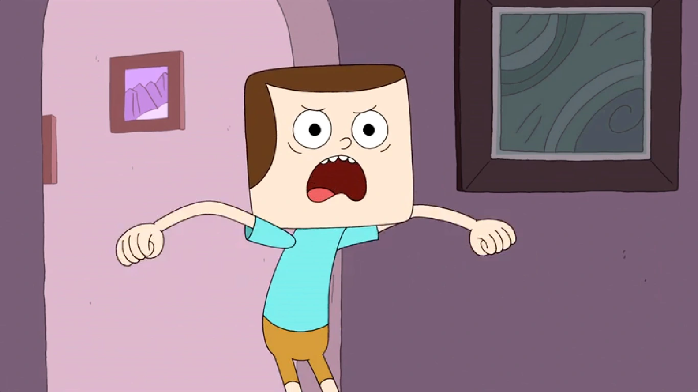
The more I watch it, the more I am reminded of my Angry Strongo design and the similarity to Clarence's friend Jeff (Clarence and Jeff are pictured above). Jeff's design is an over-sized block head with a sweep of hair across the forehead and a large semicircle down the sides. Angry has a slightly different sweep that resembles a large wave that follows his always scowling uni-brow.


Not that anyone that reads this blog gives a hoot about whether I copied off this cartoon or not, but the reason for this post is the sense that any one reader might think that is the case. I am also not saying that I believe that the creators of Clarence copied my design but there sure are some weird similarities. What we have here, more than likely, is a very close case of independent invention...I hope.

April 14, 2014 was the premiere date for the show. This has Angry Strongo being designed some 2 and a half years prior. I first started showing designs for my new "Angry" character in 2011. With the first post showing the current look of Angry Strongo appearing in October 31, 2011 (shown above). I had a version of Angry even earlier than this but the one below shows the first time I clothed him in the striped shirt that was later colored red to pay my respects to "Calvin" from Calvin and Hobbes.


As I researched the similarities further, I was struck by the layout of the room pictured below. Now I know many homes have large framed images on the wall and rounded doorways that were all the rage back in the day, but when you look at it all together, it just seems strange. 


My Angry Strongo layout pictured above was from January of 2013 (again, Clarence didn't air until April of 2014).

Anywho, I am not attempting to show any type of copying on the part of the creators of Clarence. I was just struck by the design similarities. I talk with my students about independent invention in my classroom. It happens quite often. When I give them a design problem to solve, a student sitting on the opposite side of the room often solves the problem in a remarkably similar way to someone else located far away. 

Check out this cartoon....it is very funny (my sense of humor is in line with this cartoon). Good day.

All the images used of Clarence and Jeff were copied and pasted off the net. My apologies and thanks to those who uploaded them.


Thursday, December 24, 2015

the history of fonts on stools for my classroom

About 3 or 4 years ago, my Principal, Mr. Smith, allowed me to order new metal stools to replace wooden ones that had become splinter hazards for my students. The new ones were perfect for the size of my students and my table height. The new metal stools had one flaw, a Masonite top that couldn't withstand the long term abuse that would be occurring in an elementary art room. I ran through many ideas to cover the tops. All seemed cool and I believed that the students would like the ideas. The only issue was that a majority of my ideas were way too involved and it would have taken me a year or two of design and application to conquer the project.


My love of letters seemed to fit just right. I thought about using my favorite fonts. I thought about listing the fonts and having each one drawn in its own font. Then, the simple concept of going through the 26 letters of the alphabet worked best for an Elementary art room.


I spent many hours searching the history of fonts and the important designs/designers of the last 500 years in the world of typography. I saw many lists by many of the respected minds in the font community. The fonts that continuously showed up on these lists were automatic picks. Fonts like Garamond, Baskerville, Bodoni, etc. were obvious choices. Helvetica, with its surge in popularity (surge in disgust as well) over the last few decades, was always going to be my A. Helvetica is not my favorite, but thought the students should be aware of how prevalent it is in the design world. I do love its lower case A with that bent drop of water as its bowl. 


30 Typography Stools


A Helvetica
B Copperplate
C Garamond
D Baskerville
E Rockwell
F Century
G Bodoni
H Franklin Gothic
I Times New Roman
J Claredon
K Broadway
L Sentinel
M Futura
N Gill Sans
O News Gothic
P Bembo
Q Akzidenz-Grotesk
R mine... (this does not mean that believe that I am the least bit important in the history of Typography because I AM NOT the slightest bit important in the history of Typography)
S Gotham
T Univers
U Officina
V Caslon
W Didot
X Interstate
Y American Typewritier
Z Metro


+4
Italic (Poster Bodoni)
House Industries Ampersand
Numbers
A blank one for students who choose not treat them well (not pictured)


I had some gold spray paint at home so I went to work on that Helvetica A. I made a circular mask to shield the gray metal ring at the top during spraying. My want for the letters to be exact had me tracing out enlarged letters via the computer... large enough to be seen well and still leave room for additional information. The Helvetica "a" is already taking a beating.


The thought of having all the stools gold sounded horrible, so off to Walmart and a myriad of spray cans were purchased. I used masking type and an Exacto knife to create masks for many of the letters while some were hand painted to achieve a variety of colors.


Upper and lower case was always considered to add interest as many lower case letters have unique styling. Also, I wanted to shift it around a bit just to keep it interesting.


Certain letters were treated to an interesting background. No real rhyme or reason to my choices on that. Just kept it kid friendly.


I designed this R for a project I was teaching at a local university. It was definitely inspired by the impressive House Industries ampersand pictured below.


The camo Z took the longest as I masked off each layer of green.


House Industries has been a frequent stop on my daily net surfing for many years now. Their designs are top notch and will be the kinds of designs that shall remain relevant for many decades to come. Their ampersand is way cool. You can even buy it cast in aluminum or iron!.


I threw in the Earnhardt "three" for some of my Nascar loving students and the 007 seven popped into my head at the last minute. Willie Stargell's 8 was for me. The rest of the numbers were just well constructed numbers I liked.

I have told my students that all the items in the room that I have designed, I have designed them for myself as well. I have to look at this stuff all day. The form is important but they must function as teaching devices. When these designs lose their cool, I head back to the drawing board and revamp them. I definitely had my taste in mind when designing a lot of these stools. Letters and lettering never seem to dull. I do love them.  

-Merry Christmas

Wednesday, December 23, 2015

angry strongo #45


It has been quite a while since Angry Strongo has appeared on a blog named after him. Our lives have been hectic with children, our jobs and artwork on the side. This winter has allowed me to work outside in the garage in the evening as the temps have been awesome. I was even able to hang lights without a jacket, gloves and a winter cap!

Thursday, December 10, 2015

another barn wood buffalo bills sign

A few weeks after I posted a Buffalo Bills sign designed for a family that has been so good to ours, I was contacted shortly after posting it to see if that sign was for sale. It was a teacher out of Rochester, NY, who was interested in the sign and if she could not have that one, would I build one. I told this very nice lady that I would check my supply of barn boards and give her a quote if I had the material. I had the material. Once we agreed on a price, I got to work.

I have probably typed this before, but I am always amazed how awesome weathered and aged wood looks. It is an honor to upcycle these barn boards that experienced/survived countless sunny days and winter storms to get to them to their current glory. I do my best not to waste any pieces but must make artistic choices when considering where to cut as the knots and blemishes add to the appeal. This does result in some fine pieces becoming too small to fit into any design ideas I currently have in mind. 


The dimensional set up really shows off the boards. This design has zero relief carving. It was purposely simple in order to make the wood the center of attention once the viewer has mentally travelled past the fact that they are looking at the Buffalo Bills logo made out of wood. 


It is always my hope (I guess the hope of anyone who makes stuff and sells it to others) that those individuals that buy what I make continue to enjoy it long after that initial newness wears off. 


44" wide x 30" high