My family and I went to support the Girl's High School basketball team the other night at our local University. A district game that they ended up losing and I will not discuss the inability to officiate the game by those who are supposed to be able to do so. Not only did I see four different fonts used to say the word "Mansfield" within the gymnasium, I saw this gem of a painted sign that hangs over the entrance. You only get to experience the full glory of these typographic mistakes once you are seated and able to really let it sink in.
The word "Country" was on the right side of the clock. Nowhere, could I find, any reason for the stem of the M to drop below the baseline. The awkwardness of that letter kept me peaking up from the court in between lousy calls... oops!, I commented. Then, the stencil or projector must have shifted during tracing as the curved leg of the R got crushed. The R is just plain bad on a whole lotta levels!
The outline of the word (white stroke around the black letters) is just TOO big. It creates this blast of white in the E's that is way too intense and teenie tiny slivers in the M, A, E's and R that bother me almost as much.
Other than that, it's pretty good.
Showing posts with label graphic design. Show all posts
Friday, March 2, 2018
Friday, February 16, 2018
even while absorbing the intense athletics of the olympics, great typography takes my eye and thoughts away from the action
Click on the TV. Straight to the Olympics. NBC stinks, by the way, at showing this incredible athletic event. I get way more talk from non-athletes than staight up competition (this whole gripe is for an angry strongo comic on another occassion). Ski Jumping!!! Cool!!! Don't know a single athlete. Don't care! It's the Olympics! It's all about the flag on the outfit. Very exciting. Then.... the mustache. This talented jumper has an old school almost handlebar that is mighty cool. He jumps amazing. Slides over to the camera, and as usual, pops the skis off and gets them into the TV screen as soon as possible.
THEN.... The ski comes into view. It's beautiful. Clean. Gridded. Helvetica. Very Swiss. Even as I type this out and the image is before me, I keep glancing up and checking it out. Great spacing. Fits snuggly but breathes well. I would hang the ski in my house like any other piece of cool design that I may find. You can check out the skis and the typography used a bit closer at the Slatnar site here.
GO USA!!!!
THEN.... The ski comes into view. It's beautiful. Clean. Gridded. Helvetica. Very Swiss. Even as I type this out and the image is before me, I keep glancing up and checking it out. Great spacing. Fits snuggly but breathes well. I would hang the ski in my house like any other piece of cool design that I may find. You can check out the skis and the typography used a bit closer at the Slatnar site here.
GO USA!!!!
Wednesday, December 28, 2016
a new version of tee shirt for WildFly Charters
I have been drawing nothing but lettering for the past few months. At some moments, I really feel like I am getting it. Wow, is it difficult to get it "just so". The slightest mistake is usually punching you in the face. There is no middle ground with type. It either works or fails. I am pushing myself with all kinds of tools and styles to get the right look of every project. My brother, Capt. Gregg McKee, of WildFly Charters, is tough to find gifts for. I just try to keep him in interesting variations of tee shirts for his business.
I like the mix of type styles and the weights of it all. When I squint, which it almost constantly as I draw now, it felt right. The space is just as important as the letters. I think so much differently now about Art in general. My expectations are much higher but the focus of those expectations are in far different places and on elements like "space" and "movement" and "emphasis". When I was young, it was on realism and more realism. That is gone. That is good. Art is becoming much more fun because of it.
version #2 of hand drawn lettering always tastes better
Been super busy as of late but had time off over Christmas break. Merry Christmas to all (by the way) and hope all is going well. This idea, though silly, never seems to be far from my mind. I can't shake it. And when I can't shake it, I doodle it. The many doodles have lead to this.
I look everywhere for well-used vintage book covers. The color and level of abuse are usually the deciding factors when found. They work well for what I have visioned for the final products of certain ideas. All of the color was printed using Styrofoam sheets and then scanning in. I do not use Photoshop Actions or pre-packaged apps to get my weathering.
Happy New Year as well.
I look everywhere for well-used vintage book covers. The color and level of abuse are usually the deciding factors when found. They work well for what I have visioned for the final products of certain ideas. All of the color was printed using Styrofoam sheets and then scanning in. I do not use Photoshop Actions or pre-packaged apps to get my weathering.
Happy New Year as well.
Monday, December 12, 2016
hand drawn type and web design - what a process
A few years ago, I met some fine gentlemen that were working on a game design. They needed someone to draw what was on their minds (and some stuff that wasn't). I knew, when I met them, that their talents were great and that I wanted them to appreciate my skills in their future. That intro brings me to the now. I was asked about a month ago to design a layout for a website. Calob Hess is a computer geek (geek is used here to mean super smart / ultra-talented person in his/her field) who needed some design help. I thankfully got the call. He has started a web design company but was in need of a landing page and internal experience.
Not knowing half of the terms listed in his "skills" column on his current website, I was at a loss for where to start my designing. Creating visual interest with a webdesign company usually results in photographs of the design team sitting around a fancy hipster table in a high end conference room (probably in Portland). Not that there is anything wrong with Portland, but this is north central Pennsylvania and we are not hipsters. I did not want to design something standard....predictable.
My first thoughts were toward his logo. Good starting point since he had one already.
pics of logo and color bands
I liked the colors but it didn't strike me as something compelling or memorable enough to lead me in an artistic direction. I needed an image.
As I teach young students all day, I am constantly attempting to boil things down to the "element" level. I though about the purpose of his business. "Move other people's businesses forward." Pretty simple. Showing this is difficult but I knew I wanted a single image to get that across. I boiled the sentence down further to just "forward" and an arrow came to mind. I went outside to my garage and found some of my children's sidewalk chalk and began to draw an enormous arrow that I would photograph from a ladder leaning on my roof. As I was finishing it, I thought maybe my son would pose for a picture so it would look like he was finishing it. It was sunny....perfect weather for this shot.
orig pic of matt
The shadows were great and the sweater was interestingly simple. I made sure I was high enough on the ladder that the viewer would not see his face.
I still wasn't sure if a kid drawing an arrow would work for a web design site so I set out to work on the word "forward" in the mean time.
pics of forward tries
Finally, I stumbled upon a solution for the type. I overlaid it on the picture of my son and it just seemed right.
pic of matt and type
Now...how to make a whole website based on the look and feel of this image. I shot the image over to Caleb and he shot it around to some of his trusted friends. The feedback was immediate and positive. It was working for them so I ran with it.
I set out to simplify the other three pages he needed at that point and had to boil them down to a single image and single typography concept. Since the arrow was not perfect and made to look as though a young person drew it, I purposely used hand drawn type to impact the viewer first. "Seriously whimsical" were the two words I kept present in judging my designs. I wanted it to show that even when dealing with simple solutions, the business is serious about your business. I did lean toward hand drawn type because I love it, but, if it didn't fit, it was out!
Luckily, it seems to fit.
Often Design has limitations. This stinks. I like design to go as planned. Many of my wood projects have been less than my mental picture of the final project due to some of those limitations in the wood. Web design has some inherent limits that are not there in print. BOOO HISSS!
We will see how it all goes but the whole process sure is fun. Learnin' lots and lovin' the new venture.
Not knowing half of the terms listed in his "skills" column on his current website, I was at a loss for where to start my designing. Creating visual interest with a webdesign company usually results in photographs of the design team sitting around a fancy hipster table in a high end conference room (probably in Portland). Not that there is anything wrong with Portland, but this is north central Pennsylvania and we are not hipsters. I did not want to design something standard....predictable.
My first thoughts were toward his logo. Good starting point since he had one already.
pics of logo and color bands
I liked the colors but it didn't strike me as something compelling or memorable enough to lead me in an artistic direction. I needed an image.
As I teach young students all day, I am constantly attempting to boil things down to the "element" level. I though about the purpose of his business. "Move other people's businesses forward." Pretty simple. Showing this is difficult but I knew I wanted a single image to get that across. I boiled the sentence down further to just "forward" and an arrow came to mind. I went outside to my garage and found some of my children's sidewalk chalk and began to draw an enormous arrow that I would photograph from a ladder leaning on my roof. As I was finishing it, I thought maybe my son would pose for a picture so it would look like he was finishing it. It was sunny....perfect weather for this shot.
orig pic of matt
The shadows were great and the sweater was interestingly simple. I made sure I was high enough on the ladder that the viewer would not see his face.
I still wasn't sure if a kid drawing an arrow would work for a web design site so I set out to work on the word "forward" in the mean time.
pics of forward tries
Finally, I stumbled upon a solution for the type. I overlaid it on the picture of my son and it just seemed right.
pic of matt and type
Now...how to make a whole website based on the look and feel of this image. I shot the image over to Caleb and he shot it around to some of his trusted friends. The feedback was immediate and positive. It was working for them so I ran with it.
I set out to simplify the other three pages he needed at that point and had to boil them down to a single image and single typography concept. Since the arrow was not perfect and made to look as though a young person drew it, I purposely used hand drawn type to impact the viewer first. "Seriously whimsical" were the two words I kept present in judging my designs. I wanted it to show that even when dealing with simple solutions, the business is serious about your business. I did lean toward hand drawn type because I love it, but, if it didn't fit, it was out!
Luckily, it seems to fit.
Often Design has limitations. This stinks. I like design to go as planned. Many of my wood projects have been less than my mental picture of the final project due to some of those limitations in the wood. Web design has some inherent limits that are not there in print. BOOO HISSS!
We will see how it all goes but the whole process sure is fun. Learnin' lots and lovin' the new venture.
Thursday, December 1, 2016
the Air Force 1 by Nike still rules as an impeccable design
I have always loved the look of this shoe. Nike came out with it in 1982. I was 12 (you do the math). I never owned a new original pair but bought a used pair of size 11 1/2 off of a friend (I wore a 10). They were a bit to expensive for a sixth grader. My love of their look has never faded. EVER! I have found that I am not alone with this belief/disorder. To show my love of the shoe and also my love of certain artists/illustrators, I set out to draw a serious doodled right shoe that drops in hints of illustrators that have influenced me.
Many of the marks are just whimsical ideas that happened as chance. As illustrators, cartoonists, or artists jumped into my head, I carved out a place to fit 'em in.
My owl from a graduate school poster project.
The whale squashed into the darkened sole was just a drawing of a whale. No influences. Just thought it would fit in the space.
Sorry about the image quality. Hope it doesn't detract from the time spent drawing this up. Sure was fun to stare at an Air Force 1 for hours at a time.
Sharpie on thick railroad board.
Friday, August 12, 2016
vintage pull down U.S. map (40" x 48")
Rarely do I find things that command my attention. And once I do, they seem to sit in my brain and pop into my thoughts with regularity...even when they are not in sight. One such item is this map we had framed for our bedroom. It is one map from a pull down set you may remember from school. It is a vintage one from the 1950's/60's. I have given some of the other parts away and can't locate the date or find a similar one on the net. I kept this map and the North American section. The rest of the world has changed names so much that I didn't want my children learning some wrong answers for future questions.
The colors are a thousand times better than any other map I have ever seen. You mix the colors with this amazing typography (pictured below) and you get visual perfection. This former teaching tool is what I consider to be way more powerful an example of good design than a majority of the countless pieces of artwork that I have come in contact with in the last few decades.
The shadowed mountains (below) are mighty cool as well.
The greens and blues work so well together. Each small section of this map is just spectacular.
Love the different fonts used as well as how they kerned (spaced) the letters to create weight differences to the viewer.
The number are cool as well!
My favorite section of the map is this mountainous part of Mexico as it meets with the large font. The orange of the map is striking (orange is my favorite color by the way). Everything great about this design comes together hear.
We had it framed by a kind and interesting man, Marwin Cummings, from the Lawrenceville area. I helped him mount it and it turned out way better than I had hoped for. It will be the focal point of our bedroom walls. Thanks, Mr. Cummings! Fantastic!!!!!
Why any map maker would avoid using such rich colors is puzzling. Enjoy!
Sunday, July 24, 2016
one can loose one's self in lettering
It was designed for a personal tee shirt. It sure is a beautifully frustrating hobby....letters! It is like drawing a face, it either works or it stinks. You can tweak it and tweak it and tweak it. It never seems done. It never really feels perfect.
Sunday, March 20, 2016
local font find # 27
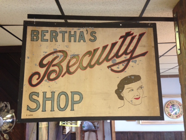
My daughter went to Mansfield to get her long hair chopped down to just below her ears. She was very excited so it called for the whole family to attend. My daughter sat in the high chair. My son and I sat down in an adjacent space. I began to sketch. He began to read some Calvin and Hobbes. I looked up and saw a terrific bit of hand painted script.
The pencil lines are still visible. The imperfections are obvious. The drawing skill level apparent as we look at the face. It all seems to point to the popular handy work of someone who learned typography at home through a mail order system many moons ago. They learned very well indeed! Regardless of the light blue type, "Beauty" is awesome! I am drawn toward the great finish to the "y" and the capital "B" beams with pride. This, if I had the good fortune of owning it, would proudly stand on a wall of my home...a high traffic wall of my humble home.
Saturday, March 19, 2016
great artwork you don't see in art history textbooks #4
The work of Ernesto Garcia Cabral (El Chango) is odd. Many of his graphic designs are very comic and purposely over the top. Some, like the one above and below, are so refined, so intriguing and so full of great decisions that I find myself drawn to them way more than 90% of the work found in the Art History books of my past education. The composition has great positive and negative space. Great balance is achieved in a heavy handed rule of thirds layout. Complementary colors. The lines that define the woman's elongated form are nothing less than timeless. We are made aware of the wind direction which tightens up her lines. Her snake-like bend is dissected by harsh diagonals created by her belongings and her arms. These objects push your eyes left and right making her feel even more snake-like. This is one of the most beautiful pieces of graphic design that I have ever seen. Period!
Posters should be more easily obtained!!!!!

Yet another dynamic composition. Also great positive and negative space. The arm position is terrific. What a talented man.
Tuesday, February 9, 2016
a new book cover project
A few months ago I was approached to do some artwork for a local woman, Cheryl Edgcomb. Mrs. Edgcomb has lead an amazing life around Tioga county and it seems that she was continuously surrounded by stamps and the people that used and loved them. Coming from a family that worked for the U.S. Postal Service, she has not fallen far from the tree. Her personality and kindness make her one of those people you struggle to say "no" to. After a short conversation, I found myself neck-deep in beautiful examples of historical documents from the area, vintage postal ephemera, and all sorts of interesting objects and envelopes that were hard to put down.
Mrs. Edgcomb was in the process of writing a book about the people she has met and the amazing tales that her travels found her a part of. She needed a book cover. Though not sure of what we could do for a cover, I was honored to attempt to make something concise out of all the mayhem. She had her title and tagline and the rest was on me. I brainstormed quite a bit. Her story lacked an isolated image that could stand as a cover image. I thought about creating some unique text but that seemed a bit vain on my part for this kind of story. As she started getting her collection out of the many boxes around my dining room table, the pile of stuff looked cool. I said that these things say it all. Like the countless stories, each of the thousands of items are a part of her and her history. I assume that all that know her, and that seems like every resident within 150 miles, would agree that the cluster of objects fits with her spirit....a myriad of stories that all lead into each other. For the cover photo, she picked out the items that were tied to a story within the text and other items that were close to her heart.
She has a passion for life. An obvious one. She liked the idea as well as the final image. I used Styrofoam to ink some letters for the "stamped" look. Scanned them in and did some manipulation and color overlay. I hand drew the tagline that was inspired by her own handwriting. That's that.
Anxious to see the final book! She has put a pile of work into the project.
Thursday, December 24, 2015
the history of fonts on stools for my classroom
About 3 or 4 years ago, my Principal,
Mr. Smith, allowed me to order new metal stools to replace wooden
ones that had become splinter hazards for my students. The new ones were
perfect for the size of my students and my table height. The new metal stools had one flaw,
a Masonite top that couldn't withstand the long term abuse that would
be occurring in an elementary art room. I ran through many ideas to
cover the tops. All seemed cool and I believed that the students
would like the ideas. The only issue was that a majority of my ideas
were way too involved and it would have taken me a year or two of
design and application to conquer the project.
My love of letters seemed to fit just right. I thought about using my favorite fonts. I thought about listing the fonts and having each one drawn in its own font. Then, the simple concept of going through the 26 letters of the alphabet worked best for an Elementary art room.
I spent many hours searching the history of fonts and the important designs/designers of the last 500 years in the world of typography. I saw many lists by many of the respected minds in the font community. The fonts that continuously showed up on these lists were automatic picks. Fonts like Garamond, Baskerville, Bodoni, etc. were obvious choices. Helvetica, with its surge in popularity (surge in disgust as well) over the last few decades, was always going to be my A. Helvetica is not my favorite, but thought the students should be aware of how prevalent it is in the design world. I do love its lower case A with that bent drop of water as its bowl.
30 Typography Stools
A Helvetica
B Copperplate
C Garamond
D Baskerville
E Rockwell
F Century
G Bodoni
H Franklin Gothic
I Times New Roman
J Claredon
K Broadway
L Sentinel
M Futura
N Gill Sans
O News Gothic
P Bembo
Q Akzidenz-Grotesk
R mine... (this does not mean that believe that I am the least bit important in the history of Typography because I AM NOT the slightest bit important in the history of Typography)
S Gotham
T Univers
U Officina
V Caslon
W Didot
X Interstate
Y American Typewritier
Z Metro
+4
Italic (Poster Bodoni)
House Industries Ampersand
Numbers
A blank one for students who choose not treat them well (not pictured)
I had some gold spray paint at home so I went to work on that Helvetica A. I made a circular mask to shield the gray metal ring at the top during spraying. My want for the letters to be exact had me tracing out enlarged letters via the computer... large enough to be seen well and still leave room for additional information. The Helvetica "a" is already taking a beating.
The thought of having all the stools gold sounded horrible, so off to Walmart and a myriad of spray cans were purchased. I used masking type and an Exacto knife to create masks for many of the letters while some were hand painted to achieve a variety of colors.
Upper and lower case was always considered to add interest as many lower case letters have unique styling. Also, I wanted to shift it around a bit just to keep it interesting.
Certain letters were treated to an interesting background. No real rhyme or reason to my choices on that. Just kept it kid friendly.
I designed this R for a project I was teaching at a local university. It was definitely inspired by the impressive House Industries ampersand pictured below.
The camo Z took the longest as I masked off each layer of green.
House Industries has been a frequent stop on my daily net surfing for many years now. Their designs are top notch and will be the kinds of designs that shall remain relevant for many decades to come. Their ampersand is way cool. You can even buy it cast in aluminum or iron!.
I threw in the Earnhardt "three" for some of my Nascar loving students and the 007 seven popped into my head at the last minute. Willie Stargell's 8 was for me. The rest of the numbers were just well constructed numbers I liked.
I have told my students that all the items in the room that I have designed, I have designed them for myself as well. I have to look at this stuff all day. The form is important but they must function as teaching devices. When these designs lose their cool, I head back to the drawing board and revamp them. I definitely had my taste in mind when designing a lot of these stools. Letters and lettering never seem to dull. I do love them.
-Merry Christmas
My love of letters seemed to fit just right. I thought about using my favorite fonts. I thought about listing the fonts and having each one drawn in its own font. Then, the simple concept of going through the 26 letters of the alphabet worked best for an Elementary art room.
I spent many hours searching the history of fonts and the important designs/designers of the last 500 years in the world of typography. I saw many lists by many of the respected minds in the font community. The fonts that continuously showed up on these lists were automatic picks. Fonts like Garamond, Baskerville, Bodoni, etc. were obvious choices. Helvetica, with its surge in popularity (surge in disgust as well) over the last few decades, was always going to be my A. Helvetica is not my favorite, but thought the students should be aware of how prevalent it is in the design world. I do love its lower case A with that bent drop of water as its bowl.
30 Typography Stools
A Helvetica
B Copperplate
C Garamond
D Baskerville
E Rockwell
F Century
G Bodoni
H Franklin Gothic
I Times New Roman
J Claredon
K Broadway
L Sentinel
M Futura
N Gill Sans
O News Gothic
P Bembo
Q Akzidenz-Grotesk
R mine... (this does not mean that believe that I am the least bit important in the history of Typography because I AM NOT the slightest bit important in the history of Typography)
S Gotham
T Univers
U Officina
V Caslon
W Didot
X Interstate
Y American Typewritier
Z Metro
+4
Italic (Poster Bodoni)
House Industries Ampersand
Numbers
A blank one for students who choose not treat them well (not pictured)
I had some gold spray paint at home so I went to work on that Helvetica A. I made a circular mask to shield the gray metal ring at the top during spraying. My want for the letters to be exact had me tracing out enlarged letters via the computer... large enough to be seen well and still leave room for additional information. The Helvetica "a" is already taking a beating.
The thought of having all the stools gold sounded horrible, so off to Walmart and a myriad of spray cans were purchased. I used masking type and an Exacto knife to create masks for many of the letters while some were hand painted to achieve a variety of colors.
Upper and lower case was always considered to add interest as many lower case letters have unique styling. Also, I wanted to shift it around a bit just to keep it interesting.
Certain letters were treated to an interesting background. No real rhyme or reason to my choices on that. Just kept it kid friendly.
I designed this R for a project I was teaching at a local university. It was definitely inspired by the impressive House Industries ampersand pictured below.
The camo Z took the longest as I masked off each layer of green.
House Industries has been a frequent stop on my daily net surfing for many years now. Their designs are top notch and will be the kinds of designs that shall remain relevant for many decades to come. Their ampersand is way cool. You can even buy it cast in aluminum or iron!.
I threw in the Earnhardt "three" for some of my Nascar loving students and the 007 seven popped into my head at the last minute. Willie Stargell's 8 was for me. The rest of the numbers were just well constructed numbers I liked.
I have told my students that all the items in the room that I have designed, I have designed them for myself as well. I have to look at this stuff all day. The form is important but they must function as teaching devices. When these designs lose their cool, I head back to the drawing board and revamp them. I definitely had my taste in mind when designing a lot of these stools. Letters and lettering never seem to dull. I do love them.
-Merry Christmas
Thursday, December 10, 2015
another barn wood buffalo bills sign
A few weeks after I posted a Buffalo Bills sign designed for a family that has been so good to ours, I was contacted shortly after posting it to see if that sign was for sale. It was a teacher out of Rochester, NY, who was interested in the sign and if she could not have that one, would I build one. I told this very nice lady that I would check my supply of barn boards and give her a quote if I had the material. I had the material. Once we agreed on a price, I got to work.
I have probably typed this before, but I am always amazed how awesome weathered and aged wood looks. It is an honor to upcycle these barn boards that experienced/survived countless sunny days and winter storms to get to them to their current glory. I do my best not to waste any pieces but must make artistic choices when considering where to cut as the knots and blemishes add to the appeal. This does result in some fine pieces becoming too small to fit into any design ideas I currently have in mind.


The dimensional set up really shows off the boards. This design has zero relief carving. It was purposely simple in order to make the wood the center of attention once the viewer has mentally travelled past the fact that they are looking at the Buffalo Bills logo made out of wood.

It is always my hope (I guess the hope of anyone who makes stuff and sells it to others) that those individuals that buy what I make continue to enjoy it long after that initial newness wears off.

I have probably typed this before, but I am always amazed how awesome weathered and aged wood looks. It is an honor to upcycle these barn boards that experienced/survived countless sunny days and winter storms to get to them to their current glory. I do my best not to waste any pieces but must make artistic choices when considering where to cut as the knots and blemishes add to the appeal. This does result in some fine pieces becoming too small to fit into any design ideas I currently have in mind.


The dimensional set up really shows off the boards. This design has zero relief carving. It was purposely simple in order to make the wood the center of attention once the viewer has mentally travelled past the fact that they are looking at the Buffalo Bills logo made out of wood.

It is always my hope (I guess the hope of anyone who makes stuff and sells it to others) that those individuals that buy what I make continue to enjoy it long after that initial newness wears off.

44" wide x 30" high
Tuesday, November 24, 2015
new logo for the Northern Tioga School District
I was asked quite a while ago to redesign the logo for our school district. I tossed out multiple ideas and none were accepted. I sat on the project a while, as no deadline was given, until a concept popped into my mind a few months ago. I sat down at the computer and pushed it to its current state.
They decided that this was ready.
I wanted to represent the 3 communities in which we have buildings.....avoid looking to industrial or too elementary school as well as still remain simple and easily understood. School is the foundation of a quality life and the teachers I work with do an amazing job at giving students an Opportunity to succeed. Well, this is it. (there is also an upward arrow lurking in the general layout)
They decided that this was ready.
I wanted to represent the 3 communities in which we have buildings.....avoid looking to industrial or too elementary school as well as still remain simple and easily understood. School is the foundation of a quality life and the teachers I work with do an amazing job at giving students an Opportunity to succeed. Well, this is it. (there is also an upward arrow lurking in the general layout)
Wednesday, November 18, 2015
vintage crayola box with awesome type and cool elf
I'm a sucker for great lettering. A nice piece of typography appeared in my school mailbox the other day. The day after it arrived, I found out that it had been gifted by a wonderful second grade teacher who is soon to retire. She assumed that I would like this empty crayola box and she assumed correct! Wow! Just big enough to hold 36 crayons, the box is of a sturdy board and in relatively great shape....a few blemishes on the corners. Though it was empty, I will display it proudly in the office that my wife and I use (when it is clean enough) to do artwork, bills and other computer junk.
The elf has a Disney feel. The type has a genuine friendliness and beautifully scaled to the box. Love the stubby ampersand as well.
One is currently on eBay for about $50. It is full of red crayons. The list describes it as coming from the early 50's (1952 is the exact claim). Awesome!
The elf has a Disney feel. The type has a genuine friendliness and beautifully scaled to the box. Love the stubby ampersand as well.
One is currently on eBay for about $50. It is full of red crayons. The list describes it as coming from the early 50's (1952 is the exact claim). Awesome!
Tuesday, October 20, 2015
buffalo bills wooden sign
I work with some amazingly talented, kind and dedicated teachers. Two of them have become good friends of our family. They are terrific people with two fine children. Their kids have babysat our children on many occasions. As a gesture of gratitude for having us over to their home and the allowing of their children to take care of ours, I decided to build them something to hang in their basement.
The basement in the home is a beautiful one and I set out to design something to add to the quality. Another teacher I work with just set me up with some well aged barn wood and I thought it would do the trick (Thanks JOE!!!!).
The man of the family is a big fan of the Buffalo Bills. I decided to build the logo out of the boards. After a bit of google searching wooden signs of that subject, I found nothing that looked anything like I had planned (always a good thing!).
First, these barn boards are naturally striking and to paint them always feels wrong. My design was to stain them, if necessary, with new and used motor oil...nothing that would hide the beat up and weathered look of the wood.
I have limited tools and limited skills when it comes to working with wood. The design has to be simple for both my taste and my talent with this material.
The Bills logo has two colors and also a white outline that separates the colors and continues around the outside of the entire design. I decided to make it a dimensional piece with the white of the logo being a total background layer. The idea came together as I started the assembly of the background. A simple raised layer of lighter wood on top of a layer of darker wood.
I wanted the piece to be large but not pompous. A bit of thought had to be put into the scale. Knowing the basement, I rested on 44" x 30". Too small and the design would waste the limited wood.
Below, the final resting place.
The basement in the home is a beautiful one and I set out to design something to add to the quality. Another teacher I work with just set me up with some well aged barn wood and I thought it would do the trick (Thanks JOE!!!!).
The man of the family is a big fan of the Buffalo Bills. I decided to build the logo out of the boards. After a bit of google searching wooden signs of that subject, I found nothing that looked anything like I had planned (always a good thing!).
First, these barn boards are naturally striking and to paint them always feels wrong. My design was to stain them, if necessary, with new and used motor oil...nothing that would hide the beat up and weathered look of the wood.
I have limited tools and limited skills when it comes to working with wood. The design has to be simple for both my taste and my talent with this material.
The Bills logo has two colors and also a white outline that separates the colors and continues around the outside of the entire design. I decided to make it a dimensional piece with the white of the logo being a total background layer. The idea came together as I started the assembly of the background. A simple raised layer of lighter wood on top of a layer of darker wood.
I wanted the piece to be large but not pompous. A bit of thought had to be put into the scale. Knowing the basement, I rested on 44" x 30". Too small and the design would waste the limited wood.
Below, the final resting place.
Friday, July 24, 2015
local font find #23
It should be obvious that the spacing between letters (kerning) is horrible on this sign we drove by in New York state. Problems are everywhere. The reason that I have it as #23 is how poorly the 99 looks on the interstate logo. Why is it so far right?!?!??!?!??!!!!!!! The border of white is much smaller on the I-86 shield but at least the 86 is centered. WOW! is this horrible. I will get some shots of a good I-99 sign compared to this poor one in the near future. YIKES!
Tuesday, June 9, 2015
alternative Heart of Darkness book cover
As a final project for the 2D Design class, I had my students redesign a book cover of their choice. Some research had to be done as to what covers already were in existence and a possible revisiting with the text if necessary. One of my favorite books of my youth was Heart of Darkness by Joseph Conrad. There was one catch to the project....it had to be rendered on an existing book cover. I supplied old, large and plain canvas covers to which the students picked numbers between 1 and 100 for first choice. My examples for the students are pictured below.
I did some preliminary sketches with marker and watercolor to find the right mix of design and color choices.
I stressed that they should keep it simple. I had them view some vintage book covers that successfully utilized simple and still looked amazing.
Each student had a front and a back to work with (giving them a test cover if needed). I attempted to solve the problem with just black paint on my red cover. I always seem to lean toward one color, usually black, from the start of all projects. The blood red river was the one element I was sure of.
Pictured below is the final version. All the sketches and versions were shown to the students. I attempted to do all the projects to give the students a sense of time and commitment. I have a full time teaching job, two kids and a house to take care of. I got the projects done (including brainstorming and multiple sketches), yelled at my kids and did some laundry and dishes as the semester rolled on. Most of college is about time and time management. As a young man, this was an impossible task. I have been on a slow improvement plan as I have found my wife and started a family.
Summer is here!!!!!!!! Have fun folks!
Subscribe to:
Posts (Atom)