Showing posts with label lettering. Show all posts

Friday, March 2, 2018

local font find #32

My family and I went to support the Girl's High School basketball team the other night at our local University. A district game that they ended up losing and I will not discuss the inability to officiate the game by those who are supposed to be able to do so. Not only did I see four different fonts used to say the word "Mansfield" within the gymnasium, I saw this gem of a painted sign that hangs over the entrance. You only get to experience the full glory of these typographic mistakes once you are seated and able to really let it sink in.


The word "Country" was on the right side of the clock. Nowhere, could I find, any reason for the stem of the M to drop below the baseline. The awkwardness of that letter kept me peaking up from the court in between lousy calls... oops!, I commented. Then, the stencil or projector must have shifted during tracing as the curved leg of the R got crushed. The R is just plain bad on a whole lotta levels!

The outline of the word (white stroke around the black letters) is just TOO big. It creates this blast of white in the E's that is way too intense and teenie tiny slivers in the M, A, E's and R that bother me almost as much.

Other than that, it's pretty good.

Friday, February 16, 2018

even while absorbing the intense athletics of the olympics, great typography takes my eye and thoughts away from the action

Click on the TV. Straight to the Olympics. NBC stinks, by the way, at showing this incredible athletic event. I get way more talk from non-athletes than staight up competition (this whole gripe is for an angry strongo comic on another occassion). Ski Jumping!!! Cool!!! Don't know a single athlete. Don't care! It's the Olympics! It's all about the flag on the outfit. Very exciting. Then.... the mustache. This talented jumper has an old school almost handlebar that is mighty cool. He jumps amazing. Slides over to the camera, and as usual, pops the skis off and gets them into the TV screen as soon as possible. 


THEN.... The ski comes into view. It's beautiful. Clean. Gridded. Helvetica. Very Swiss. Even as I type this out and the image is before me, I keep glancing up and checking it out. Great spacing. Fits snuggly but breathes well. I would hang the ski in my house like any other piece of cool design that I may find. You can check out the skis and the typography used a bit closer at the Slatnar site here.
GO USA!!!!

Monday, February 12, 2018

a love of all things type

Over the past few decades, my sketchbooks have slowly switched from general drawings of my surroundings and random doodles to lettering. Letter forms are inherently beautiful when done well and inherently difficult to do well. That search for making something your own and making it hold it's beauty is a challenge that drives an amazing amount of people all over the net. My nerdiness isolated me prior to the Internet. Once I made my way into the modern age, I realized that my disorder is plaguing people all over the world. 

As an elementary art teacher, I am always looking for a way to inspire my students to look closer at the world around them and creatively analyze it. The "problem solvers" are what schools should be turning out. The art room is a great place to kick start this process. 

When the first two paragraphs mesh, you get student names/initials as design. Some students were asked their interests and others I took as a straight typographic problem to solve. Some choices were based on student personality while others are reflective of my state of mind at the time. (Sophie, the first one shown, is my neice, not a student)....


Friday, December 30, 2016

local font find #31 i love this lettering!


This was spotted during Dickens of a Christmas over in Wellsboro, Pa. Not sure the bank name, but it is right on the main street. Anywho, the lettering is awesome. The font below is killer as well. Love the wide "c's" and the dot under the small "c". This sign would hand in the living room!!!!


Wednesday, December 28, 2016

a new version of tee shirt for WildFly Charters


I have been drawing nothing but lettering for the past few months. At some moments, I really feel like I am getting it. Wow, is it difficult to get it "just so". The slightest mistake is usually punching you in the face. There is no middle ground with type. It either works or fails. I am pushing myself with all kinds of tools and styles to get the right look of every project. My brother, Capt. Gregg McKee, of WildFly Charters, is tough to find gifts for. I just try to keep him in interesting variations of tee shirts for his business. 

I like the mix of type styles and the weights of it all. When I squint, which it almost constantly as I draw now, it felt right. The space is just as important as the letters. I think so much differently now about Art in general. My expectations are much higher but the focus of those expectations are in far different places and on elements like "space" and "movement" and "emphasis". When I was young, it was on realism and more realism. That is gone. That is good. Art is becoming much more fun because of it.


version #2 of hand drawn lettering always tastes better

Been super busy as of late but had time off over Christmas break. Merry Christmas to all (by the way) and hope all is going well. This idea, though silly, never seems to be far from my mind. I can't shake it. And when I can't shake it, I doodle it. The many doodles have lead to this.


I look everywhere for well-used vintage book covers. The color and level of abuse are usually the deciding factors when found. They work well for what I have visioned for the final products of certain ideas. All of the color was printed using Styrofoam sheets and then scanning in. I do not use Photoshop Actions or pre-packaged apps to get my weathering.

Happy New Year as well.

Monday, December 12, 2016

hand drawn type and web design - what a process

A few years ago, I met some fine gentlemen that were working on a game design. They needed someone to draw what was on their minds (and some stuff that wasn't). I knew, when I met them, that their talents were great and that I wanted them to appreciate my skills in their future. That intro brings me to the now. I was asked about a month ago to design a layout for a website. Calob Hess is a computer geek (geek is used here to mean super smart / ultra-talented person in his/her field) who needed some design help. I thankfully got the call. He has started a web design company but was in need of a landing page and internal experience.

Not knowing half of the terms listed in his "skills" column on his current website, I was at a loss for where to start my designing. Creating visual interest with a webdesign company usually results in photographs of the design team sitting around a fancy hipster table in a high end conference room (probably in Portland). Not that there is anything wrong with Portland, but this is north central Pennsylvania and we are not hipsters. I did not want to design something standard....predictable. 

My first thoughts were toward his logo. Good starting point since he had one already.

pics of logo and color bands

I liked the colors but it didn't strike me as something compelling or memorable enough to lead me in an artistic direction. I needed an image.

As I teach young students all day, I am constantly attempting to boil things down to the "element" level. I though about the purpose of his business. "Move other people's businesses forward." Pretty simple. Showing this is difficult but I knew I wanted a single image to get that across. I boiled the sentence down further to just "forward" and an arrow came to mind. I went outside to my garage and found some of my children's sidewalk chalk and began to draw an enormous arrow that I would photograph from a ladder leaning on my roof. As I was finishing it, I thought maybe my son would pose for a picture so it would look like he was finishing it. It was sunny....perfect weather for this shot.

orig pic of matt

The shadows were great and the sweater was interestingly simple. I made sure I was high enough on the ladder that the viewer would not see his face. 

I still wasn't sure if a kid drawing an arrow would work for a web design site so I set out to work on the word "forward" in the mean time. 

pics of forward tries

Finally, I stumbled upon a solution for the type. I overlaid it on the picture of my son and it just seemed right.

pic of matt and type

Now...how to make a whole website based on the look and feel of this image. I shot the image over to Caleb and he shot it around to some of his trusted friends. The feedback was immediate and positive. It was working for them so I ran with it.

I set out to simplify the other three pages he needed at that point and had to boil them down to a single image and single typography concept. Since the arrow was not perfect and made to look as though a young person drew it, I purposely used hand drawn type to impact the viewer first. "Seriously whimsical" were the two words I kept present in judging my designs. I wanted it to show that even when dealing with simple solutions, the business is serious about your business. I did lean toward hand drawn type because I love it, but, if it didn't fit, it was out!

Luckily, it seems to fit.

Often Design has limitations. This stinks. I like design to go as planned. Many of my wood projects have been less than my mental picture of the final project due to some of those limitations in the wood. Web design has some inherent limits that are not there in print. BOOO HISSS!

We will see how it all goes but the whole process sure is fun. Learnin' lots and lovin' the new venture.


Friday, August 19, 2016

local font find #29

While on a trip up to the local hardware store for some wood screws, I gave the old sign that is kept out front a slow drive by. It is strange that I have not photographed this prior. While inside, I questioned the history behind the sign. I was told by the fine folks at Morgan and Margraff that a local Elkland sign painter, Glenn Wilson, completed this sign many years ago (they believe it was done in the mid eighties). I was told that he painted many signs locally (I would love an opportunity to see them). The owner attempted to show me a sign of the former shoe store in town that Mr. Wilson had rendered but he was unable to locate it in the warehouse. I sure hope that sign is found....wow, was I excited at the prospect of unearthing another sign!


Though this sign has had daily battles with the elements, it still retains the style and skill that Mr. Wilson obviously possessed. Mother Nature, in my opinion, has this sign in amazing condition. If it were mine, it would find wall space.  


The arched letters of MORGAN are great with an exaggerated M and N. Love the rounded, flared-out R's. The A's seem to come from the early part of the 20th century and place us in the era of the nature-driven Art Nouveau days.


As we zoom in on this AND, we can see the shaky brush stokes. Most sign painters pride themselves on completing a letter with as few strokes as possible. I would have loved to have watch him apply the paint. Was his hand shaky? Has the weather worn parts of the letters and we are left with the uneven edges? What kind of speed were his strokes? No matter the answer to these questions, he was confident and talented. A good mix. (an update to the brush stroke issues...I found out that the sign was touched up, many years ago, at the hands of a non-sign painter...thus the shakey, multiple brush strokes)


I am on the lookout for any other signs by this man. If you know any, email me please! Would love to post some images (or maybe buy). Thanks all.

Friday, August 12, 2016

vintage pull down U.S. map (40" x 48")

Rarely do I find things that command my attention. And once I do, they seem to sit in my brain and pop into my thoughts with regularity...even when they are not in sight. One such item is this map we had framed for our bedroom. It is one map from a pull down set you may remember from school. It is a vintage one from the 1950's/60's. I have given some of the other parts away and can't locate the date or find a similar one on the net. I kept this map and the North American section. The rest of the world has changed names so much that I didn't want my children learning some wrong answers for future questions.


The colors are a thousand times better than any other map I have ever seen. You mix the colors with this amazing typography (pictured below) and you get visual perfection. This former teaching tool is what I consider to be way more powerful an example of good design than a majority of the countless pieces of artwork that I have come in contact with in the last few decades.


The shadowed mountains (below) are mighty cool as well.


The greens and blues work so well together. Each small section of this map is just spectacular.


Love the different fonts used as well as how they kerned (spaced) the letters to create weight differences to the viewer.


The number are cool as well!


My favorite section of the map is this mountainous part of Mexico as it meets with the large font. The orange of the map is striking (orange is my favorite color by the way). Everything great about this design comes together hear. 

We had it framed by a kind and interesting man, Marwin Cummings, from the Lawrenceville area. I helped him mount it and it turned out way better than I had hoped for. It will be the focal point of our bedroom walls. Thanks, Mr. Cummings! Fantastic!!!!!

Why any map maker would avoid using such rich colors is puzzling. Enjoy!

Wednesday, August 3, 2016

new tee shirt and new place to buy em


Been trying out some new venues for tee shirt sales.... the latest is TeePublic.
I am giving it a go. Read a pile of reviews and the shirts look very good. Will be trying out several other sites soon. Hope all is well with you all!


Sunday, July 24, 2016

one can loose one's self in lettering


It was designed for a personal tee shirt. It sure is a beautifully frustrating hobby....letters! It is like drawing a face, it either works or it stinks. You can tweak it and tweak it and tweak it. It never seems done. It never really feels perfect.

Sunday, March 20, 2016

local font find # 27

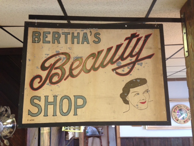
My daughter went to Mansfield to get her long hair chopped down to just below her ears. She was very excited so it called for the whole family to attend. My daughter sat in the high chair. My son and I sat down in an adjacent space. I began to sketch. He began to read some Calvin and Hobbes. I looked up and saw a terrific bit of hand painted script. 


The pencil lines are still visible. The imperfections are obvious. The drawing skill level apparent as we look at the face. It all seems to point to the popular handy work of someone who learned typography at home through a mail order system many moons ago. They learned very well indeed! Regardless of the light blue type, "Beauty" is awesome! I am drawn toward the great finish to the "y" and the capital "B" beams with pride. This, if I had the good fortune of owning it, would proudly stand on a wall of my home...a high traffic wall of my humble home.

Sunday, February 14, 2016

local font find #26

Though more than a century ago, this lettering glows with cool! It was from a box of amazing vintage items that belong to Cheryl Edgcomb (her book cover was posted below). Wow!!!


1907

Saturday, January 16, 2016

local font find #25


There is a local antique shop that has this just inside the front door. Having walked past it often, today I noticed many issues. Off center letters, tilted letters and an upside down letter. It would seem odd that the letter was traced upside down on purpose. 


This is the font that was used. See if you can find the upside down letter. It won't take you long.

Thursday, January 7, 2016

forkzilla - another exercise in brainstorming

While on "lunch duty" at my teaching job (we walk between tables and make sure the students are behaving and all), a young 6th grade girl called me over with a terrific smile on her face. She had a look as though there was something awesome to tell me. The awesome news was her fork. Yes!, her fork. It was gigantic and super heavy as well. She thought it was so extraordinary, she had to let someone know about it and felt that my being the bizarre Art Teacher, I was the perfect recipient of this great find. We all laughed as we looked at this abnormally large fork. It was almost a serving fork. I asked a student on the other side of the table if we could see her fork. I took this regular sized fork and placed it next to the enormous one and WOW!!! It really was big. Anywho, we all laughed (not sure why) and I left my "duty" to go back and teach for the afternoon. It was most strange that I couldn't shake the large spoon and the general sillyness of the whole event. How did that spoon get into the school? Why did this young lady feel the need to show an adult? Why was it funny? Why can't I stop thinking about this odd silverware anomoly?

So...I used the event to show her class how I brainstorm and idea to relative completion. The result was FORKZILLA and the R.B. Lunch Disaster! I will use this as an example for an upcoming Comic Book Cover lesson I teach at that grade level.


Thursday, December 24, 2015

the history of fonts on stools for my classroom

About 3 or 4 years ago, my Principal, Mr. Smith, allowed me to order new metal stools to replace wooden ones that had become splinter hazards for my students. The new ones were perfect for the size of my students and my table height. The new metal stools had one flaw, a Masonite top that couldn't withstand the long term abuse that would be occurring in an elementary art room. I ran through many ideas to cover the tops. All seemed cool and I believed that the students would like the ideas. The only issue was that a majority of my ideas were way too involved and it would have taken me a year or two of design and application to conquer the project.


My love of letters seemed to fit just right. I thought about using my favorite fonts. I thought about listing the fonts and having each one drawn in its own font. Then, the simple concept of going through the 26 letters of the alphabet worked best for an Elementary art room.


I spent many hours searching the history of fonts and the important designs/designers of the last 500 years in the world of typography. I saw many lists by many of the respected minds in the font community. The fonts that continuously showed up on these lists were automatic picks. Fonts like Garamond, Baskerville, Bodoni, etc. were obvious choices. Helvetica, with its surge in popularity (surge in disgust as well) over the last few decades, was always going to be my A. Helvetica is not my favorite, but thought the students should be aware of how prevalent it is in the design world. I do love its lower case A with that bent drop of water as its bowl. 


30 Typography Stools


A Helvetica
B Copperplate
C Garamond
D Baskerville
E Rockwell
F Century
G Bodoni
H Franklin Gothic
I Times New Roman
J Claredon
K Broadway
L Sentinel
M Futura
N Gill Sans
O News Gothic
P Bembo
Q Akzidenz-Grotesk
R mine... (this does not mean that believe that I am the least bit important in the history of Typography because I AM NOT the slightest bit important in the history of Typography)
S Gotham
T Univers
U Officina
V Caslon
W Didot
X Interstate
Y American Typewritier
Z Metro


+4
Italic (Poster Bodoni)
House Industries Ampersand
Numbers
A blank one for students who choose not treat them well (not pictured)


I had some gold spray paint at home so I went to work on that Helvetica A. I made a circular mask to shield the gray metal ring at the top during spraying. My want for the letters to be exact had me tracing out enlarged letters via the computer... large enough to be seen well and still leave room for additional information. The Helvetica "a" is already taking a beating.


The thought of having all the stools gold sounded horrible, so off to Walmart and a myriad of spray cans were purchased. I used masking type and an Exacto knife to create masks for many of the letters while some were hand painted to achieve a variety of colors.


Upper and lower case was always considered to add interest as many lower case letters have unique styling. Also, I wanted to shift it around a bit just to keep it interesting.


Certain letters were treated to an interesting background. No real rhyme or reason to my choices on that. Just kept it kid friendly.


I designed this R for a project I was teaching at a local university. It was definitely inspired by the impressive House Industries ampersand pictured below.


The camo Z took the longest as I masked off each layer of green.


House Industries has been a frequent stop on my daily net surfing for many years now. Their designs are top notch and will be the kinds of designs that shall remain relevant for many decades to come. Their ampersand is way cool. You can even buy it cast in aluminum or iron!.


I threw in the Earnhardt "three" for some of my Nascar loving students and the 007 seven popped into my head at the last minute. Willie Stargell's 8 was for me. The rest of the numbers were just well constructed numbers I liked.

I have told my students that all the items in the room that I have designed, I have designed them for myself as well. I have to look at this stuff all day. The form is important but they must function as teaching devices. When these designs lose their cool, I head back to the drawing board and revamp them. I definitely had my taste in mind when designing a lot of these stools. Letters and lettering never seem to dull. I do love them.  

-Merry Christmas

Wednesday, November 18, 2015

vintage crayola box with awesome type and cool elf

I'm a sucker for great lettering. A nice piece of typography appeared in my school mailbox the other day. The day after it arrived, I found out that it had been gifted by a wonderful second grade teacher who is soon to retire. She assumed that I would like this empty crayola box and she assumed correct! Wow! Just big enough to hold 36 crayons, the box is of a sturdy board and in relatively great shape....a few blemishes on the corners. Though it was empty, I will display it proudly in the office that my wife and I use (when it is clean enough) to do artwork, bills and other computer junk.


The elf has a Disney feel. The type has a genuine friendliness and beautifully scaled to the box. Love the stubby ampersand as well.


One is currently on eBay for about $50. It is full of red crayons. The list describes it as coming from the early 50's (1952 is the exact claim). Awesome!

Saturday, August 15, 2015

local font find #24

We found ourselves in Coudersport, Pa. the other day. We were helping a fine young lady move her things from apartment to apartment. Upon our journey, we made our way past a Pennsylvania Dept. of Transportation building near the elementary school. The lettering was awesome. I had to stop and snag a few photos. The lettering was beautifully retro and dated and very few were aligned on the building with any regard to being straight. 

This type style is part of the Art Deco movement that was experienced in the early part of the 20th century. Most consider it from the 1920's up to WWII.


If you follow the horizontals of the brick, you can see how off the individual letters were set. Maybe they rotated slightly on one connecting point (I did not walk up to the side of the building to see how they were stuck to the facade).

They are awkward and jovial. They really do jump at the viewer as individual design gems. The weight is interesting and a real feat of problem solving can be attributed to the designer. I was unable to google search an exact font name but many Art Deco themed fonts were very similar.

Friday, July 24, 2015

local font find #23


It should be obvious that the spacing between letters (kerning) is horrible on this sign we drove by in New York state. Problems are everywhere. The reason that I have it as #23 is how poorly the 99 looks on the interstate logo. Why is it so far right?!?!??!?!??!!!!!!! The border of white is much smaller on the I-86 shield but at least the 86 is centered. WOW! is this horrible. I will get some shots of a good I-99 sign compared to this poor one in the near future. YIKES!

Saturday, July 4, 2015

"not so" local font find #22

We have made it a yearly destination to stop for an overnight rest in Staunton, Va on our way home from visiting my family in Florida. Staunton (we learned it is pronounced "stan-ton" on this trip) is the home of Woodrow Wilson. Ash thought we should take a trip through town before risking our lives on I-81 north and the mayhem of 4th of July traffic. We drove by Pres. Wilson's birthplace and decided to stop and take a look.

At the museum next door to his birthplace, they had his Presidential limo outside. It was to be in a parade the following morning and the museum staff was attempting to get the motor to turn over. 


The head of the museum was overseeing the maintenance and saw my family passing by. He called us over and asked if we would like to take a closer look. Another man opened the back door and we were invited to step inside. My children took him up on the offer.....


This Pierce Arrow Limo is in pristine condition and quite beautiful. I'm not an extreme "car guy" and I could have stared at this machine for an hour or two.


The details were awesome.


To the point of this post, the type! The license plate looked like it was designed for this machine. It fit it so well. As we walked around this piece of art, the plate blended in with all the glossy detail. Being a font nerd, I was alerted to its beauty and classy look immediately.


If I found any flaw, it would be the font used in "antique vehicle". This is all about the numbers. The 5 and the 2 being the same makes the 5 seem unique. Love the zero as well. Anywho, if you are every experiencing the misery of I-81 in the middle of Virginia and you need a break, stop into the beautiful city of Staunton (stan-ton) and drive around town for a bit. A small slice of American heaven.

in addition: I am in no way promoting the ideals that Wilson stood for. I have avoided politics on this blog for many reasons. Recent readings have convinced me of this former President's racist beliefs. My family will no longer have a single cent spent in the positive upkeep of this man, his legacy and the attempt to keep his history a positive one.