Showing posts with label signs. Show all posts

Friday, March 2, 2018

local font find #32

My family and I went to support the Girl's High School basketball team the other night at our local University. A district game that they ended up losing and I will not discuss the inability to officiate the game by those who are supposed to be able to do so. Not only did I see four different fonts used to say the word "Mansfield" within the gymnasium, I saw this gem of a painted sign that hangs over the entrance. You only get to experience the full glory of these typographic mistakes once you are seated and able to really let it sink in.


The word "Country" was on the right side of the clock. Nowhere, could I find, any reason for the stem of the M to drop below the baseline. The awkwardness of that letter kept me peaking up from the court in between lousy calls... oops!, I commented. Then, the stencil or projector must have shifted during tracing as the curved leg of the R got crushed. The R is just plain bad on a whole lotta levels!

The outline of the word (white stroke around the black letters) is just TOO big. It creates this blast of white in the E's that is way too intense and teenie tiny slivers in the M, A, E's and R that bother me almost as much.

Other than that, it's pretty good.

Wednesday, December 7, 2016

local font find #30

We visited Corning, NY the other day in search of some gifts. Any time I go to Corning I am in search of some old typography. The city has an interesting history and much of it has been preserved and still promoted. 

We stepped into a local glass shop and whammo! There it is. 


Exactly the kind of thing I am looking for. An historically important part of Corning's past and an inspiring part of a Font Geek's present. The sign is huge. About 10-12 feet wide. It is dimensional. Carved out letters with a textured background. Great bird logo above...WOW!


The sign is in rough shape. That is fine by me as I think we should experience it as life and the elements have delivered it to us. It tells a more intimate story in this state. A special "thank you" to the person in charge of displaying it. They had the insight leave it be. Also, the entrance to this building is beautiful. Old, stately doors. Plenty of glass. Great railings on the staircase.


If you are ever in the beautiful city of Corning, head to Market Street on the Wegman's end of town. Check it out. (if the company was as good as the sign, they were mighty good!)

Saturday, August 20, 2016

commission for a reduced wooden tarpon sign as house number

Never planning that these tarpon signs would be sold outside of our trips down to Florida each summer, I was contacted for a sign from some interesting folks out of NJ. Not having the space for the full size 6 foot signs I have been producing, they were looking for the same aesthetic quality but much smaller. More like 23 inches across. I said I would be glad to make one but had to check on the silo boards remaining to see if the lengths were there. Well, they were. 


I gridded off some poster board for an exact size/proportion reduction and found that i couldn't get the tarpon cut from one board. In order to keep strength at a maximum, I centered it to allow for fins to stay away from knots as well as the joining of the two pieces.


I was pleased with the final shape.


The kids were drawing with chalk on the driveway so I spent a few minutes adding some large, strange creatures with blue collars and plants...not sure why. Looks like they road their bikes over it before I got this shot.


The wood has highly defined grain. The exterior is covered with deep ridges that catch the sun and its shadows. I dremeled out the numbers after adding the paint. I scuffed and scraped the paint with a multitude of items to beat it up a bit more before shipping it out.


The buyer wanted the numbers left in their natural state, so this is how it was sent out. I wish I had an unlimited supply of these boards. They are striking. I will miss them when the are gone (they're almost gone). Later!

Friday, August 19, 2016

local font find #29

While on a trip up to the local hardware store for some wood screws, I gave the old sign that is kept out front a slow drive by. It is strange that I have not photographed this prior. While inside, I questioned the history behind the sign. I was told by the fine folks at Morgan and Margraff that a local Elkland sign painter, Glenn Wilson, completed this sign many years ago (they believe it was done in the mid eighties). I was told that he painted many signs locally (I would love an opportunity to see them). The owner attempted to show me a sign of the former shoe store in town that Mr. Wilson had rendered but he was unable to locate it in the warehouse. I sure hope that sign is found....wow, was I excited at the prospect of unearthing another sign!


Though this sign has had daily battles with the elements, it still retains the style and skill that Mr. Wilson obviously possessed. Mother Nature, in my opinion, has this sign in amazing condition. If it were mine, it would find wall space.  


The arched letters of MORGAN are great with an exaggerated M and N. Love the rounded, flared-out R's. The A's seem to come from the early part of the 20th century and place us in the era of the nature-driven Art Nouveau days.


As we zoom in on this AND, we can see the shaky brush stokes. Most sign painters pride themselves on completing a letter with as few strokes as possible. I would have loved to have watch him apply the paint. Was his hand shaky? Has the weather worn parts of the letters and we are left with the uneven edges? What kind of speed were his strokes? No matter the answer to these questions, he was confident and talented. A good mix. (an update to the brush stroke issues...I found out that the sign was touched up, many years ago, at the hands of a non-sign painter...thus the shakey, multiple brush strokes)


I am on the lookout for any other signs by this man. If you know any, email me please! Would love to post some images (or maybe buy). Thanks all.

Friday, August 12, 2016

vintage pull down U.S. map (40" x 48")

Rarely do I find things that command my attention. And once I do, they seem to sit in my brain and pop into my thoughts with regularity...even when they are not in sight. One such item is this map we had framed for our bedroom. It is one map from a pull down set you may remember from school. It is a vintage one from the 1950's/60's. I have given some of the other parts away and can't locate the date or find a similar one on the net. I kept this map and the North American section. The rest of the world has changed names so much that I didn't want my children learning some wrong answers for future questions.


The colors are a thousand times better than any other map I have ever seen. You mix the colors with this amazing typography (pictured below) and you get visual perfection. This former teaching tool is what I consider to be way more powerful an example of good design than a majority of the countless pieces of artwork that I have come in contact with in the last few decades.


The shadowed mountains (below) are mighty cool as well.


The greens and blues work so well together. Each small section of this map is just spectacular.


Love the different fonts used as well as how they kerned (spaced) the letters to create weight differences to the viewer.


The number are cool as well!


My favorite section of the map is this mountainous part of Mexico as it meets with the large font. The orange of the map is striking (orange is my favorite color by the way). Everything great about this design comes together hear. 

We had it framed by a kind and interesting man, Marwin Cummings, from the Lawrenceville area. I helped him mount it and it turned out way better than I had hoped for. It will be the focal point of our bedroom walls. Thanks, Mr. Cummings! Fantastic!!!!!

Why any map maker would avoid using such rich colors is puzzling. Enjoy!

Friday, August 5, 2016

buffalo sabres sign out of reclaimed boards and barn boards

I have been blessed with fine friends and interesting acquaintances. They may not look on me with the same sentiment, but I still feel blessed just the same. I may have said this similar thing in a previous post...sorry. I do feel it is necessary to preface this post with these thoughts. 

One such bunch of fine folks bought a new home a few months ago. Their pride in the purchase was obvious. I felt compelled to build them (though the design was leaning heavy toward the husband's taste) something cool for a future basement upgrade to a living space.

I love great logos (nothing out of the ordinary for graphic design folks). But, this logo, that of the Buffalo Sabres, was one that I found difficult to create something unique for these fine folks. I previously made a raised wooden Buffalo Bills sign and thought that the style might work with the original Buffalo Sabres logo (from 1970).


The extra outlines of the current logo would not be possible with my skill level when working with wood. Luckily, the older logo is better anyway (my opinion).


The background circle is approximately 42 inches in diameter and I used reclaimed wood to build it. It came off the roof of a local Elkland home that was recently torn down. The wood is about 90 years old or so and looks awesome!


I used aged barn boards as the raised elements. I acquired many splinters and had multiple fails with the wood. There are so many cracks from the weathering that a piece can split off at any point while cutting out the shapes.


Though a pile of work, way more than I predicted at the onset, the work was thoroughly enjoyable. The wood allows imperfections to be perfect. It allows my weaknesses and inexperience with wood to feel acceptable and, I think, look pretty good. My weakness is a strength! Boy, wish this concept worked for me each and every day!


The finished sign, at 42 inches wide, is something I hope will appear striking to folks entering their basement and add to a great finished space. Good folks deserve good things. I tried to deliver.

This picture was taken with a wide angle lens and the viewer looses the outer ring (you can see the dark outer ring in the image above). The dark outer ring helps to set off the light raised ring and give a bit of completion/frame to the work.

Glad to have delivered it safely to its new home and on to new stuff....tarpon stuff!!!!!!

Friday, July 15, 2016

tarpon sign for pine island, florida... i love old barn wood

I have been unable to confirm or deny my neighbor's claim that the boards I have used on my tarpon signs are old silo boards. Either way, they are relatively light weight and awesome. The roughness can't be faked. They are just plain OLD! At 1 3/4 inches thick, they can stand alone and command attention. The boards don't need some rectangular or oval base to show off their dimension. 


I am running low on the boards and once these last few are gone, I believe I may never find anything like them again. This is why I have taken great care on the shape of the tarpon and placement of all the blemishes. I did multiple experiments on my scraps to achieve the right balance of color to natural wood. I also ran the boards horizontally to achieve more of a true sign look that one might find fifty or sixty years ago when driving through old Matlacha and Pine Island.

I previously did a large wooden tarpon out of the same material for my brother's large wall space, Capt. Gregg McKee of WildFly Charters. 

My hope is that this can find a home in the terrific spot of Pine Island, Fl. With nearby islands like Sanibel and it's amazing beaches close by, Pine Island struggles to get recognized by some visitors to S.W. Florida as an awesome place to vacation and/or live year round.


At 73" wide and 28" high, it would look great in a living room or large entrance way. Poolside might be cool as well. I don't plan on shipping it, but I will be trucking it to Florida next summer along with some painted furniture by my wife Ashley.

She has a new blog as well: ashcan works. Check it out!!!!

Wednesday, June 8, 2016

local font find # 28


Just up the road from our home is a fantastic sign welcoming folks to the Fairview Cemetery in Osceola, Pa. The all-caps have a stately look. The arms of the E's and ends of C's are chopped at slight angels giving them a bit more character (see below). The RUST!...oh the RUST!!!! Rarely does rust take away from my visual joy (at some point the rust will overtake the entire sign, but I still love it). The dates are set very close to the title and it makes the large space in the center of the sign feel even greater. Due to that space not being centered and the ornamental piece above it, the sign does feel a bit awkward but not to the point that it repells the viewer. 


The blocky numbers fit fantastically with the lettering. The 2 feels as though it may fall due to the cut in the bottom left of the number....oh well!


The only issue with this quality sign is that it is very close to the road and is difficult to take in as you drive past. I sure do love it!!!

Sunday, March 20, 2016

local font find # 27

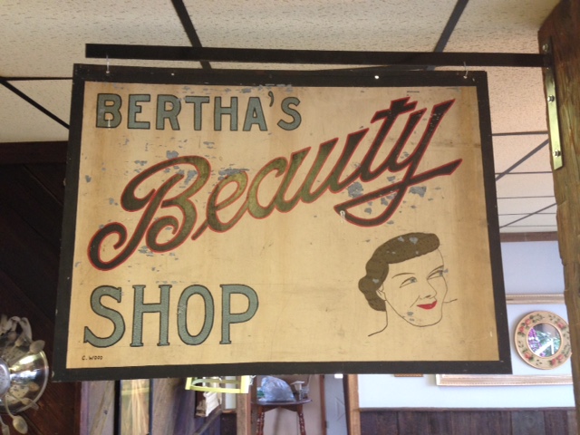
My daughter went to Mansfield to get her long hair chopped down to just below her ears. She was very excited so it called for the whole family to attend. My daughter sat in the high chair. My son and I sat down in an adjacent space. I began to sketch. He began to read some Calvin and Hobbes. I looked up and saw a terrific bit of hand painted script. 


The pencil lines are still visible. The imperfections are obvious. The drawing skill level apparent as we look at the face. It all seems to point to the popular handy work of someone who learned typography at home through a mail order system many moons ago. They learned very well indeed! Regardless of the light blue type, "Beauty" is awesome! I am drawn toward the great finish to the "y" and the capital "B" beams with pride. This, if I had the good fortune of owning it, would proudly stand on a wall of my home...a high traffic wall of my humble home.

Thursday, December 10, 2015

another barn wood buffalo bills sign

A few weeks after I posted a Buffalo Bills sign designed for a family that has been so good to ours, I was contacted shortly after posting it to see if that sign was for sale. It was a teacher out of Rochester, NY, who was interested in the sign and if she could not have that one, would I build one. I told this very nice lady that I would check my supply of barn boards and give her a quote if I had the material. I had the material. Once we agreed on a price, I got to work.

I have probably typed this before, but I am always amazed how awesome weathered and aged wood looks. It is an honor to upcycle these barn boards that experienced/survived countless sunny days and winter storms to get to them to their current glory. I do my best not to waste any pieces but must make artistic choices when considering where to cut as the knots and blemishes add to the appeal. This does result in some fine pieces becoming too small to fit into any design ideas I currently have in mind. 


The dimensional set up really shows off the boards. This design has zero relief carving. It was purposely simple in order to make the wood the center of attention once the viewer has mentally travelled past the fact that they are looking at the Buffalo Bills logo made out of wood. 


It is always my hope (I guess the hope of anyone who makes stuff and sells it to others) that those individuals that buy what I make continue to enjoy it long after that initial newness wears off. 


44" wide x 30" high

Wednesday, November 18, 2015

vintage crayola box with awesome type and cool elf

I'm a sucker for great lettering. A nice piece of typography appeared in my school mailbox the other day. The day after it arrived, I found out that it had been gifted by a wonderful second grade teacher who is soon to retire. She assumed that I would like this empty crayola box and she assumed correct! Wow! Just big enough to hold 36 crayons, the box is of a sturdy board and in relatively great shape....a few blemishes on the corners. Though it was empty, I will display it proudly in the office that my wife and I use (when it is clean enough) to do artwork, bills and other computer junk.


The elf has a Disney feel. The type has a genuine friendliness and beautifully scaled to the box. Love the stubby ampersand as well.


One is currently on eBay for about $50. It is full of red crayons. The list describes it as coming from the early 50's (1952 is the exact claim). Awesome!

Tuesday, October 20, 2015

buffalo bills wooden sign

I work with some amazingly talented, kind and dedicated teachers. Two of them have become good friends of our family. They are terrific people with two fine children. Their kids have babysat our children on many occasions. As a gesture of gratitude for having us over to their home and the allowing of their children to take care of ours, I decided to build them something to hang in their basement. 

The basement in the home is a beautiful one and I set out to design something to add to the quality. Another teacher I work with just set me up with some well aged barn wood and I thought it would do the trick (Thanks JOE!!!!).

The man of the family is a big fan of the Buffalo Bills. I decided to build the logo out of the boards. After a bit of google searching wooden signs of that subject, I found nothing that looked anything like I had planned (always a good thing!). 

First, these barn boards are naturally striking and to paint them always feels wrong. My design was to stain them, if necessary, with new and used motor oil...nothing that would hide the beat up and weathered look of the wood. 


I have limited tools and limited skills when it comes to working with wood. The design has to be simple for both my taste and my talent with this material. 

The Bills logo has two colors and also a white outline that separates the colors and continues around the outside of the entire design. I decided to make it a dimensional piece with the white of the logo being a total background layer. The idea came together as I started the assembly of the background. A simple raised layer of lighter wood on top of a layer of darker wood. 


I wanted the piece to be large but not pompous. A bit of thought had to be put into the scale. Knowing the basement, I rested on 44" x 30". Too small and the design would waste the limited wood.


Below, the final resting place. 


Saturday, September 26, 2015

large tarpon wooden sign/piece of art

I am not sure yet as to the point of making this large tarpon sign. My awesome neighbor scored this amazing bunch of very old wood (we think it is silo boards) that has incredible texture.


 This tarpon strikes a much more dynamic pose than the last one I made for my brother's home. 


At just over 6 feet from the bottom of the jaw to the tip of the tail, I believe this tarpon to possess the correct dimensions of these beautiful fish. Some old motor oil and roughed on paint and she'll soon be ready for whatever her future holds.

Saturday, August 15, 2015

local font find #24

We found ourselves in Coudersport, Pa. the other day. We were helping a fine young lady move her things from apartment to apartment. Upon our journey, we made our way past a Pennsylvania Dept. of Transportation building near the elementary school. The lettering was awesome. I had to stop and snag a few photos. The lettering was beautifully retro and dated and very few were aligned on the building with any regard to being straight. 

This type style is part of the Art Deco movement that was experienced in the early part of the 20th century. Most consider it from the 1920's up to WWII.


If you follow the horizontals of the brick, you can see how off the individual letters were set. Maybe they rotated slightly on one connecting point (I did not walk up to the side of the building to see how they were stuck to the facade).

They are awkward and jovial. They really do jump at the viewer as individual design gems. The weight is interesting and a real feat of problem solving can be attributed to the designer. I was unable to google search an exact font name but many Art Deco themed fonts were very similar.