Friday, July 27, 2012
one of my favorite sketches
For some reason, we occasionally do odd little things on a whim that please us for years to come. This wee drawing of a lotion pump lid (approx 2" tall) has been with me since 1994. My skin is horribly dry throughout the winter months so I guess this might have been a common object to have about my apartment at the time. I used a cheap ball point pen for the line work and a mechanical pencil for the simple values.
I'm sure the reason I've kept this little scrap is because it reminds me of my father's engineering texts. He was trained to be a civil engineer and had all kinds of books with great mechanical drawings in them. They were almost always line drawings that were entirely done with a straight edge and/or french curves. All the shading and 3-D stuff was rendered with precise hatching and cross hatching. I used to copy them during boring stretches. As far as Art was concerned, these illustrations were tops. You didn't need the interior of the Sistine Chapel, the Scream or Potato Eaters when you had water flow calculations through thick metal piping!!!
I miss those books.
Tuesday, July 17, 2012
"not so" local font finds #9
The Olde Fish House Marina not only has an interesting sign out front, it has some cool stuff hanging inside. Great "A" above.
The Li'l Stinger has a great look. Love how the lowercase "i" was jammed into "stinger". Not sure that making the apostrophe black was necessary, but hey, why not?!!? I do like the lettering more than the illustration and the "G" seems a bit skinny.
This wasn't actually inside the Olde Fish House. It is the logo on a beat up forklift out back.
...and the BEST is last!!!!! I find myself wishing for this sign regularly. It should be in my home in a place of honor. I would hug it and squeeze it and call it George. It is close to perfection. I LOVE IT!!! The fish is fantastically simple. The black and orange are awesome (orange has been my favorite color since childhood)!!!!!! The subtle addition of water along the bottom adds a touch of texture to the background "X"! YES!!!!!!!!!!!!!!!!!!!!!!!!!
yet another great sign
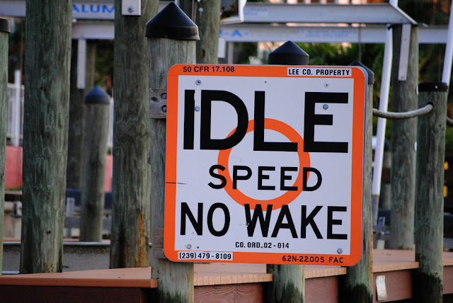
If you can visually remove "LEE COUNTY" sticker and the phone number, you are left with a teriffic sign. Again...I would have this hanging in my home. The font scales work well and the kerning (spacing) makes for an interesting negative space. You gotta love that simple orange circle as well!
These signs are all over the place in and around Matlacha, Fl. You'd think Lee County could spare one!
Tuesday, July 10, 2012
rusty metal versus paint
My folks live down on the island of Matlacha, Florida. I don't have time here and now to give full details concerning how cool it is in and around Matlacha, but just know that it is a great place (especially for my parents to retire). After you cross the drawbridge entering the island you will find the Olde Fish House Marina on your right. This establishment has an enormous metal fish out front that they used as both a sign and also a daily display board of fresh catches and specials. It had been exposed to the elements for years and the metal was orange with rust. In my mind it had achieved a state of perfection (except that it wasn't in my home). The form of the fish was great and mixing that with large metal rings around the eyes, the rivets and the awesome rust, it brought a tear to your eye. This photo was then!...
Since our last jaunt south the sign has undergone a makeover. As stated above, I was fond of the white chalk on rust version. Very fond. The new look has some great aspects to it but it ceases to be...rugged, rough-around-the-edges, disheveled or just plain simple. Before I state that I like the former version better than the new one, let me point out some positives seen in the image below. First: the paint is profoundly more noticeable from the road (of major importance since it is a sign and all!). Second: the colors fit the area well. Matlacha is a hodge-podge of people (some sober, some not), houses (trailers on their last leg up to million dollar dwellings), and colors (a coral colored home could be right beside a purple one with pink shutters). You mix all these things with the amazing natural surroundings of South West Florida's Gulf Coast and I guess the sign is a snug fit. Third: the design used in the application of the colors is freewheelin' and organic. It is a whimsical mix of circles and waves. There is little fault to be found in the entire redesign.
The aesthetic argument that is clamoring in my head can be summarized by the title I selected....rusty metal versus paint. As a business owner, I would welcome the changes made. As a lover of art and creative endeavors, I mourn the loss of that rust. I mourn the loss of a simple and interesting silhouette of a fish. I mourn the loss of these two elements coming together.
I had an art teacher, back in my undergrad years, who spoke over my shoulder as I was grinding away on some project, "It is just as important to know when to stop as it is to know when to keep going." This teacher said many things that still bounce around in my head as I currently work. This "knowing when to stop" idea has impacted me profoundly. I have ruined many drawings, paintings and sculptures by thinking that adding a tiny bit more might help. The line is a fine one.
My vote is for the rusty metal. Eventhough I'm not thinking about the success or failure of the business. I'm just ranting on a beautiful object that I drove past.
If you ever make it to Matlacha, stop in and have a meal...nice people bring you good stuff in a great setting. Look for the beautifully painted fish out front!
Monday, July 9, 2012
Subscribe to:
Comments (Atom)


