

Wednesday, June 25, 2014
may's sugar shanty barn board sign finished
I decided to see how the Pennsylvania winter months and the occasional sun we get treat it. I liked it in its natural state. Mr. May liked it in its natural state. So I kept it in its natural state except for some waterproofing sealant that was applied. The sealant did darken the wood slightly. But, when it was all said and done (which it is...thank goodness), all parties involved were pleased.
Sunday, June 22, 2014
local font find #18
Not the best of photographs, but I gotta say, one of my favorites. I don't know the first thing about beautiful nails or okay nails for that matter. I do know that this sign lacks all kinds of things unless you really like red. Lets focus on the second word "Nails" (located at the bottom right).

Not only do those fonts not go together well, but those two dots perfectly stacked above each other (capital N and i) are almost hypnotic. Why would someone who owns a sign shop ever think that these two fonts would ever work well enough together to set it, cut it, weed it, and then stick that vinyl lettering to some Plexiglas. Then we can consider the white rounded rectangle as a space to fill. The negative space of that shape drives the viewer nutty! Everything feels smashed to the bottom and ya just feel stressed out! When I worked at a sign shop while living in Florida we ran into a few situations that were very difficult to solve. Shop owners had existing signs and wanted new names made to fit those spaces. It took time and ingenuity. But!!!!!!......my boss talked about his logic when reaching a final solution. He used words like "space" and "comfort" and "stress" when considering placement of his final choices. He made sure that things were never too close to the frame or outer edge. He made sure that spacing of all parts "felt right". He made signs well. When you looked at them, you read them. You didn't scratch your head. You didn't consider taking pictures of them and blogging about their issues.
Again, I am sure that there are fine folks in that shop that really make your nails "beautiful". The sign............wow.
Thursday, June 19, 2014
barn board sign #2 may's sugar shanty
I agreed to make a sign for a gentleman starting a new maple syrup business. It has taken way WAY too long to finish. I struggled quite a bit at the initial design phase and that carried over into many other aspects. Every part of this sign was over analyzed. Having done a previous barn wood sign, I wanted this one to be a big leap forward. After hours of sketching I often reverted back to my original gut instinct. Since I am new to this sign building/carving thing, trusting my gut hasn't yet gained my trust.
I drew countless shapes for this one. I googled many evenings away in hopes of inspiration. Nothing stuck. So, like the mindset of Chuck Close, I just started working (it's an uneasy feeling....I don't like it at all!).

Mr. Burrous, my father-in-law, found some terrifically aged barn boards. I chopped off any of the sections that were too far gone. Not knowing the shape yet, I gave myself about 5.5' x 3' of usable wood.

I removed all the old (very cool looking) square nails and lined up the nail holes on the boards. The decades of seeping rust stains are my favorite parts of the wood.

I scrapped my initial idea of a standard oval sign. The wood wasn't telling me, "hey, ya big ape, make it oval!" I drew one corner on some rolled paper. After cutting it out, I traced it on the board with a charcoal pencil and jigsawed it out (big "THANKS" to Earl, my neighbor....his saw). The sign was underway. I flipped the paper and traced it on the other side. I traced the top of a round wooden table to make the gentle curve along the top edge as I had left my large scale compass at school.

Even my best boards had some flaws that had to be dealt with. Large cracks were drilled out and dowelled together.
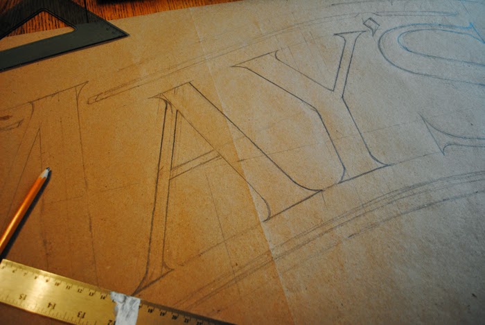
I wanted the sign to feel as old as this great wood. I drew all sorts of lettering that I liked but only this curved style seemed to fit this piece. Hand drawn lettering is not the quickest way to go but it sure does let me adjust weights and angles quickly. Nothing had to be precise on this so I experimented quite a bit.

Like the lettering, I drew a maple leaf to scale on some scrap paper. My wife and I agree that drawing a good leaf is not as easy as you might think. It is a strange phenomenon, indeed. I like the finished carved look of the leaf. I left the vein lines elevated.

I knew as I was working through the sign that spaces were being created that would need solved with some sort of ornamentation. After carving "MAY'S Sugar Shanty" and the established date, I used that same round wooden table to help create a base that had more visual weight. I made the cutouts tighter at the bottom to keep more wood to aid in that weight. Once the reader gets to the bottom, you want their eyes to travel back up. I free-handed the ornaments right onto the board. By this time, I was really starting to trust my gut.
Ashley (my wife) was called out of the house on numerous occasions to set my mind right about the design. She either smiles and nods or gets that wincing look on her face. The wince means back to the drawing board. She was a great help and all her multiple winces were spot on.
I am consulting with Mr. May about stains and colors. I don't want to do much more to this thing. It feels right. Like the syrup running out of the tree, the sign was pulled out of the boards. Anything that would cover up the roughness and the amazing character of these boards won't be considered.
Last thing, wear gloves when working with this stuff. I have cut out about twenty to thirty splinters. I will post the final photos of this soon. Thanks all and drive safely.
Subscribe to:
Posts (Atom)