Showing posts with label illustration. Show all posts

Monday, February 12, 2018

a love of all things type

Over the past few decades, my sketchbooks have slowly switched from general drawings of my surroundings and random doodles to lettering. Letter forms are inherently beautiful when done well and inherently difficult to do well. That search for making something your own and making it hold it's beauty is a challenge that drives an amazing amount of people all over the net. My nerdiness isolated me prior to the Internet. Once I made my way into the modern age, I realized that my disorder is plaguing people all over the world. 

As an elementary art teacher, I am always looking for a way to inspire my students to look closer at the world around them and creatively analyze it. The "problem solvers" are what schools should be turning out. The art room is a great place to kick start this process. 

When the first two paragraphs mesh, you get student names/initials as design. Some students were asked their interests and others I took as a straight typographic problem to solve. Some choices were based on student personality while others are reflective of my state of mind at the time. (Sophie, the first one shown, is my neice, not a student)....


Wednesday, December 28, 2016

version #2 of hand drawn lettering always tastes better

Been super busy as of late but had time off over Christmas break. Merry Christmas to all (by the way) and hope all is going well. This idea, though silly, never seems to be far from my mind. I can't shake it. And when I can't shake it, I doodle it. The many doodles have lead to this.


I look everywhere for well-used vintage book covers. The color and level of abuse are usually the deciding factors when found. They work well for what I have visioned for the final products of certain ideas. All of the color was printed using Styrofoam sheets and then scanning in. I do not use Photoshop Actions or pre-packaged apps to get my weathering.

Happy New Year as well.

Saturday, December 3, 2016

great artwork you don't see in art history books #5

During a random search on the Internet I came across an image of a tree. It was incredible. I immediately went to look for it's creator. I traced it to a man by the name of Eyvind Earle. An interesting fellow with a great personal story. He is worthy of a look.

The picture below is what has me typing this post. Of all his work, with many of his paintings superb, this painting of a series of barns has stuck with me. I think of it often. There is something about the angles, perspective and the position of the viewer that keeps me coming back.


There seems to be a whole lot happening with so few objects and so little detail. I love the dark shadow that falls across the lower right roof. It keeps pulling my eye around. The blast of light across the grass shoves you left over to the steep roof which start you back right. Wonderful movement. I always love an image that feels as though I would have never come up with the composition no matter how long I lived. Mr. Earle does this with regularity.

Thursday, December 1, 2016

the Air Force 1 by Nike still rules as an impeccable design


I have always loved the look of this shoe. Nike came out with it in 1982. I was 12 (you do the math). I never owned a new original pair but bought a used pair of size 11 1/2 off of a friend (I wore a 10). They were a bit to expensive for a sixth grader. My love of their look has never faded. EVER! I have found that I am not alone with this belief/disorder. To show my love of the shoe and also my love of certain artists/illustrators, I set out to draw a serious doodled right shoe that drops in hints of illustrators that have influenced me.


Many of the marks are just whimsical ideas that happened as chance. As illustrators, cartoonists, or artists jumped into my head, I carved out a place to fit 'em in.


My owl from a graduate school poster project.


The whale squashed into the darkened sole was just a drawing of a whale. No influences. Just thought it would fit in the space.


Sorry about the image quality. Hope it doesn't detract from the time spent drawing this up. Sure was fun to stare at an Air Force 1 for hours at a time.

Sharpie on thick railroad board.

Saturday, March 19, 2016

great artwork you don't see in art history textbooks #4


The work of Ernesto Garcia Cabral (El Chango) is odd. Many of his graphic designs are very comic and purposely over the top. Some, like the one above and below, are so refined, so intriguing and so full of great decisions that I find myself drawn to them way more than 90% of the work found in the Art History books of my past education. The composition has great positive and negative space. Great balance is achieved in a heavy handed rule of thirds layout. Complementary colors. The lines that define the woman's elongated form are nothing less than timeless. We are made aware of the wind direction which tightens up her lines. Her snake-like bend is dissected by harsh diagonals created by her belongings and her arms. These objects push your eyes left and right making her feel even more snake-like. This is one of the most beautiful pieces of graphic design that I have ever seen. Period!

Posters should be more easily obtained!!!!!


Yet another dynamic composition. Also great positive and negative space. The arm position is terrific. What a talented man.

Tuesday, February 9, 2016

a new book cover project


A few months ago I was approached to do some artwork for a local woman, Cheryl Edgcomb. Mrs. Edgcomb has lead an amazing life around Tioga county and it seems that she was continuously surrounded by stamps and the people that used and loved them. Coming from a family that worked for the U.S. Postal Service, she has not fallen far from the tree. Her personality and kindness make her one of those people you struggle to say "no" to. After a short conversation, I found myself neck-deep in beautiful examples of historical documents from the area, vintage postal ephemera, and all sorts of interesting objects and envelopes that were hard to put down. 


Mrs. Edgcomb was in the process of writing a book about the people she has met and the amazing tales that her travels found her a part of. She needed a book cover. Though not sure of what we could do for a cover, I was honored to attempt to make something concise out of all the mayhem. She had her title and tagline and the rest was on me. I brainstormed quite a bit. Her story lacked an isolated image that could stand as a cover image. I thought about creating some unique text but that seemed a bit vain on my part for this kind of story. As she started getting her collection out of the many boxes around my dining room table, the pile of stuff looked cool. I said that these things say it all. Like the countless stories, each of the thousands of items are a part of her and her history. I assume that all that know her, and that seems like every resident within 150 miles, would agree that the cluster of objects fits with her spirit....a myriad of stories that all lead into each other. For the cover photo, she picked out the items that were tied to a story within the text and other items that were close to her heart. 

She has a passion for life. An obvious one. She liked the idea as well as the final image. I used Styrofoam to ink some letters for the "stamped" look. Scanned them in and did some manipulation and color overlay. I hand drew the tagline that was inspired by her own handwriting. That's that.

Anxious to see the final book! She has put a pile of work into the project.

Saturday, February 6, 2016

eric carle inspired man cave


I've been attempting to brainstorm ideas as much as possible as of late. My second graders have painted paper like the great Eric Carle (author and illustrator of children's books) and are now using it to create images of animals. The project is based around building images using simple shapes. I attempted to reinterpret the concept of a "man cave". A small place to chill out.

All I need is light brought in, a great book and a Sheetz coffee (a large one!).

Tuesday, January 26, 2016

new angry strongo fan art - from my wife

My wife is a very talented lady. I'm sure that she is not sure how talented she is. This version of Angry Strongo (below), as my birthday card, highlights her skills. It looks better than all my other cartoons. Her sketch hand-coloring is so rich and vibrant that I am considering changing the entire presentation of my comics. We are definitely looking into using this style soon in some other ventures.

thanks Ash....


Monday, December 28, 2015

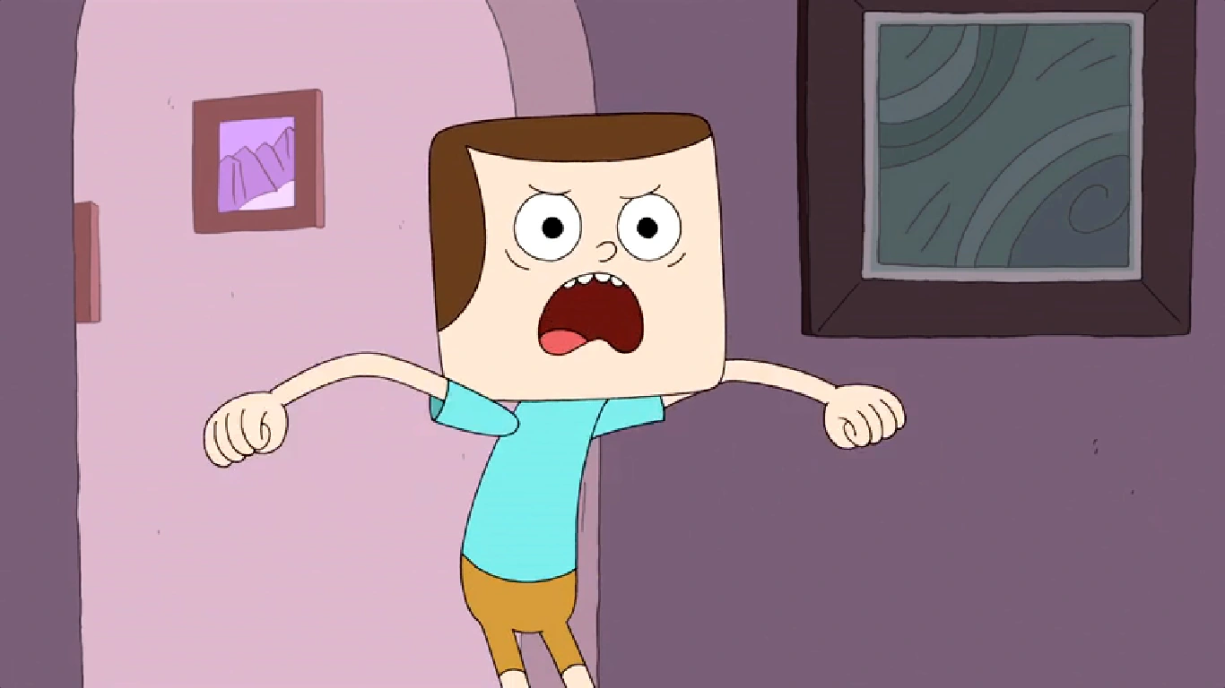
angry strongo and the new look-a-like!!!!


I have been enjoying this new Cartoon Network show called Clarence. A very strange cartoon about an even stranger young kid named Clarence. He has all kinds of odd habits and hangs with the other bizarre students in his class. You really have to watch a few episodes to get the full picture. 

The more I watch it, the more I am reminded of my Angry Strongo design and the similarity to Clarence's friend Jeff (Clarence and Jeff are pictured above). Jeff's design is an over-sized block head with a sweep of hair across the forehead and a large semicircle down the sides. Angry has a slightly different sweep that resembles a large wave that follows his always scowling uni-brow.


Not that anyone that reads this blog gives a hoot about whether I copied off this cartoon or not, but the reason for this post is the sense that any one reader might think that is the case. I am also not saying that I believe that the creators of Clarence copied my design but there sure are some weird similarities. What we have here, more than likely, is a very close case of independent invention...I hope.

April 14, 2014 was the premiere date for the show. This has Angry Strongo being designed some 2 and a half years prior. I first started showing designs for my new "Angry" character in 2011. With the first post showing the current look of Angry Strongo appearing in October 31, 2011 (shown above). I had a version of Angry even earlier than this but the one below shows the first time I clothed him in the striped shirt that was later colored red to pay my respects to "Calvin" from Calvin and Hobbes.


As I researched the similarities further, I was struck by the layout of the room pictured below. Now I know many homes have large framed images on the wall and rounded doorways that were all the rage back in the day, but when you look at it all together, it just seems strange. 


My Angry Strongo layout pictured above was from January of 2013 (again, Clarence didn't air until April of 2014).

Anywho, I am not attempting to show any type of copying on the part of the creators of Clarence. I was just struck by the design similarities. I talk with my students about independent invention in my classroom. It happens quite often. When I give them a design problem to solve, a student sitting on the opposite side of the room often solves the problem in a remarkably similar way to someone else located far away. 

Check out this cartoon....it is very funny (my sense of humor is in line with this cartoon). Good day.

All the images used of Clarence and Jeff were copied and pasted off the net. My apologies and thanks to those who uploaded them.


Tuesday, May 26, 2015

intro to graphic design project


The project was based on the Pennsylvania German/Pennsylvania Dutch Folk Art known as Frakturs....Originating a few centuries ago, they were often family related and very personal pieces made by relatively untrained artists in a simple graphic style. I based mine on teaching at the University level for the first time. The transition was not easy. Sorry that the above image is blurry, but I did not really have the time to scan it in as two halves and try to piece them together. The below images were scanned in. As a Fraktur, the entire composition seems to work well but the intense design flourish within the squirrels was too much...way too much. I would definitely leave the squirrels grey if done again. I left the swirls in as a teachable moment for my students. I did not get around to redoing the project, but there didn't seem to be a point in taking that time. It began as a demonstration of how to handle the project and I guess it will stay that way. Showing students imperfections is just as important as showing them excellence (and NO, this is not just an excuse to go lazy on a possible redo). Students should be able to recognize the flaws in their own work with the same ease as they see it in others. I think if I was considering hanging a finished product in the house, the redo would have been produced with simplified squirrels.


I really liked the sweaters (they were supposed to represent my children) and the type. I regularly and affectionately refer to my children as "squirrel boy" and "squirrel girl".


I did some straight forward aging with watercolor and attempted to keep the spacing and the design simplified. I did not try and over-draw anything. The overlapping of objects was purposely minimized and the parts really remain as individual parts. 

Monday, October 20, 2014

reel island charters logo and tee shirt image completed

I was contacted a few months ago by some fine folks down in Boca Grande, Florida (Chad and Penelope Lach) who were starting a fishing business similar to my brother's charter fishing business. They were looking for some artwork, specifically a logo that could be expanded out into a tee shirt design. Calling the business "Reel Island Charters", they had some ideas about the end result. It was to feature a snook (a popular game fish in southern Florida) and some rod and reels to set it all off. 

My initial response was to solidify a script lettering style to set it apart from whatever fish was going to be created. 


I figured that with this design they could easily letter a vehicle or scale it down to business card size and still have a solid look.

From this point, after they gave the thumbs up on the lettering, I moved on to sketching out a vintage looking layout using all the information that they supplied. I adjusted the "Reel Island" script to fit around the snook and used an oval as the general shape of the total image.


I did some minor adjustments to the title and set up an image that I believed would work as a smaller center chest design for the front of a tee. 


Looking forward to hearing from the Lach family and hope the design is met with a positive response in the local community and patrons and it helps them to get the word out. If you are near Boca Grande, Florida, give them a call and do some terrific fishing in one of the most beautiful spots in the U.S of A.

Tuesday, May 20, 2014

mort's meat mafia

I am still not sure of the person I designed this for but it has to do with someone who knows my wife's best friend (his name might be Mort). He wanted a cow, pig and chicken designed into a logo for his new venture, Mort's Meat Mafia. I googled this idea and found that it had been done about a billion different ways. Three animals and the concept of meat, well done! It has been tweaked and twisted and designed over and over. The problem is that it is kinda necessary. You can't just show one of these animals or it gives the audience a much different perception about the product(s). I really didn't know how to bring my own spin on this universal concept. I decided to lead the design toward a more simple end by just giving a cleaver some type. 


I used some inked Styrofoam to get the cleaver and chopped out the hand drawn lettering via Photoshop. Love the natural texture that ya get from Styrofoam. Never gets old!!! 
This design was liked but still the client wanted those darn animals. "Less is more" was thrown out the window. I drew up some suited animals wearing shades and merged it all together and.....


As individual characters....I kind of like them. That chicken looks like a real killer!...an unflappable dude! I think I would still prefer the cleaver with about 40 variations of lettering to the one with the animals. It seems like a bit much. Then again, anything that takes away from type is something to rethink in my book. To be honest, I have not had time to ingest it all. Maybe weeks from now I might come around on the whole thing. Sure do like the chicken.

Sunday, March 23, 2014

maple syrup drawing

My father-in-law has a good friend who is starting a maple syrup business. He wanted to give him a small piece of artwork to commemorate the start. Ashley (my wife) sketched out a great idea/layout and I added some hatching and cross-hatching to tone it out a bit. Throw down some script type for the "252 Buckets and a Dream" and it is done. 

Ashley's sketch...


My final rendering...


Thursday, February 27, 2014

more Terrayn concept art ... Liset's castle


My attempt has been to use the terrain in four different styles....once for each of the Kingdoms of Terrayn. This is Liset's structure, the third one completed in the series of four. She is second oldest and a bit more mystical than the others. I had the Tate Modern (London, England) loosely in mind as well as Eldric's castle. This is what my brain gets when I mix the two. Her symbol will eventually be in that center part of the compass that adorns the floor.

Tuesday, February 25, 2014

one of those speed drawing videos


I have never been on video while drawing before. I didn't like the feeling and was glad when it was over. This is a low res test run that may be used in the near future to show how the CodeMushroom guys go from my sketches to an in-game build. Dan Reifsnyder, the man behind the original music on Terrayn, threw down a track to keep you from snoring. The video was not meant to be a "how to" instructional video concerning the rendering of a structure so I told the guys at a few points during the shoot to just skip ahead....FYI. The last image you see is the final version scanned into Photoshop and merged with a weathered piece of paper. As our 30 days are ticking down on Kickstarter, I am just trying to stay busy with the concept art that is still needed...

- I am using a mechanical pencil and lousy printer paper (some of my favorite art supplies)


Monday, February 17, 2014

kickstarter video for terrayn


This video was put together by Adam Murtland, a talented young man from the Mansfield Area. He shot footage of the team talking about the game and I was very pleased to have been left out of the final video. My drawings are enough. No one wants to watch me ramble on about whatever and such. Trust me, Adam gets some major points for his knowing how to edit of the scrap. Thanks Adam....the world thanks you as well!

Friday, January 24, 2014

final wynnid concept art for terrayn

The game is coming along and I am trying to hold up my end. In the previous post, I displayed some Wynnid ideas and just had to shine her look a bit and finalize the amulet. The image below is that attempt.


Sunday, January 19, 2014

third born, Wynnid, concepts drawings for Terrayn

On to Wynnid. Eldric's older sister. You'll read about her soon over at Terrayn. My goal has been to give each character a form (obviously), a home, and an amulet (almost a logo, I guess, on a medallion). The two men will have round amulets while the women carry ovals.


Another goal was, and still is, to keep these characters simple. I don't want them otherworldly. They should come to the viewer as figments of your past (though long ago), not your imagination. 


Her amulet quickly sketched and a long-haired version.


Wynnid's home. I felt she should not hide in a castle but live freely in a relatively modest dwelling. The home was designed to surround a courtyard. 11 large rooms adjoin the main living quarters. Wynnid resides in the larger structure and invites persons of knowledge to come and relax as they wish. Each evening the guests make their way to the courtyard for food and the exchange of ideas. It is a place for storytelling, invention, science and art.


The courtyard as seen from Wynnid's second story window.