Tuesday, January 31, 2012

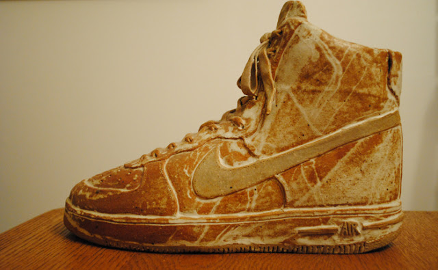
more proof that my early shoe obsession still lingers

During a multicultural art class at Mansfield University, I was given the task of choosing a culture and doing a piece of artwork that exemplified that culture's style. A few google searches into the process had me fixated on the Ga's.

The Ga tribe in Ghana has become famous for their elaborate coffins. It has become a custom for those that can afford it to spend eternity in an object or animal that defined your existence on earth. Coke bottles, wingtips, fancy cars and beer cans are shown on many websites that describe these fine craftsmen.


fish coffin ready to go
I loved the fact that their artwork (coffins) would soon be under ground. This would be an enormous decision for these folks as funerals were community activities and this is the vessel that would carry you onward to the afterlife. Once I figured out the cultural art style, I then had to consider what object I might wish to lay in while six feet under.

Shoes were a huge part of my life as a boy and young man (as described in a previous post). Deciding which shoe would represent my love of athletic footwear was the real challenge. I narrowed it down to five Nike products: the Airship, the Sock Trainer (a running/training shoe), the Air Force 1, the Dunk, and the Revolution. The Air Force 1 was chosen due to the impact it made and still makes on our culture. Air Jordan's were not considered due to the fact that I never owned a pair.

I am not a woodworker like the talented men in Ghana so working in wood was out. My budget was about zero dollars so a full scale coffin, regardless the material, was also out. I was taking a course in ceramics at the time so I attempted to get kill two birds and go with a men's size 10.5 in clay. The Ga also make small containers so I used this bit of info to tie it all together. Clay and small sounded like a good mix. The plan was to make a shoe that had a removable lid that could pass as a container until I got it home. The real purpose was to have an Air Force 1 out of clay. The shoe looked great until the glaze didn't take. It now looks like I spilt milk all over it (also, the kiln firing shrunk it down to a size 8.5 or 9).


Every year or so I ask Ashley if I should get out some spray paint and give it a spiffy clean coat. She has said "NO!" each time.

Saturday, January 28, 2012

great artwork you don't see in art history textbooks #1

Boris Lovet-Lorski...a Lithuanian who immigrated to the U.S. He lived all over the U.S. and a few years in Paris.


winged sphinx  (1930-1932) Egyptian granite
22 1/8 x 40 1/2 x 14 1/2 in. WT: 283lb.


If you are ever in D.C. and have a long layover (really long) or an afternoon to kill, you can fill that time with an interesting walk through Hirshhorn Museum and Sculpture Garden. It is part of the enormous Smithsonian system of museums.

I happened to be aimlessly touring through the Hirshhorn about 15 years ago and my eyes stumbled upon this sculpture. My love for it was instant. It had so much refined design and stylized parts that it was a shock to my eyes. I was excitedly getting down at its level and looking at it from every possible angle. From the squared-off wings and those great shoulders and biceps to those four rib lines and that odd transition to the lion body, the entire piece held my interest. The stone color fits this futuristic robot-headed sphinx very well. All his choices were good ones. Though a bit dated by the Art Deco inspired design aspects found in the head area, I still find myself wishing that I had been the artist to pull this off. It is simply beautiful.

Wednesday, January 25, 2012

a sketchbook, a lousy memory and Vermeer

Without keeping a sketchbook, not only would I miss the chance to record the many strange thoughts and the occassional good idea that passes through my skull, but I would also forget huge chunks of my life. If I doodle during a meeting, cut an image out of a magazine or even tape in some artifact from an art exhibition, I lock in a solid point for quality recall. My memory leans heavy toward the visual. I'm sure I trained it that way but there is no turning back from that now. Without some sort of visual reference point, I struggle to remember most of what happens to me.

Here are a few pages from my sketchbook that let me remember even the most mundane of meetings (yes, it's true!, doodling a mess like this actually helps)...


...from a meeting that included budget info


...note taking from a meeting


...great taped-in inspirations from the Nutmegger Workshop

While looking thru my sketchbook for material that was needed for an upcoming blog post, I stumbled upon a pamphlet from my past. As soon as I saw this little bit of marketing material the memories flooded back...


...taped-in brochure from National Gallery of Art

About 17 years ago the National Gallery of Art in Washington, D.C. gathered together 21 paintings. These 21 paintings brought tens of thousands of art lovers to our nation's capital.  We waited in line for hours to get tickets just so that we could wait in another line a few hours later. The temperatures outside should have kept most away but did little to defeat us. After finally escaping the cold, hundreds crammed themselves into a few rooms to get a glimpse at the handiwork of Johannes Vermeer (he only has about 34 paintings attributed to him). 21 paintings...but only one brought me to town. Only one kept me in line. Only one had me fighting off the burning cold....


I remember showing some of my friends a copy of this image and they just didn't get it. They saw nothing more than some buildings, a bit of water and a few folks in the foreground. To be honest, looking at this image I'm about to post, I can understand why they may have thought that way. I'm not sure what had me so drawn to this landscape. But I can tell you that after seeing it in person, I was right in my instincts to feel the way I did. In fact, I could not have guessed how amazing it would be and how much my admiration of Vermeer's genius would grow. There is something about what little we know about this man that has my mind wondering beyond the image. I want to know more of what is happening beyond that golden roof which is glowing in the background. Why did he choose this moment to capture? The majority of the visible town is in shadow. With Vermeer, you're always left with more questions than answers. He did what all great people and things do...they remind us why we live our lives. Why we push on. Why we pursue. Why we perform. Why we try to get smarter. Why we try to outdo others. Why we bring children into this world and attempt to have them share in this wonder. Why we travel to another state, stand in line for hours and get squashed in a room just to see some painting of a city that doesn't even look the same anymore.

I used this Bob Dylan lyric in my brother's wedding and I find it fitting when thinking back to that four minutes (or so) that I stood before the View of Delft..."it frightens me, the awful truth, of how sweet life can be." I am approaching my 42nd birthday (half way to 84) and it is my hope that I have the honor of standing before many more great things with my wife and kids by my side.

Monday, January 23, 2012

more exciting than Christmas morning... the Nike Catalogs

In 1982 Nike released the Air Force 1 basketball shoe. I was twelve and just getting into the sneaker phase of my life. Athletics being more important than breathing, shoes soon took over most of my waking thoughts. After the Air Force 1 began finding their way onto college and NBA feet, this young kid out of UNC, Michael Jordan, was drafted by the Chicago Bulls. It was during the Olympics in 1984 when his physical skills and otherworldly basketball talent started shocking fans. My world changed immensely after seeing him play without the strictness of the college game. His abilities were unleashed and Nike paid $2.5 million for ownership of his feet for five years.

Shortly after Jordan's '84-'85 season while wearing other early Nike sneakers like the Airship, my love of Nike shoes was borderline obsessive. I was drawing shoes all the time and begging my folks to dish out the cash for the real thing. My mom eventually caved and bought me a pair of blue Airships around 1985. This was my first real encounter with having something really cool on my feet. I wore them until they fell apart. I shouldn't have thrown them away (I'm sure my wife would love to see them!).

My mother was the inspiration for writing to Nike and letting them know how interested I was in their company. I'm not sure how I found the address of Nike's corporate headquarters out in Beaverton, OR but it was likely off a shoe box. This was around my 10th grade year in '85. In response, Nike sent me a catalog of their latest shoes that were not available in Altoona yet. It was better than Christmas morning! I even saved the envelope the catalog came in. The envelope was eventually lost when my parents sold their PA home.

That first catalog:


front cover


back cover


detail of two-page spread for basketball shoe section


Air Jordan page


Dunks page
(had the blue pair)

I easily looked at this catalog thousands of times in that first month. I took it to school to astonish my friends...they were astonished.

The second catalog that showed up:


front and back cover of Team Sales Catalog


had a white and charcoal pair
(though they looked cool, the plastic behind the heel
cracked within the first month while playing basketball)


Just looking back through them now has me remembering how obsessed I was with the look of their shoes. The designers that worked for Nike at this time were right on the mark with the wants and needs of athletes as well as shoe-geeks. Form was meeting advanced function and it looked really good. The company's popularity exploded during that '84-'88 stretch.

The shoes that came out of Beaverton a few years later never seemed to make me feel that same way. After my highschool years, I failed to be that impressed with Nike footwear. The "Golden Years" were over.


Friday, January 13, 2012

kindergarten students show off texture skills

My four Kindergarten classes just completed a project that had them adding simulated texture to a general evergreen tree design. As with all of my projects, students produce as much as possible of the entire work. Each student had to draw, trace, color and cut out the triangle. They then had to use scissors to add the texture to the sides of their triangles. The sides of the trunks were then roughed up with some not-so-straight cuts. They also used four to five crayons to draw zigzag lines on the trunks to simulate bark.


I've tried my best to make all of my displays worth the work. These large investments of my time need to not only display student work (important on many levels) but they should draw in the attention of other grade levels and solidify the overall intention of the lesson. Humor has become a big theme for me. Yes, you're not going to fall over and have trouble catching your breath from laughing so hard, but this subtle approach is having students, as well as teachers in the building, talking about the display. If kids talk about it, they sure have a better chance of retaining the information.

We will discuss the seven Elements of Art/Design throughout the year in Kindergarten: Color, Line, Shape, Texture, Space, Form and Value (value is something we will hit briefly at this grade level).

Friday, January 6, 2012

want to have a career in the arts?....or any career for that matter?

During my first year of teaching I heard many students tell me about their dreams of becoming an artist. Because of student interest, I created this poster as an addition to my final project while completing a Masters Degree at Mansfield University. The final project was a poster series that attempted to simplify the Elements and Principles of Design so that K-6th graders could begin to understand them as so as to put them into practice. I've been referencing it quite a bit while teaching over the last five years.


Study has to be first...in my mind. If you want to be successful in any career, you must know your trade. You must grow with the times.

Because art is the expression of your ideas and your emotions, artists without a deep understanding of people and things make art that falls flat. All of the artists I truly love are brilliant individuals. They aren't just loaded with artistic talent. They possess a high level of knowledge about many things. Their intellect draws me in and I want more and more from them. Their abilities stand the test of time.

I have always been interested in the person behind the art. What else do they do with their lives? What are the writing? What rare works or sketches are lurking out there? How did their artistic style evolve as their education grew? The more I find out about their lives the greater connection/love I have for their artwork.


Many students get bitten by the lazy bug and need the occasional lecture on hard work. I usually relate it to becoming a professional athlete or vet or some other popular profession that most definitely requires piles of hard work to achieve the title. I guess I lecture a lot...probably because I needed this very lecture when I was their age. To be honest, I needed this lecture until I was about thirty years old. When I was being paid to do a job, I always worked hard for every boss I had. The real issue in my life was how I spent my down time. My time away from work had no focus or any real purpose at all except to have fun. With this blog and the Angry Strongo character I now have a genuine focus for all my time. Though this time is minuscule, any artwork, design or odd idea now can be refined for the eventual appearance on this site. That is a good thing to have in ones life. My plate is always full now. My hope is that all that may find themselves reading this stuff find it tasty as well.

Wednesday, January 4, 2012

spotted a unique logo


I spotted this quality logo a few times on our family trips south to Wellsboro. This logo would have caught my eye in any setting, but traveling along that rural stretch made it leap. I finally had to stop and snap this shot. The photograph is lousy…sorry about the field goal posts. This thing has all the qualities I love. It is refined as much as possible and symmetrical. A thick line goes well with the subject (bulldog). It looks as though the “A” (the mouth) was central and nicely incorporated into the bulldog face. It’s supposed to symbolize strength & toughness and it delivers.

I did some generic Google searching and found out that APASCO is part of a larger company, Holcim. Holcim is a cement and gravel company that originated in Switzerland and is currently doing business all over the planet.  Leave it to the Swiss to be involved with a logo this cool. This is the kind of logo worthy of a freight car…very nice!
On a sad note...was unable to find t-shirts for sale.

Monday, January 2, 2012

local font find #4

Ash and I took a trip around the Finger Lakes area a while back. It was my first time trekking around those parts. We had the pleasure of walking the glen toward the tail end of our trip. That little walk was incredible. An amazing place. If you have not made the trip....it is well worth the journey. Watkins Glen has obvious tourist trappings yet it is still holding on to huge amounts of character and charm. Admittedly only scratching the surface due to limited time, we were impressed by the friendly nature of the community and their attempts to retain the small town feel. Being the font nerd that I am, I snapped a few shots of some interesting lettering coming out of the glen and along the main streets (to prove the whole nerd thing, these photos were taken before I decided I should spend a considerable amount of my time running a blog).


...from the cemetery that runs along the glen


...a vintage hand-crafted beauty. love the capital E in "the" and the super high h.


...the date says it all. great lower case "n" in the font.


...my favorite from the trip.