It was designed for a personal tee shirt. It sure is a beautifully frustrating hobby....letters! It is like drawing a face, it either works or it stinks. You can tweak it and tweak it and tweak it. It never seems done. It never really feels perfect.
I have been unable to confirm or deny my neighbor's claim that the boards I have used on my tarpon signs are old silo boards. Either way, they are relatively light weight and awesome. The roughness can't be faked. They are just plain OLD! At 1 3/4 inches thick, they can stand alone and command attention. The boards don't need some rectangular or oval base to show off their dimension.
I am running low on the boards and once these last few are gone, I believe I may never find anything like them again. This is why I have taken great care on the shape of the tarpon and placement of all the blemishes. I did multiple experiments on my scraps to achieve the right balance of color to natural wood. I also ran the boards horizontally to achieve more of a true sign look that one might find fifty or sixty years ago when driving through old Matlacha and Pine Island. I previously did a large wooden tarpon out of the same material for my brother's large wall space, Capt. Gregg McKee of WildFly Charters. My hope is that this can find a home in the terrific spot of Pine Island, Fl. With nearby islands like Sanibel and it's amazing beaches close by, Pine Island struggles to get recognized by some visitors to S.W. Florida as an awesome place to vacation and/or live year round.
At 73" wide and 28" high, it would look great in a living room or large entrance way. Poolside might be cool as well. I don't plan on shipping it, but I will be trucking it to Florida next summer along with some painted furniture by my wife Ashley.
She has a new blog as well: ashcan works. Check it out!!!!
Just up the road from our home is a fantastic sign welcoming folks to the Fairview Cemetery in Osceola, Pa. The all-caps have a stately look. The arms of the E's and ends of C's are chopped at slight angels giving them a bit more character (see below). The RUST!...oh the RUST!!!! Rarely does rust take away from my visual joy (at some point the rust will overtake the entire sign, but I still love it). The dates are set very close to the title and it makes the large space in the center of the sign feel even greater. Due to that space not being centered and the ornamental piece above it, the sign does feel a bit awkward but not to the point that it repells the viewer.
The blocky numbers fit fantastically with the lettering. The 2 feels as though it may fall due to the cut in the bottom left of the number....oh well!
The only issue with this quality sign is that it is very close to the road and is difficult to take in as you drive past. I sure do love it!!!
Sorry about this being a photo...no time to scan. Busy beyond belief. This is kinda late as well.... I'm not into all these holidays anyhow....they just keep coming and coming....yikes!
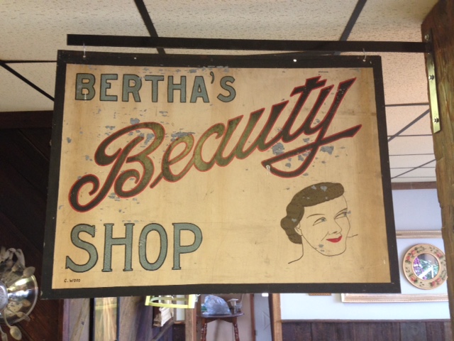
My daughter went to Mansfield to get her long hair chopped down to just below her ears. She was very excited so it called for the whole family to attend. My daughter sat in the high chair. My son and I sat down in an adjacent space. I began to sketch. He began to read some Calvin and Hobbes. I looked up and saw a terrific bit of hand painted script.
The pencil lines are still visible. The imperfections are obvious. The drawing skill level apparent as we look at the face. It all seems to point to the popular handy work of someone who learned typography at home through a mail order system many moons ago. They learned very well indeed! Regardless of the light blue type, "Beauty" is awesome! I am drawn toward the great finish to the "y" and the capital "B" beams with pride. This, if I had the good fortune of owning it, would proudly stand on a wall of my home...a high traffic wall of my humble home.
The work of Ernesto Garcia Cabral (El Chango) is odd. Many of his graphic designs are very comic and purposely over the top. Some, like the one above and below, are so refined, so intriguing and so full of great decisions that I find myself drawn to them way more than 90% of the work found in the Art History books of my past education. The composition has great positive and negative space. Great balance is achieved in a heavy handed rule of thirds layout. Complementary colors. The lines that define the woman's elongated form are nothing less than timeless. We are made aware of the wind direction which tightens up her lines. Her snake-like bend is dissected by harsh diagonals created by her belongings and her arms. These objects push your eyes left and right making her feel even more snake-like. This is one of the most beautiful pieces of graphic design that I have ever seen. Period!
Posters should be more easily obtained!!!!!
Yet another dynamic composition. Also great positive and negative space. The arm position is terrific. What a talented man.
Though more than a century ago, this lettering glows with cool! It was from a box of amazing vintage items that belong to Cheryl Edgcomb (her book cover was posted below). Wow!!!
My wife was asked to draw a cartoon of my friend Jonathan Miller to celebrate an upcoming milestone. In our research for the comic, we have had to watch this video many times. Jonathan's sense of humor as he endures the effects of his stroke is truly remarkable. Give this thing a view and see how you might be handling the tougher things in your life. I know I need to keep things in much better perspective....thanks Jonathan!