Saturday, July 27, 2013

taking pride in your work #2

This entry goes out to those talented folks at Invisible Creature. These talented graphic designers always seem to be accomplishing so much and doin' it so well. 

Our living room is home to two Invisible Creature posters that were done for the Sasquatch Music Festival in the great state of Washington (somewhere between Seattle and Spokane). We like looking at them so much, we ordered two more. The 2011 version....


And the 2012 version....


I'm not writing to argue my taste in poster design (even though these ARE good!!!!) but to highlight a company that cares about presentation. The posters arrived two days ago in a great little poster tube... (my foot kept it from rolling around and blurring the picture....)


They use there own packing tape as well as a customized circle sticker and an awesome stamp (stamp pictured below)...


When quality is near, you know it. You are aware of it and it is so compelling. Even a small thing like stamping each tube you send out.

Hope all are well out there. Consider what you sell to folks and also consider their experience receiving it. 

Friday, July 19, 2013

more work....less Art work....

The house has seen little upgrade this past school year. My wife was having people over this week which had me on a deadline of misery. The only thing that has made all this work around the house worth while is that the place is starting to really look like our "home".
Having my wife (also an art educator) in charge of choosing the colors for our interior has been interesting to say the least. She is a risk-taker with this task...and she always seems to get it right. Our living room needed paint desperately. She handed me this...


Not sure if she was serious, she never did let on that this was some kind of gag as I left for Home Depot (I added the white circle around the dab of paint that they mixed at the Depot....it matched perfectly!!!) When applying the first coat, I was worried. I have to sit in this space! The second coat cleaned up the color but I was still concerned. It wasn't until we rehung the artwork that I was sold. Every piece now feels isolated and important. It has created emphasis on the art as well as soothing the feel of the room.


I'm not sure if this picture captures the color well, but, this is all ya get. The main image of the room, a raven by Ikki Matsumoto is made so much more powerful by this green. The white that surrounds the bird never looked interesting as a negative space until the green was applied. The other two images: a small interesting gem from Jon Klassen of a ship about to fall into an abyss and the other is a cheerful concert poster by Invisible Creature for My Morning Jacket performing at the Sasquatch Music Festival.


This dog hasn't helped this blog either. Helped me calm down?...Yes!!!!! My kids named it Scooby. The little lady sure is cute!

Thursday, July 4, 2013

WildFly Charters gets stuck with family...

My brother, Capt. Gregg, runs WildFly Charters out of Matlacha, Florida. He knows his craft well and also controls his anger well as he has to deal with a novice angler like myself. He puts you in a great spot and it is your time to sink or swim....I usually sink. 

Occasionally I swim....


a very nice Redfish that I believe we ate shortly after this photo....


This was the first tarpon I have ever landed....the lazy slug only jumped once after i set the hook........not so big, but it sure was fun!

Fishing, in general, is not my favorite activity (Golf still wins easily). But when you get to fish the way my brother does, I can see why folks can get pretty serious about it. I love the time I get to spend with my brother and it is made ever better by being a passenger/guest on his boat and fishing along side him. He explains things well due to a vast knowledge about most subjects, he wants you to be successful and he makes plenty of time for his family. He's a good man. I'm blessed.

Check out his website and blog....then go fishing with the man!

Thanks again brother!!!


Monday, July 1, 2013

i needed a vacation from art....but art is everywhere!

When the school year ends and the repetitive nature of teaching has sizzled one's mind, the only way I can recover from this mental beating is to shut down for a stretch. We pack up our family and head the 1300 miles, due south, to Matlacha, Florida to visit my folks. It is here that I begin the two week search for mindlessness. I just want simple pleasures intermixed with total relaxation. There is one main problem to this plan that I attempt to implement each summer, natural beauty. 

The gulf coast of Florida is a spectacularly beautiful place. If you really want time away from art and true time void of thought in Southwest Florida, you should forget your camera. I spend 14 days each summer snapping hundreds of photographs (new digital technology allows us to delete about 80% of the pictures taken cause they just plain stink! no developing cost either!!!!!) Anywho, I spend the 2 weeks mentally cropping, checking lighting, choosing better angles and changing lenses (sometimes just in case something happens). The beauty in and around Matlacha refuses to let you relax completely. You gotta shoot!!!!


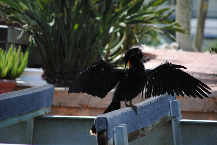
The wildlife watches you as well.


The weather comes up quick and usually with equal severity. As your field of vision is more than half made up by the enormous sky, it takes on an extraordinary feel....one finds himself looking up often.


Not even the grand entrance of my daughter can scare off a creature overrun by the prospect of an easy meal.


Though sometimes as vicious as the daily summer thunderstorms, the wildlife of Florida retains its beauty as well.

Wednesday, May 29, 2013

how times have changed #1

Yes, ladies and gentlemen, I have come up with another category for this ever changing blog. The world has changed "by leaps" since my youth. This post goes back even further.

Children's books were vastly different 50 years ago. The themes were odd. The language was strange. The illustration was simple and usually VERY dated (this doesn't mean lousy! It usually was awesome stuff.). There seemed to be a formula but, even so, the authors of the era could write some wording that would be considered shocking to the modern reader.

While at a Family Reading Night at my wife's school, I decided to check through this enormous pile of books which were part of the book exchange. Peeking out of the bottom of the mound was a little glimpse of an obvious Maurice Sendak illustration. Knowing my wife is a huge fan, I freed it from the mess. It turned out to be a strange little book...


I gave it a read during a lull in the action.

I ran across the reason for this post...


...and just like that, a simple and polite decline....No hole in the head! 1958. I guess this kind of language was just fine. Times have changed. It made me think of those amazing Warner Brother cartoons that consumed my youth. Yosemite Sam shootin' up the place. Bugs Bunny and Daffy Duck could smash each other over the head, shot each other at point blank, anvils magically falling from the sky, and everything turned out just fine. You can't beat anvils!!!!

Those were the days.........


Sunday, May 19, 2013

takin' pride in your work #1

This new set of finds will showcase a complete or general lack of caring when someone is delivering their product to the public.

Our faculty room occasionally has piles of free books that teachers donate to anyone passing through. Most are aged beyond relevant or more likely, irrelevant at the time of their printing. Having some hoarding issues, I always take the few seconds to search the piles.

This one inspired my new category...

 
Nothing shows the person about to read your text that it's gonna be awesome like a super pixelated mess on the cover. Not much more to say. No, I did nothing to this cover in photoshop. Just had to scan it in. I didn't read a single word beyond the cover (and even reading that was painful!).


Wednesday, May 15, 2013

got the sign done for the boss

My boss, Mr. Smith, the Principal of R. B. Walter Elementary, wanted a sign to let folks entering our school to stop into the office first. After some design, paint, assembly, and some more paint, I delivered this....


I added some simple trim pieces around both sides to give the sign some sense of thickness.


Mr. Smith ordered a great twisted wrought iron scroll hanger for my sign. To be honest, it looks better than the sign. Oh well!!! It sure does bring the eyes of the visitors upward toward the information. CHECK IN FIRST!

I think he made a fine choice.


He is retiring in a few weeks. We sure will miss him and hope his workless days are terrific.

Tuesday, April 16, 2013

local font find #12

A good sign painter, like any master of his/her craft, has the ability to transform the letters into seamless, effortless and beautiful experience. I had the good fortune to have a VHS tape recording the night back in '86 when Michael Jordan lit up the Celtics for 63 points. I watched that game for the next few weeks many times. The last time I watched it was just as riveting as the night I watched it live. He made the domination of some of the greatest players in the game seem so simple. The analogy is a bit skewed but stick with me on this one. The sign painter has to compete with the current wave of so-called sign designers that use perfectly cut vinyl lettering stuck to the side of a truck or board. The lettering is all done by machine and usually that machine is run by folks with little to no design knowledge. The letters, though precise, lack an emotional response. The throwback sign painter wields a brush and some paint and dives in over a rough sketch. When we come upon a true sign painters work, we have a very human response to a human event. Cut vinyl is flat. We simply read the words. Michael Jordan, in that instance of his 63 point explosion, made me view the rest of the players in the league in the same way I currently feel about cut vinyl.

I'm not sure of the artist/sign painter responsible for the work I'm about to show you, but it really is nice stuff and worthy of a view....


This trailer has been slowly rotting just south of R. B. Walter Elementary in a field that is home to some regular auctions throughout the good weather months.


So good...this is logo material!!!!


love how the "i" transitions into that beautiful "z".

Sunday, April 14, 2013

sign for my boss's office almost done

Some time ago, my boss asked me to design a sign to hang above the Office door. As people enter our school, they need to understand that checking into the office is essential for school safety. I took on the job of creating an interesting design for the spot. The process went like this....

First: brainstorm, sketch, brainstorm, sketch, brainstorm, sketch...and buy a piece wood and cut it to size (it is always good to have that blank surface staring at you to give you that kick in the pants!)


Second: Scan the parts into the computer and begin the shuffling around in hope of finding the right composition. It has to feel right. If words are a part of the composition, choosing the right typeface is essential to the success.


Third: I did all my Photoshop designing to scale (27"x20" at 150dpi grayscale). I then chop the finished design into 8x10 chunks and print them out. The pieces then get trimmed and tapped back into a collage that looks like my final sign. I give a light rubbing of hard graphite on the back side of the collage. Tape it onto the sign board and trace it with a mechanical pencil which leaves a light pencil line to fill in with paint.


Fourth: Paint. I keep a few pieces of paper laying over the graphite so my drawing hand/arm doesn't smudge.


 FRONT

BACK


Last: I will coat the entire sign with a water based finish, Polycrylic (clear satin), to protect it. Before that is done, I will choose some sort of trim treatment to frame off the design.

I hope to deliver it to the boss soon since he's retiring after this school year. I'll take some shots of it when it hanging above the Office door.


Thursday, April 4, 2013

greetings from discover


My latest design for society6... not sure how this design came to be...most likely I was doodling a font and noticed discover can be broken into two interesting words. I'm sure I'm not the first person to notice this but ran with it anyway. Used some old magazine photos to fill the lettering. Later.....

Monday, April 1, 2013

angry strongo #38 hand sanitizer pumps

professionally speaking, this is a hectic time of year. sorry for the lack of comics lately....will try and get on it in the next few months....