Wednesday, August 21, 2013

hand painted signs everywhere!!!!!

It was my first experience at Knoebels. It has been around since 1926 and has done a fantastic job of retaining some of that antique charm (without seeming rundown). It has also survived about a half dozen floods....not sure how!


Small stone cottage that sells fudge/candy apples/ etc. inside. Very cool. Would live here in a heartbeat (if it was closer to my job).

My children loved the rides and all of the interesting things to see. The older the ride, the more they seemed to enjoy it. 


Self-propelled rail cars.


As a "flatlander" up here in northern PA, the park reminded me of what Lakemont Park used to feel like back in my hometown of Altoona. Lakemont had huge trees when I was a young boy and rides packed together as well. It had large picnic areas and an enormous swimming pool. It also made an effort to keep a classic charm about it (now, after chopping down all the old trees, it is almost all new and lacks any historical charm!  booo!!!! hisss!!!)


random cool old stuff


Our family will make this a yearly adventure!!!! (maybe twice!)


almost forgot....some hand painted signs!!!! (too many to show from the park, so here's just a taste!)


nice!


Monday, August 19, 2013

i'm not bitter but i sure have soured

This idea has been on the cork board for about half a year. I drew several attempts that left me feeling flat about the whole affair. I knew I liked the wording but couldn't get a visual that didn't totally stink. I put it on Society6 last evening.


I wanted it to look like a lousy piece of candy....the kind you would have to read first and not just trust the coloring/design and gobble it down. Other than that, I haven't much to say.

later.... 

Thursday, August 15, 2013

local font find #13

On our trip to the Museum of Play in Rochester, we stopped in Dansville for a doughnut and a drink. Upon exiting the vehicle, I noticed this gem of a sign at the nearby strip mall. 


I can image what the conversation was like at the sign shop when this business person was looking to have a sign built for his/her shop. Maybe something like this...."I need a sign. I've gotta go to Walmart, I trust that you can knock somethin' out by the time I get back. Oh, and I ain't got much cash since I'm startin' this here shop and all so keep it cheap. Thanks!" 

The signmaker (a loosely used term) then put down his low grade bottle of gin and got to work. Type out the letters. Stretch them vertically so they fill the space. Three minutes later he was weeding out the cut vinyl and transferring it onto the plexi. Everyone involved was satisfied. Low expectations earn you low quality service. 

If that lousy "I" has hidden meaning, they should let us all in on it... it's hideous! 


Saturday, August 3, 2013

slow and steady loses the sprint

It has been some time since my last little bit of design for my stuff over at society6. I am constantly thinking about some future designs, either images or strange sayings. 
In my youth, running and jumping meant the world to me. Being fast and being able to jump over things others couldn't became part of my self-identity. I remember being very bothered by the story of The Tortoise and the Hair. That rabbit could have destroyed that turtle if he just would have pushed on....ATTACKED the moment!!! In my book, this was a race! SIMPLE! A chance to show your stuff! Nope, he took it easy and was forever remembered as a slowpoke. I have never ran a sprint or distance race with that mentality. Slow and steady wins the race?!? Slow and Steady gets you crushed!!!! I heard that saying a bunch in my youth...it never made sense and it still doesn't. I know what people are getting at when they say it, but, come on!, how about GO HARD till the FINISH LINE!
Anywho, this design had these things in mind as I drew it all out. 


The background is the back of a book on ants from the late sixties. I noticed it while browsing about my wife's art classroom. As soon as I saw it, I knew I'd use it for something.

Friday, August 2, 2013

old barn wood is cool...WAY COOL!

I am constantly looking for ideas for birthday gifts for my folks. They live in Florida...this creates a problem...What do they need?!?!? You can always use a hand made sign from your youngest son! YES, a dock sign to greet all their canal-traveling visitors. With this solid tidbit of knowledge, I set out to build one. 

My father-in-law, Mr. Burrous, wrangled up some terrifically aged barn boards.


I pulled two of the 4 boards that were of similar thickness, length and grain weathering. I lined up the nail holes on the left side and ripped them at about 43 inches wide (making the sign 24x43.5). I was beginning to feel quite good about the whole thing at this early stage...very rare indeed.


I ripped two thin strips to use as bracing on the back. I really liked how the back looked at this stage....also very rare.


I had to decide on a fish for the central theme. We were given this book while on vacation down in FLA a few months ago.


There were several options for the fish. Redfish...Snook....TARPON!!!!! Really there was only one option for my first barn wood sign.


I kept the finest board for the tarpon. One inch thick (this makes it kinda old! ...the modern wood sellers never give you what the labels say!). It has deep cracks, knots and numerous quality abrasions. I wanted this sign to look old as soon as I give it to them. This board sealed the deal!


I sketched it out and jigsawed the lines. Pretty straight forward. I took left over pieces and cut out fins. This was very fun to do. Very. I liked the fish just like this...that rough unfinished state often looks like you should consider it finished.


I rubbed white house paint (using an old rag from the garage) across the main body of the tarpon and on the adjoining parts of the fins...then some gray/black on their tips. I added some greenish-yellow along the top of the body and then some bluish stuff above that and around the outside edge.


Then came the anxiety. Every work of art (not that this is Art but ya get what I'm sayin') I've ever done has this phase at some point. Some are even entirely anxiety-ridden. I only had 4 boards and if I mess up carving into them, I'm up the creek! I practiced on a piece. I still was stressing. I sketched out some letters and went right in.


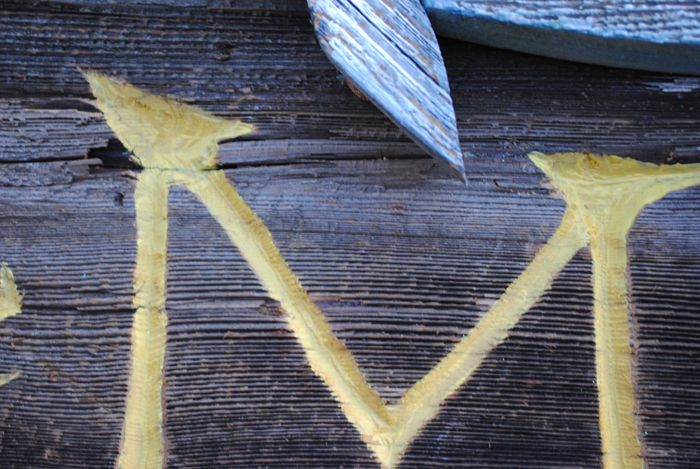
I tried not to be precise. Anyway, the wood would not allow the unskilled hands I possess to be precise. Things just work out some times. 


This staged photograph was to show the Dremel bit and the angle of attack. It also showed how the wood splinters A LOT! In the end, it adds to the aged look I wanted.


The THE came last as I wasn't sure how I was going to draw it. Also carving this small was scaring me more than any other aspect.


I left large spaces below the  C & O and above the C & K for lag bolts that will attach it to the dock. I still hadn't figured out the eye and face details. Like the THE, I wasn't sure how to accomplish it. My wife said that it had to be done. Four or five hours passed before I dove in. Stressful!


I roughed-in some yellow house paint (Ashley had it left over from some project. She said I should use yellow. I don't argue color much with her anymore. If I do argue color, it is really just to test my arguing skills....I hope to win but will just go with her opinion in the end).


The eyes were carved and some gill lines and such. And, well, that is that. Whimsy and old. Instant aging. Old barn wood is cool. 


I'm still figuring out what I should coat it with...exposure to saltwater and all. I definitely don't want any shine. Thompson's water seal or something. We'll see. I'll post it again when it's in place (months from now!). 

Saturday, July 27, 2013

taking pride in your work #2

This entry goes out to those talented folks at Invisible Creature. These talented graphic designers always seem to be accomplishing so much and doin' it so well. 

Our living room is home to two Invisible Creature posters that were done for the Sasquatch Music Festival in the great state of Washington (somewhere between Seattle and Spokane). We like looking at them so much, we ordered two more. The 2011 version....


And the 2012 version....


I'm not writing to argue my taste in poster design (even though these ARE good!!!!) but to highlight a company that cares about presentation. The posters arrived two days ago in a great little poster tube... (my foot kept it from rolling around and blurring the picture....)


They use there own packing tape as well as a customized circle sticker and an awesome stamp (stamp pictured below)...


When quality is near, you know it. You are aware of it and it is so compelling. Even a small thing like stamping each tube you send out.

Hope all are well out there. Consider what you sell to folks and also consider their experience receiving it. 

Friday, July 19, 2013

more work....less Art work....

The house has seen little upgrade this past school year. My wife was having people over this week which had me on a deadline of misery. The only thing that has made all this work around the house worth while is that the place is starting to really look like our "home".
Having my wife (also an art educator) in charge of choosing the colors for our interior has been interesting to say the least. She is a risk-taker with this task...and she always seems to get it right. Our living room needed paint desperately. She handed me this...


Not sure if she was serious, she never did let on that this was some kind of gag as I left for Home Depot (I added the white circle around the dab of paint that they mixed at the Depot....it matched perfectly!!!) When applying the first coat, I was worried. I have to sit in this space! The second coat cleaned up the color but I was still concerned. It wasn't until we rehung the artwork that I was sold. Every piece now feels isolated and important. It has created emphasis on the art as well as soothing the feel of the room.


I'm not sure if this picture captures the color well, but, this is all ya get. The main image of the room, a raven by Ikki Matsumoto is made so much more powerful by this green. The white that surrounds the bird never looked interesting as a negative space until the green was applied. The other two images: a small interesting gem from Jon Klassen of a ship about to fall into an abyss and the other is a cheerful concert poster by Invisible Creature for My Morning Jacket performing at the Sasquatch Music Festival.


This dog hasn't helped this blog either. Helped me calm down?...Yes!!!!! My kids named it Scooby. The little lady sure is cute!

Thursday, July 4, 2013

WildFly Charters gets stuck with family...

My brother, Capt. Gregg, runs WildFly Charters out of Matlacha, Florida. He knows his craft well and also controls his anger well as he has to deal with a novice angler like myself. He puts you in a great spot and it is your time to sink or swim....I usually sink. 

Occasionally I swim....


a very nice Redfish that I believe we ate shortly after this photo....


This was the first tarpon I have ever landed....the lazy slug only jumped once after i set the hook........not so big, but it sure was fun!

Fishing, in general, is not my favorite activity (Golf still wins easily). But when you get to fish the way my brother does, I can see why folks can get pretty serious about it. I love the time I get to spend with my brother and it is made ever better by being a passenger/guest on his boat and fishing along side him. He explains things well due to a vast knowledge about most subjects, he wants you to be successful and he makes plenty of time for his family. He's a good man. I'm blessed.

Check out his website and blog....then go fishing with the man!

Thanks again brother!!!


Monday, July 1, 2013

i needed a vacation from art....but art is everywhere!

When the school year ends and the repetitive nature of teaching has sizzled one's mind, the only way I can recover from this mental beating is to shut down for a stretch. We pack up our family and head the 1300 miles, due south, to Matlacha, Florida to visit my folks. It is here that I begin the two week search for mindlessness. I just want simple pleasures intermixed with total relaxation. There is one main problem to this plan that I attempt to implement each summer, natural beauty. 

The gulf coast of Florida is a spectacularly beautiful place. If you really want time away from art and true time void of thought in Southwest Florida, you should forget your camera. I spend 14 days each summer snapping hundreds of photographs (new digital technology allows us to delete about 80% of the pictures taken cause they just plain stink! no developing cost either!!!!!) Anywho, I spend the 2 weeks mentally cropping, checking lighting, choosing better angles and changing lenses (sometimes just in case something happens). The beauty in and around Matlacha refuses to let you relax completely. You gotta shoot!!!!


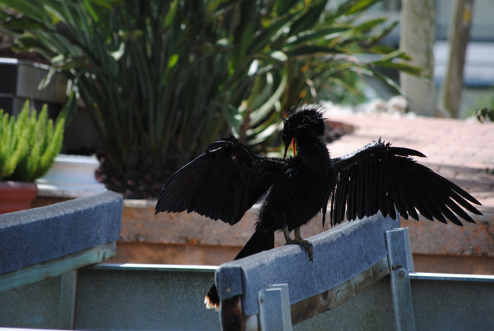
The wildlife watches you as well.


The weather comes up quick and usually with equal severity. As your field of vision is more than half made up by the enormous sky, it takes on an extraordinary feel....one finds himself looking up often.


Not even the grand entrance of my daughter can scare off a creature overrun by the prospect of an easy meal.


Though sometimes as vicious as the daily summer thunderstorms, the wildlife of Florida retains its beauty as well.

Wednesday, May 29, 2013

how times have changed #1

Yes, ladies and gentlemen, I have come up with another category for this ever changing blog. The world has changed "by leaps" since my youth. This post goes back even further.

Children's books were vastly different 50 years ago. The themes were odd. The language was strange. The illustration was simple and usually VERY dated (this doesn't mean lousy! It usually was awesome stuff.). There seemed to be a formula but, even so, the authors of the era could write some wording that would be considered shocking to the modern reader.

While at a Family Reading Night at my wife's school, I decided to check through this enormous pile of books which were part of the book exchange. Peeking out of the bottom of the mound was a little glimpse of an obvious Maurice Sendak illustration. Knowing my wife is a huge fan, I freed it from the mess. It turned out to be a strange little book...


I gave it a read during a lull in the action.

I ran across the reason for this post...


...and just like that, a simple and polite decline....No hole in the head! 1958. I guess this kind of language was just fine. Times have changed. It made me think of those amazing Warner Brother cartoons that consumed my youth. Yosemite Sam shootin' up the place. Bugs Bunny and Daffy Duck could smash each other over the head, shot each other at point blank, anvils magically falling from the sky, and everything turned out just fine. You can't beat anvils!!!!

Those were the days.........