Monday, October 20, 2014

reel island charters logo and tee shirt image completed

I was contacted a few months ago by some fine folks down in Boca Grande, Florida (Chad and Penelope Lach) who were starting a fishing business similar to my brother's charter fishing business. They were looking for some artwork, specifically a logo that could be expanded out into a tee shirt design. Calling the business "Reel Island Charters", they had some ideas about the end result. It was to feature a snook (a popular game fish in southern Florida) and some rod and reels to set it all off. 

My initial response was to solidify a script lettering style to set it apart from whatever fish was going to be created. 


I figured that with this design they could easily letter a vehicle or scale it down to business card size and still have a solid look.

From this point, after they gave the thumbs up on the lettering, I moved on to sketching out a vintage looking layout using all the information that they supplied. I adjusted the "Reel Island" script to fit around the snook and used an oval as the general shape of the total image.


I did some minor adjustments to the title and set up an image that I believed would work as a smaller center chest design for the front of a tee. 


Looking forward to hearing from the Lach family and hope the design is met with a positive response in the local community and patrons and it helps them to get the word out. If you are near Boca Grande, Florida, give them a call and do some terrific fishing in one of the most beautiful spots in the U.S of A.

Saturday, October 18, 2014

new africa themed design for this years "fall into the arts"


My wife is setting up another Fall into the Arts event at Westfield Elementary School where she is the Art Teacher. It is a great night of music, theatre and the visual arts geared toward young students. 
The act of drawing type is something that never seems to diminish in the joy that it brings me. My hope is that I am continuously improving with my skills. Each project has a feeling attached to it and the goal is hopefully reached. The viewer might not be aware of each specific goal, but I sure am. I don't think I will ever be fully satisfied with anything I do and that has been a good thing in my life. I never reach the carrot. I just keep pulling the art cart up the steep grade of living.

Monday, September 15, 2014

art doesn't fall far from the tree


My son Matthew is a second grader who loves school, reading, Lego's, Star Wars and just about everything else except cheese. My wife and I, both art teachers, have never pushed him, or his sister Clare, toward the arts. We do the occasional art project together but we refrain from harsh criticism of their skills. We definitely don't push it! 

During music class they were given some Popsicle sticks to work out some music theories (which I don't understand well enough to explain here...second grade stuff). When finished, they had a few minutes to just create something with the sticks. Not sure where Matt picked up the 3-dimensional thinking, but he must be watching his parents work or just thinking through it on his own. I guess it is good to do ones work in front of them even if you would bet your right arm that they weren't paying any attention at all. 

Tuesday, August 19, 2014

tarpon coffee table

My brother, Capt. Gregg McKee, has documented a coffee table my wife and I worked on while in FL the past month (my wife did the paintings of the tarpon on top, all the really cool and important parts).


You can check out more pics over at my brother's blog by clicking pine island angler. Thanks brother!

my 4th grader's design projects made it into Subaru's Drive magazine

About 8 years ago I came up with an art lesson for my fourth grade students. I call it "Cars of the Future". Each year my students invent what vehicles might look like years from now and I choose a major auto manufacturer to send the artwork to. Many companies have sent some great "thank you" gifts for the students. Tee shirts, Frisbee's, pencils, etc. This year, Subaru was AWESOME! Each student received a red Subaru Tee, blue baseball hat, and a rally cowbell. Also, our "thank you" picture was featured in the Subaru Life section of their DRIVE magazine. 


If you click on the "view the artwork" link at the bottom of the page, you can see each individual piece that was sent. 


WAY TO GO R.B. WALTER 4TH GRADE!!!! (now 5th graders!) KEEP IT UP!

Sunday, August 17, 2014

tarpon sign out of silo boards

My good friend and neighbor (Earl) located some terrific wood for me a few months ago. It was 5 pieces of awesome tongue and groove silo boards measuring about 12 ft long. Did I mention that they were awesome? They were!


I owed my brother (Capt. Gregg McKee) a Christmas/birthday gift and began designing an indoor sign with these boards in mind. I quickly got sick of looking at my sketches of rectangular signs and decided to make it the shape of a tarpon (a large Florida game fish for those of you who aren't the fishing type). I wanted it to be full size or larger. My final sketch had me out to 6 and a half feet.


There was one major issue that was causing me concern. How do I get this thing the 1300 miles to Fl? I contemplated buying the crossbars for the roof rack system on the SUV. I could then wrap it up, tie it down and hope that it survived the trip. I considered U-Haul but didn't have a tow package on the SUV. Shipping costs were too crazy to even consider. In the end I devised a way to make it in two pieces so that it would fit inside the vehicle and safely arrive (if the family made it there safely). 

I would use vertical chunks that would be doweled together. I would build it in the two sections so that I could easily finish assembly in Florida.


The tongue and groove made construction a bit more simple but the real issue was the fact that silo boards have a curve to them vertically. I had to adjust the angle of the dowels so that the face of the boards connected and the back had space so it appeared that they whole thing fit together well. It took some tinkering but worked.

We and it arrived safely in Florida. The 2 pieces connected easily. Brother was pleased! (that being the most important part). Below are some pics that Capt. Gregg sent up that show it in place on the large wall that some of these Florida homes have.


I don't often comment on my own work unless I am tearing it down or complaining about some aspect. But, on this one, I really liked it and was proud to hand it over to my terrific brother. The intent was to have the sign look well aged and to keep it simple. Both came together.

I have blogged about this before, I think, but if I were to tally up all the charter fees my brother has lost on me and now me and my family, it would be in the 4 year college tuition range.

Big Thanks, Brother!

Friday, August 15, 2014

other disney lettering


Type is very important throughout Disney. They have an attention to detail that is impressive. My head was on a swivel all day. The structures, the signs, and the people...it was tough to take it all in. Obviously there is much more type around the huge parks but these are a few examples that were caught by my camera.

Thursday, August 14, 2014

local font find #20 the disney edition 1

My family spent a few weeks in Florida visiting my parents and brother's family. My parents live in a great little gem of a spot off the coast of Cape Coral called Matlacha. The last 4 days of our vacation were spent at Disney World. I saw many amazing things. Too many to bore you with via this blog. But what I did find was this outstanding box with amazing lettering on the front in a play area deep in the heart of Disney's Animal Kingdom. Everything about this metal box was perfect. PERFECT!!!!! It was so beautiful that I still miss it. It had a magnetic pull to my eye and heart. Would love to have this in my living room for some quality staring every evening. 


Thursday, July 17, 2014

local font find #19

This quality bunch of letters can be found heading south on old rt 15 from the Mansfield, Pa signal light. Before you get to the elementary school, on your right, you will find the Holy Child Catholic Church. I love the blocky all caps of "HOLY CHILD" with the "O" and "D" as almost pure rectangles. Very cool and sophisticated. LOVE IT! The lettering fits that building and the classy sculpture. Well done folks.


Wednesday, June 25, 2014

may's sugar shanty barn board sign finished

I decided to see how the Pennsylvania winter months and the occasional sun we get treat it. I liked it in its natural state. Mr. May liked it in its natural state. So I kept it in its natural state except for some waterproofing sealant that was applied. The sealant did darken the wood slightly. But, when it was all said and done (which it is...thank goodness), all parties involved were pleased. 


Sunday, June 22, 2014

local font find #18

Not the best of photographs, but I gotta say, one of my favorites. I don't know the first thing about beautiful nails or okay nails for that matter. I do know that this sign lacks all kinds of things unless you really like red. Lets focus on the second word "Nails" (located at the bottom right). 


Not only do those fonts not go together well, but those two dots perfectly stacked above each other (capital N and i) are almost hypnotic. Why would someone who owns a sign shop ever think that these two fonts would ever work well enough together to set it, cut it, weed it, and then stick that vinyl lettering to some Plexiglas. Then we can consider the white rounded rectangle as a space to fill. The negative space of that shape drives the viewer nutty! Everything feels smashed to the bottom and ya just feel stressed out! When I worked at a sign shop while living in Florida we ran into a few situations that were very difficult to solve. Shop owners had existing signs and wanted new names made to fit those spaces. It took time and ingenuity. But!!!!!!......my boss talked about his logic when reaching a final solution. He used words like "space" and "comfort" and "stress" when considering placement of his final choices. He made sure that things were never too close to the frame or outer edge. He made sure that spacing of all parts "felt right". He made signs well. When you looked at them, you read them. You didn't scratch your head. You didn't consider taking pictures of them and blogging about their issues. 

Again, I am sure that there are fine folks in that shop that really make your nails "beautiful". The sign............wow.

Thursday, June 19, 2014

barn board sign #2 may's sugar shanty

I agreed to make a sign for a gentleman starting a new maple syrup business. It has taken way WAY too long to finish. I struggled quite a bit at the initial design phase and that carried over into many other aspects. Every part of this sign was over analyzed. Having done a previous barn wood sign, I wanted this one to be a big leap forward. After hours of sketching I often reverted back to my original gut instinct. Since I am new to this sign building/carving thing, trusting my gut hasn't yet gained my trust. 

I drew countless shapes for this one. I googled many evenings away in hopes of inspiration. Nothing stuck. So, like the mindset of Chuck Close, I just started working (it's an uneasy feeling....I don't like it at all!).


Mr. Burrous, my father-in-law, found some terrifically aged barn boards. I chopped off any of the sections that were too far gone. Not knowing the shape yet, I gave myself about 5.5' x 3' of usable wood. 


I removed all the old (very cool looking) square nails and lined up the nail holes on the boards. The decades of seeping rust stains are my favorite parts of the wood. 


I scrapped my initial idea of a standard oval sign. The wood wasn't telling me, "hey, ya big ape, make it oval!" I drew one corner on some rolled paper. After cutting it out, I traced it on the board with a charcoal pencil and jigsawed it out (big "THANKS" to Earl, my neighbor....his saw). The sign was underway. I flipped the paper and traced it on the other side. I traced the top of a round wooden table to make the gentle curve along the top edge as I had left my large scale compass at school.


Even my best boards had some flaws that had to be dealt with. Large cracks were drilled out and dowelled together. 


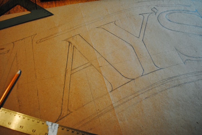
I wanted the sign to feel as old as this great wood. I drew all sorts of lettering that I liked but only this curved style seemed to fit this piece. Hand drawn lettering is not the quickest way to go but it sure does let me adjust weights and angles quickly. Nothing had to be precise on this so I experimented quite a bit.


Like the lettering, I drew a maple leaf to scale on some scrap paper. My wife and I agree that drawing a good leaf is not as easy as you might think. It is a strange phenomenon, indeed. I like the finished carved look of the leaf. I left the vein lines elevated. 


I knew as I was working through the sign that spaces were being created that would need solved with some sort of ornamentation. After carving "MAY'S Sugar Shanty" and the established date, I used that same round wooden table to help create a base that had more visual weight. I made the cutouts tighter at the bottom to keep more wood to aid in that weight. Once the reader gets to the bottom, you want their eyes to travel back up. I free-handed the ornaments right onto the board. By this time, I was really starting to trust my gut.

Ashley (my wife) was called out of the house on numerous occasions to set my mind right about the design. She either smiles and nods or gets that wincing look on her face. The wince means back to the drawing board. She was a great help and all her multiple winces were spot on.

I am consulting with Mr. May about stains and colors. I don't want to do much more to this thing. It feels right. Like the syrup running out of the tree, the sign was pulled out of the boards. Anything that would cover up the roughness and the amazing character of these boards won't be considered.

Last thing, wear gloves when working with this stuff. I have cut out about twenty to thirty splinters. I will post the final photos of this soon. Thanks all and drive safely.

Wednesday, May 21, 2014

a small walk with the kids....fresh air needed

Cowanesque Lake was the site of a short walk with the little ones. We did not have much time and the weather was not cooperating as well. Just enough time to take in some scenery, eat some peanuts and such, and move on down the line.


The geese had been using the path as a bathroom for the past few days. Woody Guthrie would have called it some "hard travelin".


Not sure why I placed these two pics of Clare in....just thought they caught her spirit.


The eagle was the hit of the day. Kids watched for quite a while. There is something about large birds of prey that have always caught my attention.
If I was a better photographer, I'd be one of those nuts who sits in the tree or hangs on the cliff all day to get the ultimate shots of these amazing creatures.


Tuesday, May 20, 2014

mort's meat mafia

I am still not sure of the person I designed this for but it has to do with someone who knows my wife's best friend (his name might be Mort). He wanted a cow, pig and chicken designed into a logo for his new venture, Mort's Meat Mafia. I googled this idea and found that it had been done about a billion different ways. Three animals and the concept of meat, well done! It has been tweaked and twisted and designed over and over. The problem is that it is kinda necessary. You can't just show one of these animals or it gives the audience a much different perception about the product(s). I really didn't know how to bring my own spin on this universal concept. I decided to lead the design toward a more simple end by just giving a cleaver some type. 


I used some inked Styrofoam to get the cleaver and chopped out the hand drawn lettering via Photoshop. Love the natural texture that ya get from Styrofoam. Never gets old!!! 
This design was liked but still the client wanted those darn animals. "Less is more" was thrown out the window. I drew up some suited animals wearing shades and merged it all together and.....


As individual characters....I kind of like them. That chicken looks like a real killer!...an unflappable dude! I think I would still prefer the cleaver with about 40 variations of lettering to the one with the animals. It seems like a bit much. Then again, anything that takes away from type is something to rethink in my book. To be honest, I have not had time to ingest it all. Maybe weeks from now I might come around on the whole thing. Sure do like the chicken.

Saturday, May 17, 2014

not so local font find #17

Around age 12, that would be about 1982, I used to watch a channel out of New York City. I think it was WPIX. I could be wrong about this but I'm putting out there anyway. This station would run classic TV programs after school and late at night. Shows like the Honeymooners, Laurel and Hardy, the Three Stooges, Leave it to Beaver, the Odd Couple and the Little Rascals. They were so good....so much better than anything current that might have been playing on other stations. I logged a lot of hours taking in the brilliance of those old shows. Time well spent.

Walking through Walmart (or some such place) the other day, I noticed a Little Rascals DVD in the cheap bin. I picked it up because I thought my children should be subjected to some real quality TV. 

I'm not sure that my kids are old enough yet to appreciate these talented kids. They showed little to no interest in their high jinx. But what I noticed in my matured state was the lettering. GREAT LETTERING ALL OVER THE PLACE! From the intro credits to the hand painted signs on many episodes. I laughed just like I used to but watched carefully for the slightest glimpse of some great type.


A young Spanky was the star of the show. Cute little guy and an amazing voice.


This was a 1934 episode in which this moving truck (below) was moving a family into the "rascals" neighborhood.


Obviously the "W" caught my eye. I quickly got my camera and scanned the DVD back to take these screen shots. I just love the whole side of this truck. The "Wilshire Storage Co." has a great extended 3-D look to the lettering. The dimensional edges look like they might have been a gold color but who knows with the black and white of the screen. Anywho, I sure do like the lettering. 

As a side note, I noticed some amazing lettering on the classic Jimmy Stewart film, The Spirit of St. Louis the other day. He gets out of a cab in California when he is visiting the company that might just build his plane. The door of that cab would be hanging on my living room wall! That might be my next post.